MOLAS: textile design & political identity

MOLAS: textile design & political identity

cgk.ink journal — textile & identity
cgk.ink journal · Guna Yala, Panamá

MolasTextile design & political identity

A blouse panel, cut and stitched by hand, that helped a people keep their land, their language and their name.

“Clothes aren’t going to change the world. The women who wear them are.”— Anne Klein
01 / 04 — What is a mola
01
The garment

What is a mola?

molaDulegaya (Guna language): “clothing” or “blouse.”

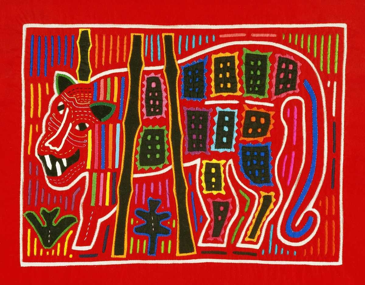
To the Guna, mola simply means clothing. To the rest of the world it means the panels: two vivid, hand-stitched rectangles worn front and back on a woman’s blouse, the centerpiece of a full ensemble of wrapped skirt, headscarf, gold and beaded wini wrapped at wrist and calf.

The Guna live along Panamá’s Caribbean coast and across the San Blas archipelago they call Guna Yala. Their textile art is believed to descend from body painting: the same geometric language moved from skin to cotton once trade cloth and needles reached the islands.

Every mola is a statement of who made it, and of who she is.

Guna mola panel in layered reverse appliqué, Panamá
Layered
Colorful mola textile with geometric and animal motifs
Storied
Detail of a hand-cut mola showing layered cotton and fine stitching
Cut
Mola textile art in red, orange and black
Stitched
02 / 04 — Reverse appliqué
02
The technique

Cut down to the color

Stack

Several layers of brightly colored cotton are basted together, darkest or boldest on top.

Cut

The maker slices through the top layer to expose the color beneath, then cuts again, deeper.

Turn

Each raw edge is folded under, so every line of the design becomes a channel of color.

Stitch

Tiny, nearly invisible hand stitches lock it all in place. A complex panel can take weeks or months.

The tell of a great mola: more layers, finer cuts, smaller stitches.

03 / 04 — Dress as resistance
03
The politics

Dress as resistance

1919

Assimilation

Panamá’s government begins pressing the Guna to give up traditional dress, including the mola, nose rings and wini, in favor of Western clothes.

1925

The Guna Revolution

In February, the Guna rise up against police occupation of the islands. Wearing the mola becomes an open act of defiance, and the uprising is still commemorated every year.

1938

Recognition

The San Blas territory is established as a comarca, the first step toward the self-government the Guna fought for.

Today

Guna Yala

An autonomous region governed by the Guna General Congress, where the mola is still worn daily as identity, not costume.

04 / 04 — Why it matters
04
The influence

Why it matters for design

Contrast

Saturated reds, oranges and blacks set edge to edge. No gradients, no hedging: color as pure graphic force.

Depth

Layers you can read. The eye travels down through the cloth, which is why the look keeps returning to fashion and interiors.

Story

Birds, sea creatures, maze-like geometry and daily life. Every panel is a narrative before it is a pattern.

Credit the source. When mola aesthetics show up on a runway or a throw pillow, the design debt belongs to Guna women. Name them.

Shop — mola-inspired
→
Curated by cgk.ink

Mola-inspired pieces

These pieces are curated by cgk.ink and inspired by the mola art form. They are not made by Guna artisans. For an authentic mola, buy from cooperatives and sellers who work directly with Guna makers.

No products were found matching your selection.
The anti-Trump: The NEW DEAL & HOW A MINDFUL GOVERNMENT RESTORED A BATTERED NATION

The anti-Trump: The NEW DEAL & HOW A MINDFUL GOVERNMENT RESTORED A BATTERED NATION

Works Progress Administration  ·  1935–1943

The New DealPut America to Work

When a battered nation was given a plan, a paycheck, and a paintbrush.

It's difficult to imagine today that, at one point, the US led the world in building societal safety nets, made significant investments in the arts, and encouraged diversity (and equity and inclusion).

The Great Depression, beginning in 1929, left roughly a quarter of American workers jobless and millions without homes or savings. FDR answered with the New Deal, and a major piece of it was the WPA. Its programs reached the entire population and delivered lasting, measurable improvements. Here we explore some of the artwork the period produced.

Book cover about the New Deal and the WPA
3.3 MillionWorkers at peak, Nov. 1938
$4.9 BillionFirst appropriation, 1935
620,000 mi.Of streets built
10,000+Bridges built

It's important to remind ourselves that we are all immigrants to this nation.

The Agency

Jobs, Not Handouts

The Works Progress Administration was established by presidential order on May 6, 1935, as a cornerstone of the Second New Deal. Led by Harry Hopkins, it put millions of jobseekers on public payrolls, mostly in construction: parks, schools, airports, housing, and a vast network of roads and bridges.

Its first appropriation of $4.9 billion was equal to about 6.7 percent of 1935 GDP. From 1939 to 1943 it operated as the Work Projects Administration.

“These ordinary men and women proved to be extraordinary beyond all expectation. They were golden threads woven in the national fabric.” — Nick Taylor, American-Made: The Enduring Legacy of the WPA

Who Qualified

American citizens 18 or older, able-bodied, unemployed, and certified as in need by an approved local relief agency.

What It Paid

$19 to $94 a month depending on region, urbanization, and skill. The average was about $52.50, roughly $1,200 in 2024 dollars.

How Long

Hours were capped at 8 a day or 40 a week, with a stated minimum of 30 hours a week.

Culture as Infrastructure

Federal Project Number One

The logo of the Federal Art Project (FAP), a component of the WPA.

Rather than simply granting money to private institutions, the government chose to employ cultural workers directly. Federal Project Number One had five parts, and within a single year it had put more than 40,000 artists and other talented workers to work.

Federal Art Project
Director: Holger Cahill5,300+ artists in 1936

Artists produced murals, posters, and illustrations for the other WPA arts programs and mounted public exhibitions. Teaching artists worked in settlement houses and community centers, reaching an estimated 50,000 children and adults, and more than 100 community art centers served roughly eight million people.

Federal Music Project
Director: Nikolai Sokoloff16,000+ musicians

Created to employ out-of-work musicians, it formed orchestras, choral groups, opera units, concert bands, and dance bands. It also taught music to well over a hundred thousand students a week, recorded folk music, and expanded access to scores through copyists, arrangers, and librarians.

Federal Theatre Project
Director: Hallie Flanagan12,700 at peak

Broadway employment had collapsed from about 25,000 workers in 1929 to about 4,000 in 1933. The project staged some 1,200 plays in four years and introduced 100 new playwrights. Alumni include Orson Welles, John Houseman, Burt Lancaster, Joseph Cotten, Canada Lee, Will Geer, and Sidney Lumet. It was the first project to end, when Congress zeroed out its funding in June 1939.

Federal Writers' Project
Director: Henry Alsberg6,686 writers in 1936

The FWP produced the American Guide Series, 378 books and pamphlets documenting the history, culture, and landmarks of every state, city, and village. It also recorded oral histories, including the Slave Narratives, and collected American folklore.

Historical Records Survey
Director: Luther H. Evans4,400+ workers

The smallest of the five, it set out to identify, collect, and conserve the nation's historical records, one of the largest bibliographic efforts ever undertaken.

What America Stands For

Give Me Your Wretched Refuse

Send these, the homeless, tempest-tost to me

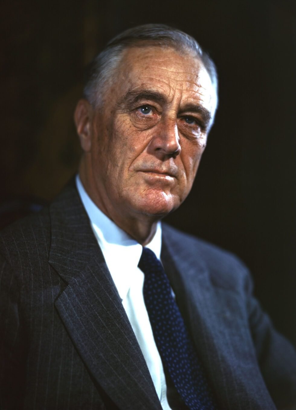
From 1933 into the war years, a sitting president actually did something good. Crippled by economic collapse, the nation found a leader with the clarity to see what it stands for: equality, freedom, and agency.

Franklin D. Roosevelt, 1944 campaign portrait
The New Colossus by Emma Lazarus and the Statue of Liberty

Not like the brazen giant of Greek fame,
With conquering limbs astride from land to land;
Here at our sea-washed, sunset gates shall stand
A mighty woman with a torch, whose flame
Is the imprisoned lightning, and her name
Mother of Exiles. From her beacon-hand
Glows world-wide welcome; her mild eyes command
The air-bridged harbor that twin cities frame.
“Keep, ancient lands, your storied pomp!” cries she
With silent lips. “Give me your tired, your poor,
Your huddled masses yearning to breathe free,
The wretched refuse of your teeming shore.
Send these, the homeless, tempest-tost to me,
I lift my lamp beside the golden door!”

Emma Lazarus  ·  November 2, 1883
From Our Studio

The WPA Collection

Designs inspired by the posters, parks, and spirit of the era, made in DTLA.

No products were found matching your selection.
Fine Art Focus: Artist: Emile-Allain Séguy & the Pochoir Method

Fine Art Focus: Artist: Emile-Allain Séguy & the Pochoir Method

The Fine Art Collection · Journal

E.A.
Séguy

& the Pochoir Method

How a Paris designer used hand-cut stencils and layered gouache to turn butterflies and beetles into some of the most dazzling prints of the Art Deco age.

Art DecoPrintmakingParis, 1920s

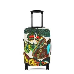
In the 1920s, as photography and fast rotary presses flooded Paris with cheap color, a small circle of designers went the other way: back to hand-cut stencils and a brush. Some of the most dazzling results were the butterfly and insect plates of Emile-Allain Séguy.

E.A. Séguy (1877–1951) was a French designer of patterns and textiles drawn from the natural world. His work sits at a rare crossroads: the flowing, organic line of Art Nouveau, which peaked around 1900, and the bold, faceted geometry of 1920s Art Deco. Few artists blended the two as convincingly.

Over his career he published eleven portfolios of designs, including butterflies, beetles, flowers, foliage, crystals, and animals. They were meant as source books, giving the makers of textiles and wallpaper a jolt of color and pattern to work from.

Two Séguys, one mix-up

Because E.A. loved insects, he is often confused with another Parisian working at the same time. The Papillons and Insectes portfolios are E.A.'s.

Emile-Allain SéguyDesigner. Made insects beautiful.
Eugène SéguyEntomologist. Classified flies.

01 — The methodWhat is pochoir?

Pochoir is simply French for "stencil." Stenciling was an old decorative trade, used for borders and wall ornament, usually in flat, crude patches of color outlined by the cutout itself.

In early 20th-century Paris, printers refined it into a fine-art process. They laid color over color, often on top of a lithograph, woodcut, wood engraving, or etching. The revival was a direct response to machine printing, whose color reproductions looked flat and muddy. A hand-laid layer of gouache had a depth and glow that no camera or press could match.

The field's handbook arrived in 1925: Jean Saudé's Traité d'enluminure d'art au pochoir, which did much to spread the technique.

02 — Layer by layerHow a print was built

Step 01Analyze

The original watercolor or gouache was broken down into its separate colors. An outline was often printed first as a black-and-white lithograph to guide the layout.

Step 02Cut

A separate stencil was cut for every color. Early ones were copper, zinc, or aluminum, later celluloid and oiled card, and today acetate.

Step 03Dab

Color went on through each stencil with a round brush called a pompon. The pigment had to be nearly dry. Too wet, and it crept under the edge.

Step 04Finish

Skilled colorists added gradation, stippling, and spatter, then touched in final details by hand. One image could need as many as 100 stencils.

100Stencils for a single print
11Séguy design portfolios
1925Saudé's pochoir treatise
0Machines involved

03 — The luxury printFashion's favorite medium

Done entirely by hand, pochoir was slow and expensive, and that suited the luxury press perfectly. From the early 1900s through the Jazz Age it filled the pages of elite fashion journals. Every print was inspected and approved before it left the studio.

Designers such as George Barbier and Sonia Delaunay issued their costume and textile designs as lustrous pochoir folios. Bespoke furniture makers, wallpaper houses, and architects used it for catalogs aimed at very wealthy clients.

04 — The insectsNature as industrial designer

Séguy's plates take iridescent beetles, moths, and dragonflies and arrange them into dense, jewel-toned patterns. His brightly colored geometric designs were meant to inspire textiles and wallpaper. He wanted to bring to decorative artists the exotic creatures they had overlooked simply because they were rare in life and in illustration.

Butterflies, he knew, would be an easy sell. The other insects needed a defense. In his view they were built like wonderful machines and deserved the same admiration as an airplane fuselage, an ocean liner, or a locomotive.

"Nature was a successful industrial designer!"

— Dover Publications, on Séguy's vision

05 — Beyond the bugsFlowers, fish & pure rhythm

Séguy's eye went well past insects. Portfolios such as Floréal and the bilingual Suggestions for Stuffs and Carpets offered blooms, foliage, koi, and swirling abstractions, all stenciled in pochoir and meant to be lifted straight onto silks, upholstery, and rugs.

06 — LegacyA century later

Dover Publications later reissued the plates as Séguy's Decorative Butterflies and Insects in Full Color, keeping the work in circulation for new generations of designers. That is a big reason his butterflies still turn up on textiles, wallpaper, and prints today, and why his hand-stenciled color still looks startlingly modern.

Collect the color

Explore Séguy alongside the masters of modern design in the cgk.ink Fine Art Collection: art-inspired apparel, decor, and home goods, curated in Los Angeles.

E.A. SéguyPochoirArt DecoArt NouveauPrintmakingModernism 2027
Robert & Sonia Delaunay

Robert & Sonia Delaunay

Robert
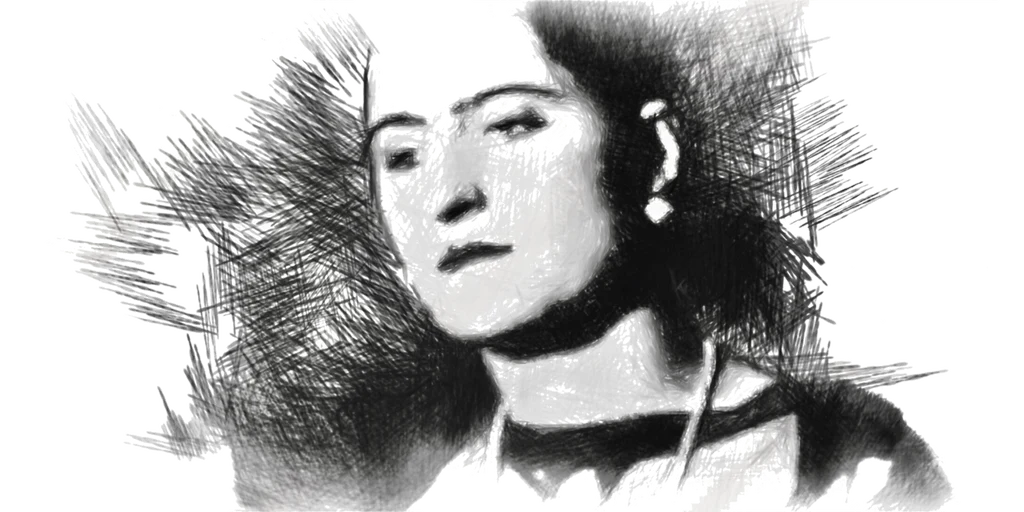
Sonia
Delaunay

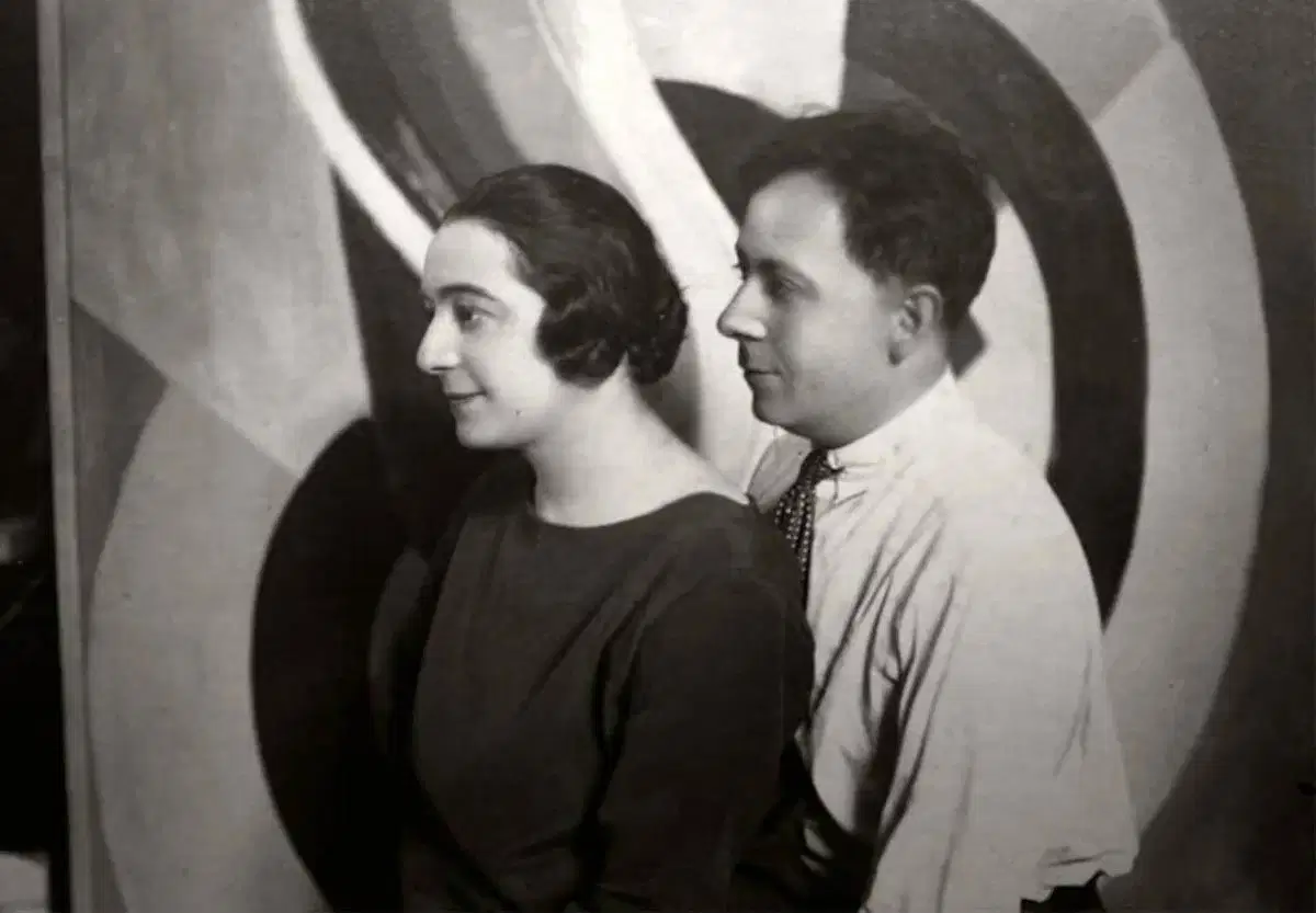
The Delaunays: Two Artists, One Theory of Color

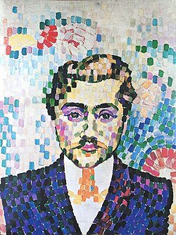
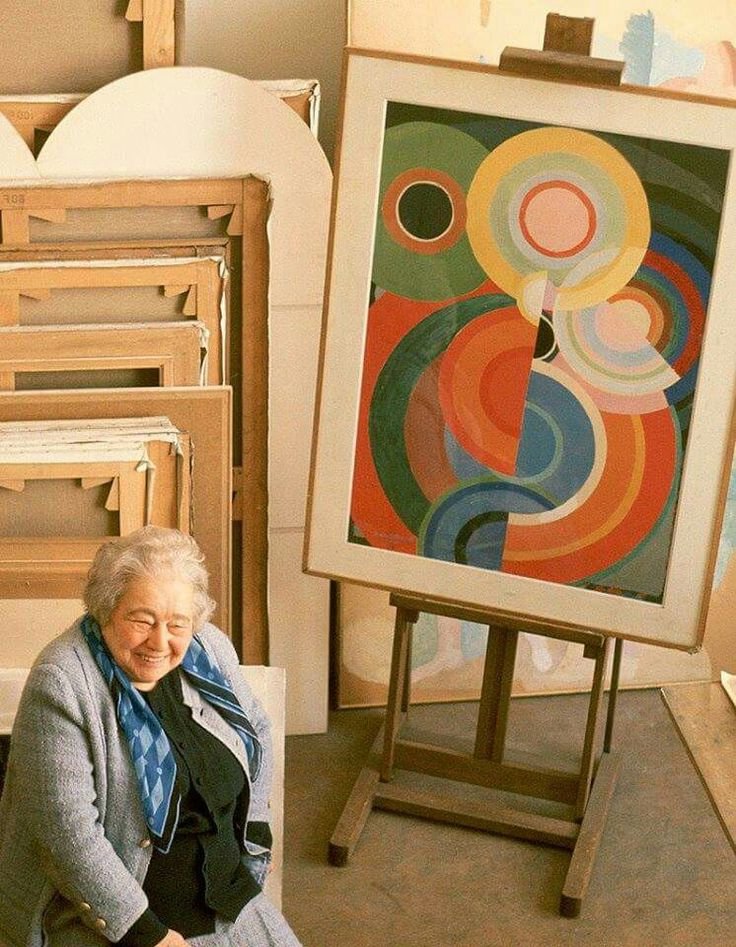
In 1910, two 25-year-old painters married in Paris. Over the next three decades, Robert and Sonia Delaunay built one of the most original ideas in modern art: that color by itself, without outlines or subject matter, could create light, movement and rhythm.

The poet Guillaume Apollinaire called their approach Orphism, after Orpheus, the mythical musician. The name fit. Their work is meant to be felt the way music is felt.

Both artists are now part of our Fine Art Collection. Here's why their story belongs together, and why their work still looks so modern more than a century later.

A Shared Language: Simultaneous Contrast

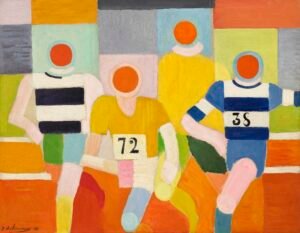
Robert Delaunay, The Runners, ca. 1924–26

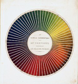
The Delaunays started from a 19th-century discovery by the chemist Michel-Eugène Chevreul. He found that colors change each other when placed side by side. Orange next to blue makes both look brighter and makes the edge between them seem to vibrate. The Delaunays called this simultaneous contrast and made it the base of everything they created.

Cubism, the leading movement of their time, broke objects into muted browns and grays. The Delaunays kept Cubism's fractured structure and filled it with pure, saturated color: discs, arcs and interlocking planes that seem to spin and pulse.

Robert Delaunay, The Runners, ca. 1924–26

Robert Delaunay (1885–1941): Painting Modern Life

Robert Delaunay, The Runners, ca. 1924–26

Robert was the theorist of the pair. His paintings take on the energy of the new century: electric light, airplanes, crowds, speed.

Robert Delaunay, The Runners, ca. 1924–26

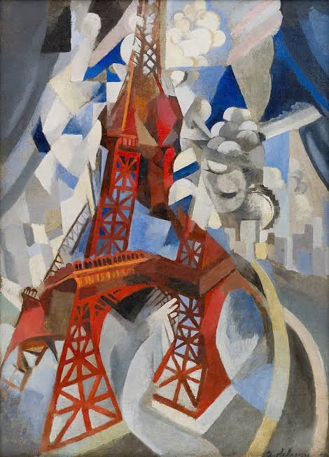
The Eiffel Tower series. He painted the tower more than thirty times between 1909 and 1928, breaking its iron frame into rhythmic, tumbling color. For him it stood for modernity: fractured, luminous and always in motion.


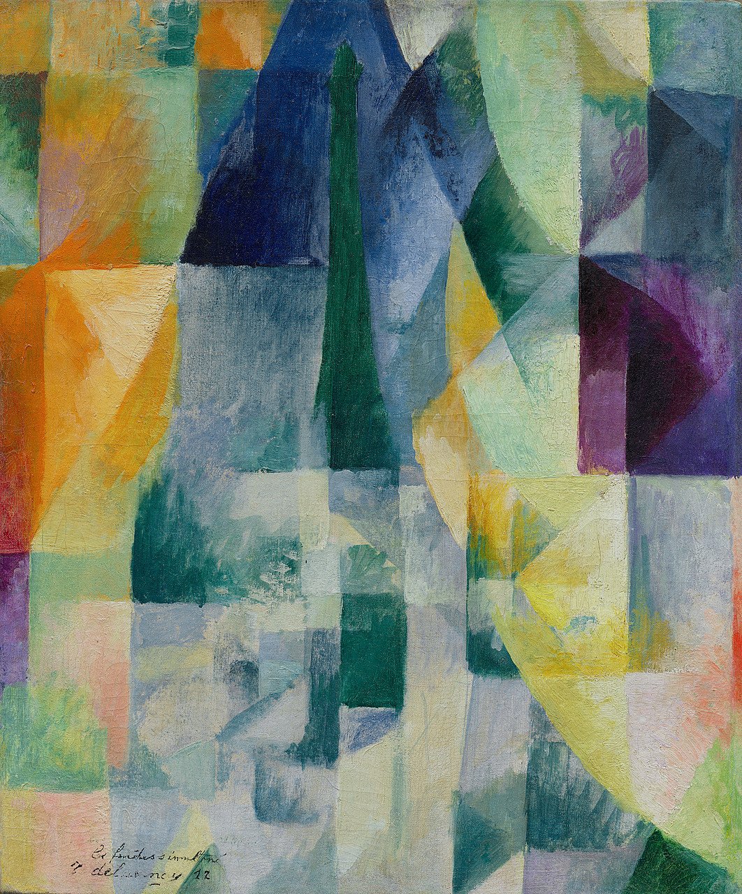
 The Windows series (1912). Views of Paris dissolve into overlapping transparent planes of color. These are some of the first paintings where color itself is the subject.

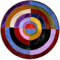
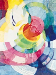
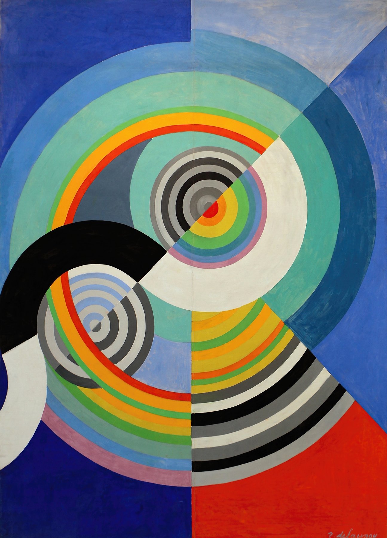
Circular Forms and Rythme. His concentric color discs, often likened to suns, moons and propellers, are among the earliest fully abstract paintings in Western art.

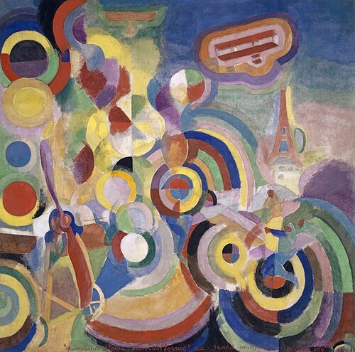
Homage to Blériot (1914). A celebration of flight built from whirling rings of color.

Sonia Delaunay (1885–1979): Taking Color Off the Canvas

Robert Delaunay, The Runners, ca. 1924–26

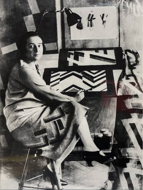
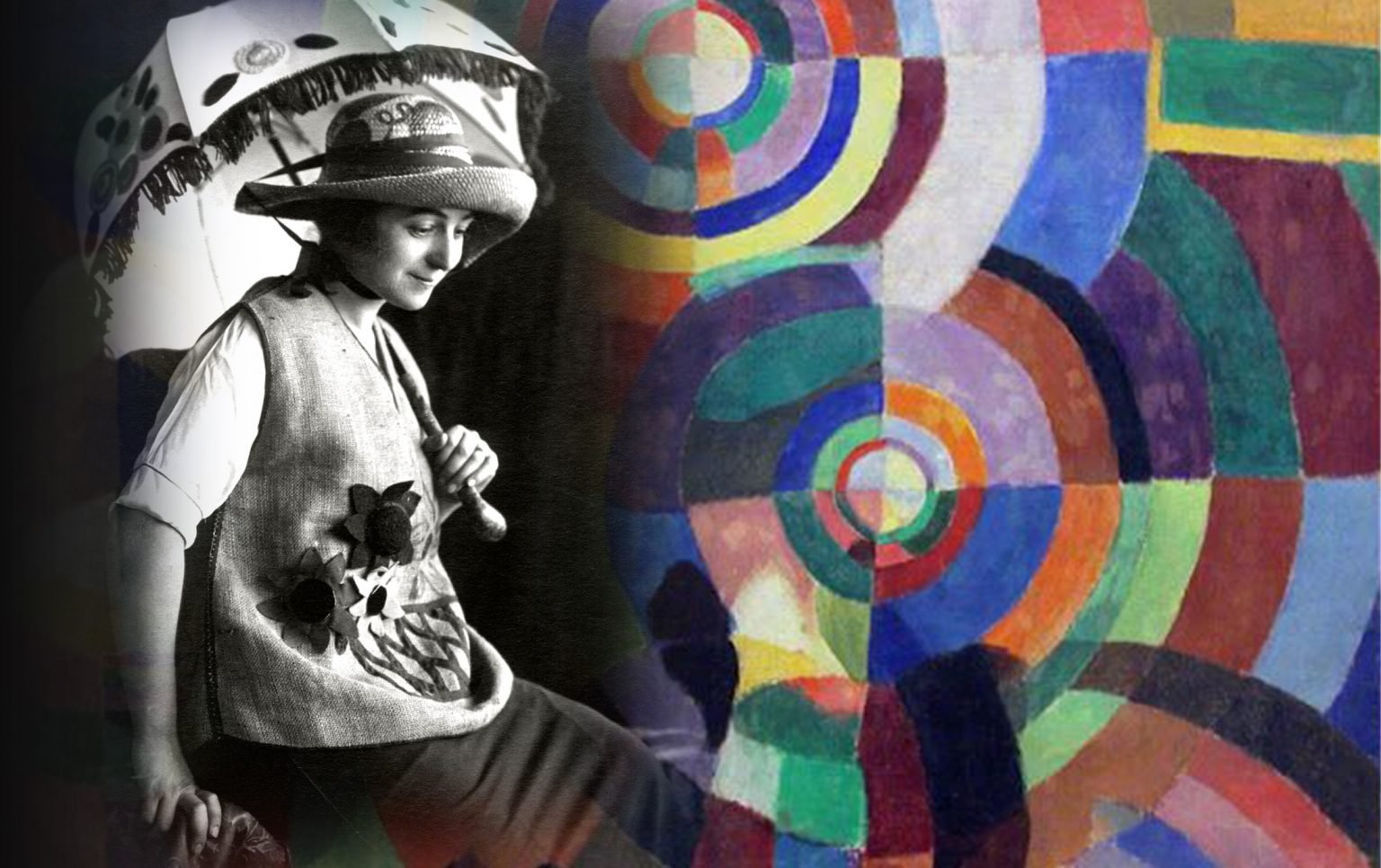
Sonia took the same theory and carried it into everyday life. Where Robert's ideas stayed mostly on the canvas, hers went into fashion, textiles, books, theater and even cars.

Robert Delaunay, The Runners, ca. 1924–26

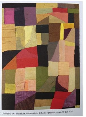
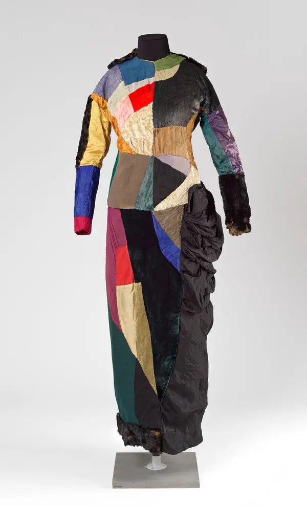
The Quilt (1911). She made a patchwork blanket for their infant son out of fabric scraps, and it became one of her first abstract works. It was art made to be used.
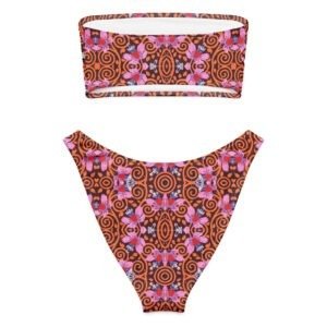
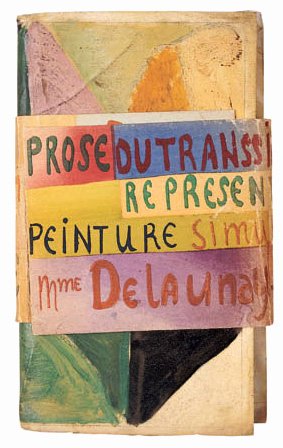
La Prose du Transsibérien (1913). Made with the poet Blaise Cendrars, this two-meter folding book sets poetry beside flowing color. It is one of the landmark artists' books of the century.

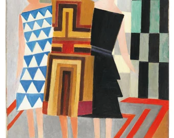
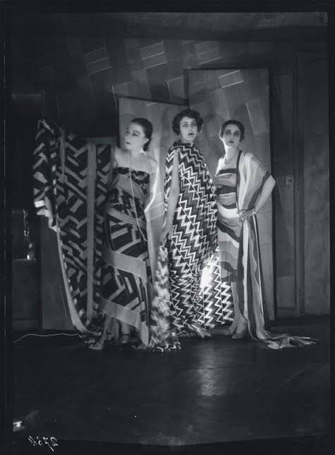
Simultaneous Dresses. She wore her own color-blocked designs to the Bal Bullier dance hall in Paris, turning the dance floor into a moving painting.

Textiles and fashion. Through the 1920s she ran her own design studio and boutique. She created printed fabrics, scarves, coats and costumes, and famously painted a Citroën to match an outfit.

The Louvre (1964). She became the first living woman to receive a retrospective at the Louvre, and she kept working into her nineties.

A Pioneering Couple

Pioneers of pure abstraction in painting

Pioneers of the idea that fine art and design are one

Painting versus living.

Robert thought of the canvas as a place to experiment and wrote long essays on color and light. Sonia rarely stopped to theorize. She tested ideas by making things: a quilt, a dress, a book cover. His work asks you to look. Hers asks you to wear it, hold it, live with it.

Structure versus flow

Robert's compositions are organized around a center: discs, towers and rings that radiate outward. Sonia's designs tend to be modular and rhythmic. Blocks, stripes and repeating bands of color can extend in any direction, which is exactly what fabric needs.

Recognition over time

Robert was treated as the movement's leading figure during his lifetime, and he died in 1941. Sonia's reputation grew over the following decades. Today many historians see her as the more radical of the two, because she refused to separate "high" art from design. That idea shapes how we think about fashion and product design today.

Why the Delaunays Belong at cgk.ink

At cgk.ink, we curate art-inspired pieces for everyday life. Sonia Delaunay was doing exactly that a hundred years ago. Robert's color discs and Sonia's rhythmic patterns translate naturally into apparel, blankets and home goods, because they were built on the belief that color should surround us.

Explore both artists in our Fine Art Collection, and see how two artists, one marriage and one theory of color changed the look of the modern world.

From Edo to Art Nouveau

From Edo to Art Nouveau

The 1800s Design Revolution

How Asian Art Fueled the Western Decorative Arts Boom

The 19th century witnessed a spectacular revolution in how everyday objects were made, viewed, and integrated into the home. As the Industrial Revolution swept across the globe, it sparked an unprecedented explosion of decorative arts, forever altering interior design, furniture, and textiles.

The most profound catalyst for this transformation did not come from Western factories—it arrived from the East. When global trade routes reopened, an influx of East Asian art fundamentally reshaped E​uropean design, shattering rigid Western traditions and paving the way for modernism.

The Opening of Japan and the Paris World's Fair

For over two centuries, Japan remained largely closed to the West under a strict policy of national isolation. That status quo ended abruptly in 1853 when trade borders reopened. What followed was a cultural tidal wave.

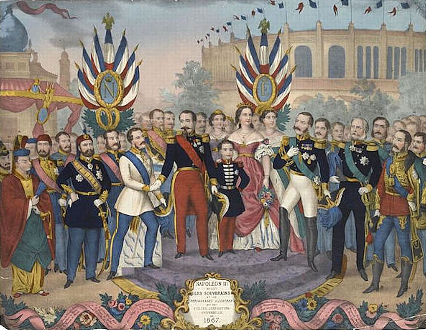
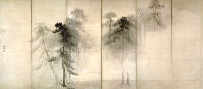
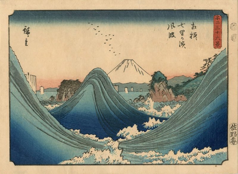
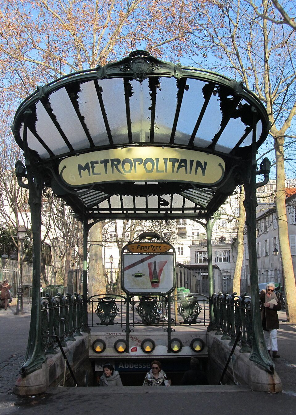
Shiploads of East Asian treasures flooded Western markets: Japanese ukiyo-e woodblock prints, painted porcelain, lacquerware fans, brilliant silks. By the time Japan officially showcased its craftsmanship at the Paris World’s Fair of 1867, a full-blown obsession had taken hold.

Napoleon III receives the rulers and illustrious men who visited the Exposition universelle of 1867.

Napoleon III receives the rulers and illustrious men who visited the Exposition universelle of 1867.

The Birth of Japonisme

The French dubbed this craze "Japonisme," a fervor ​that rapidly spread across Europe. It permanently infected the decorative arts, shifting the Western aesthetic paradigm away from dense Victorian clutter toward elegant, intentional placement.

Major Artists and Works

Vincent van Gogh: Painted Portrait of Père Tanguy (1887) and Agostina Segatori Sitting in the Café du Tambourin, incorporating background Japanese prints.

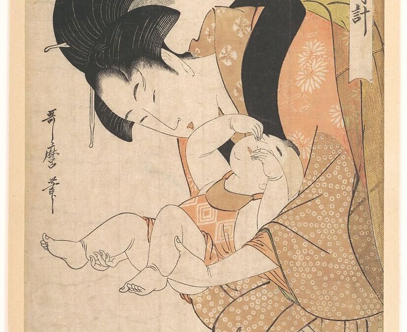
Mary Cassatt: Created a famous series of color etchings like Maternal Caress (1890–91) heavily influenced by Japanese spatial design.

James McNeill Whistler: Painted Harmony in Blue and Gold: The Peacock Room (1876–77), blending interior design and Japanese aesthetics.

Edgar Degas: Used high angles and odd off-center placement inspired by prints seen during the era.

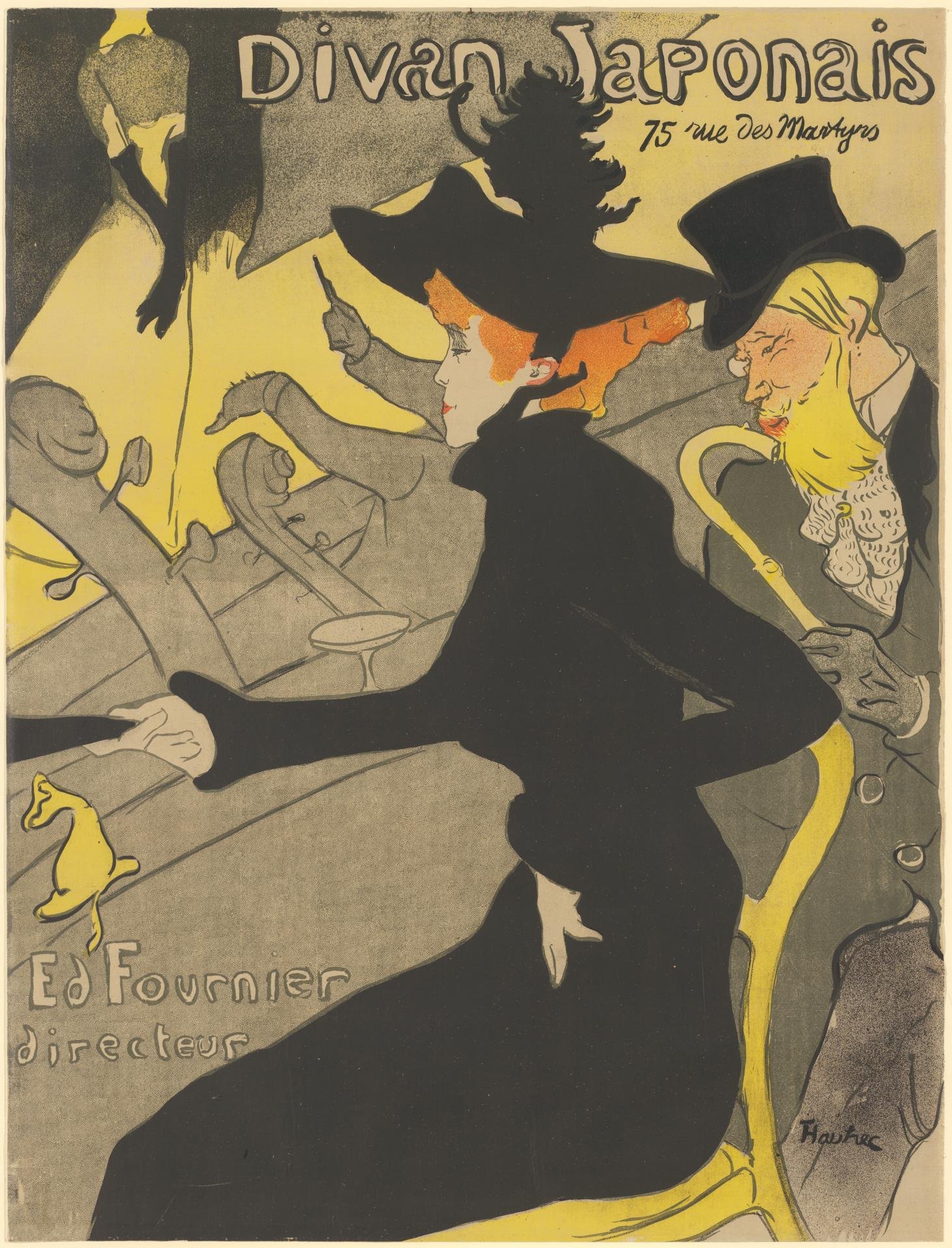
Henri de TOULOUSE-LAUTREC
Divan Japonais 1893

Breaking the Victorian Mold:

Three Principles Borrowed from the East

To European designers, Asian art offered a thrilling alternative to the stuffy, symmetrical, and over-ornamented historical styles of the Victorian era. Western crafters eagerly adopted three revolutionary design philosophies from Eastern masters:

Asymmetry & Space:

Flatness & Geometry

Organic Naturalism

Unlike European design, which demanded absolute symmetry, Asian compositions embraced dynamic imbalance. Designers left intentional empty spaces, allowing the visual layout to breathe.

Traditional Western shading and forced perspective were swapped for bold, flat planes of color, distinct silhouettes, and strong, eye-catching diagonal lines.

Instead of idealized or heavily stylized motifs, Asian art celebrated the raw, unedited beauty of nature—capturing insects, birds, waves, and botanical forms with sweeping fluidity.

From Anglo-Japanese Silver to French Art Nouveau Glass

The artistic cross-pollination completely transformed major European decorative movements on both sides of the English Channel.

The Aesthetic Movement (Great Britain)

Art Nouveau (France)

In Great Britain, the Aesthetic Movement adopted an "Art for Art’s Sake" ethos heavily inspired by Eastern interiors.

Furniture makers crafted "Anglo-Japanese" side chairs, using dark stains to mimic rare Asian ebony and carving crane motifs directly into the woodwork.

Prestigious silversmiths, including Tiffany & Co., abandoned classical scrollwork to engrave sleek, asymmetrical patterns of bamboo and foliage onto their holloware.

Simultaneously, the Art Nouveau movement bloomed in France.

Renowned glassmaker Émile Gallé and jeweler René Lalique directly channeled the sinuous, whip-lash lines of Japanese art into their works.

Masterpieces of French furniture and architecture began incorporating the organic curvature of plant stems and waves, a direct nod to the flowing linework popularized by Eastern masters.
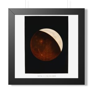
The Lasting Legacy of 19th-Century Fusion

The 19th-century decorative art explosion proved that household items could be elevated beyond mere functional utility. By absorbing the minimalism, craftsmanship, and material sensitivity of Asian design, European artisans successfully broke away from the weight of their own past.

In doing so, they laid down the foundational design principles—clean lines, functional beauty, and geometric simplicity—that would eventually define 20th-century modernism.

explore further >

We've created a more in-depth page about this important  culural movement and its context, timeline and important works.
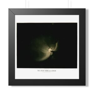
Explore the collection >

This post is part of our expanding FINE ARTS COLLECTION where we write about what inspires us to create the designs that we sell here on cgk.ink

Fine Art Focus: Étienne Trouvelot & the Birth of Astronomical Impressionism

Fine Art Focus: Étienne Trouvelot & the Birth of Astronomical Impressionism

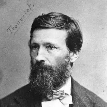
Étienne Trouvelot

(1827 - 1895)

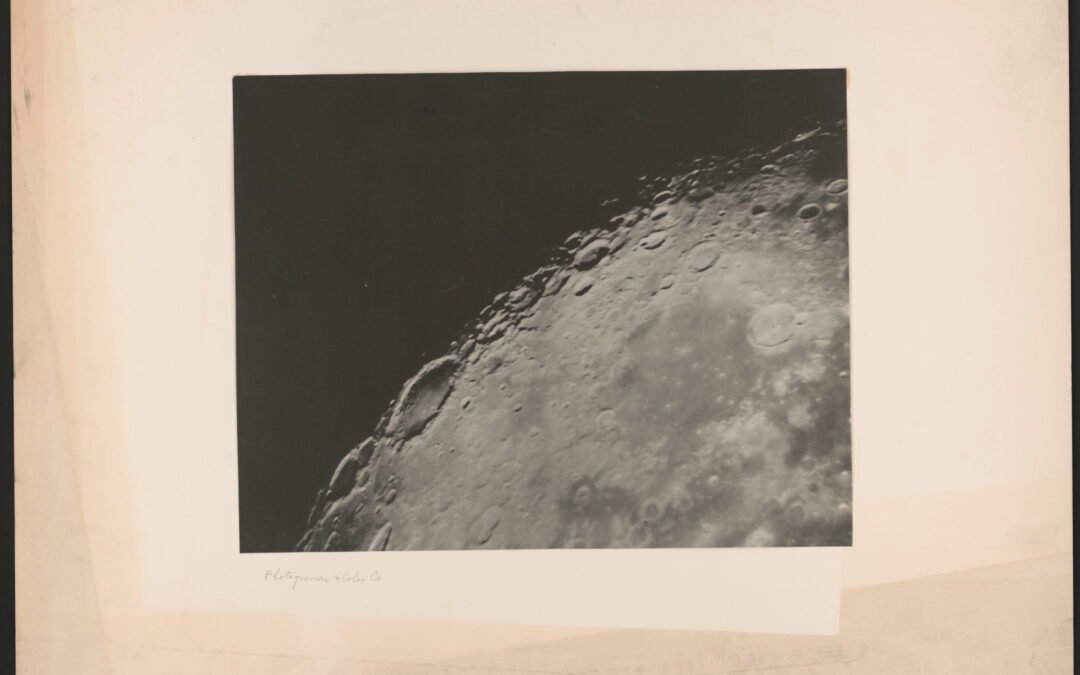
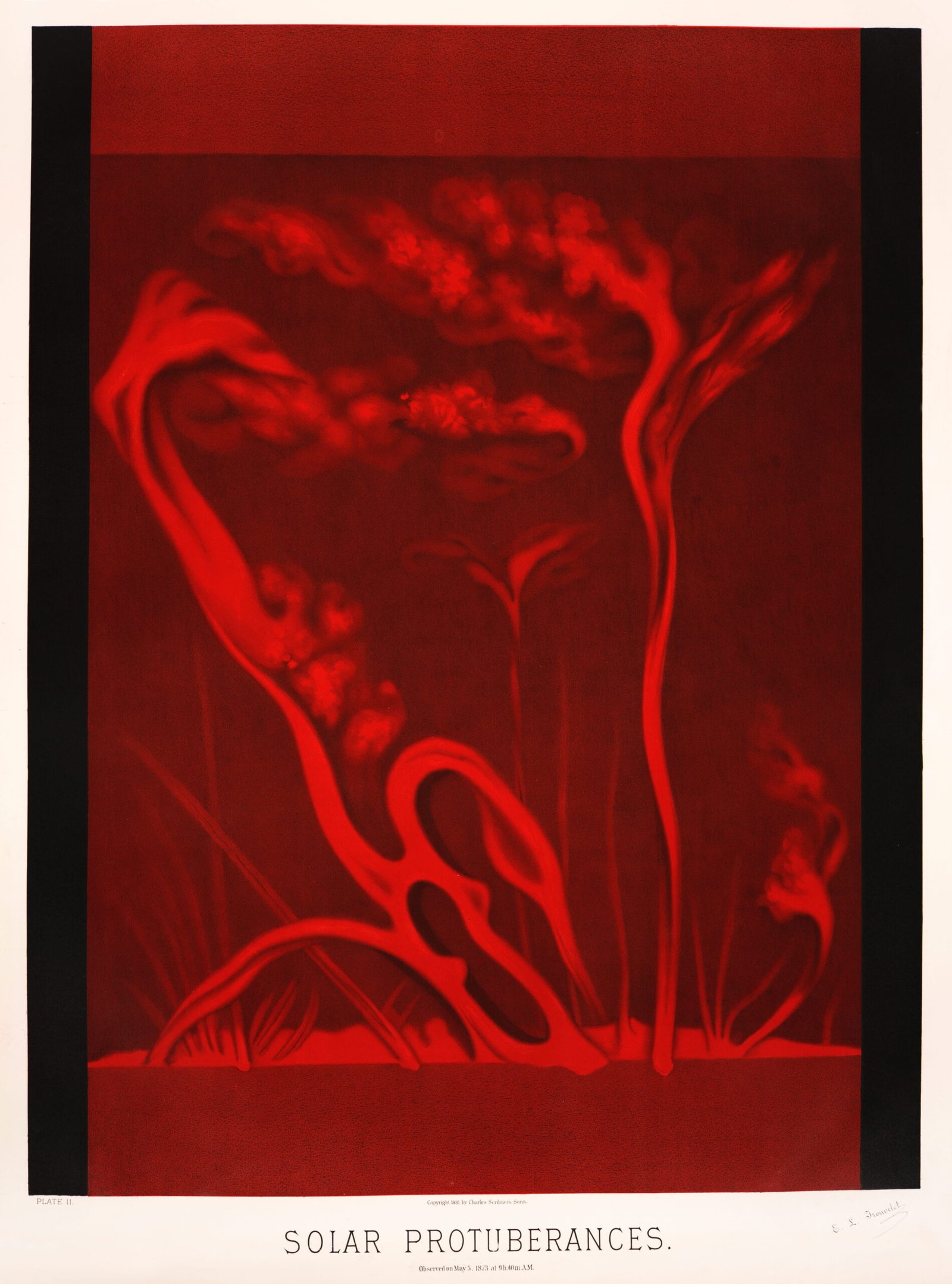
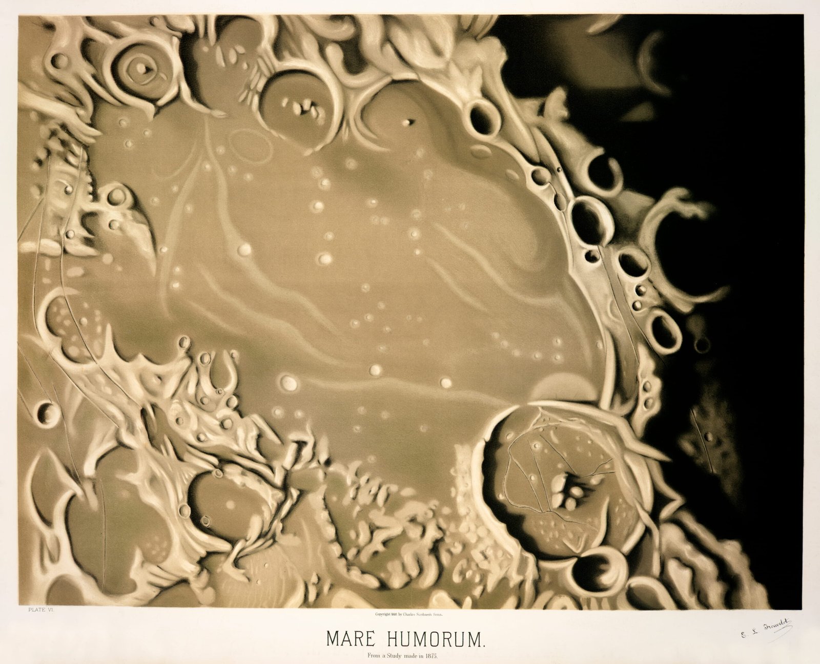
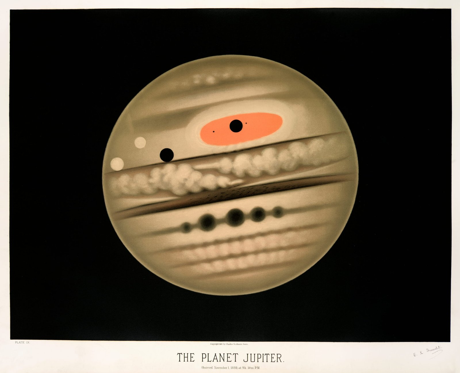
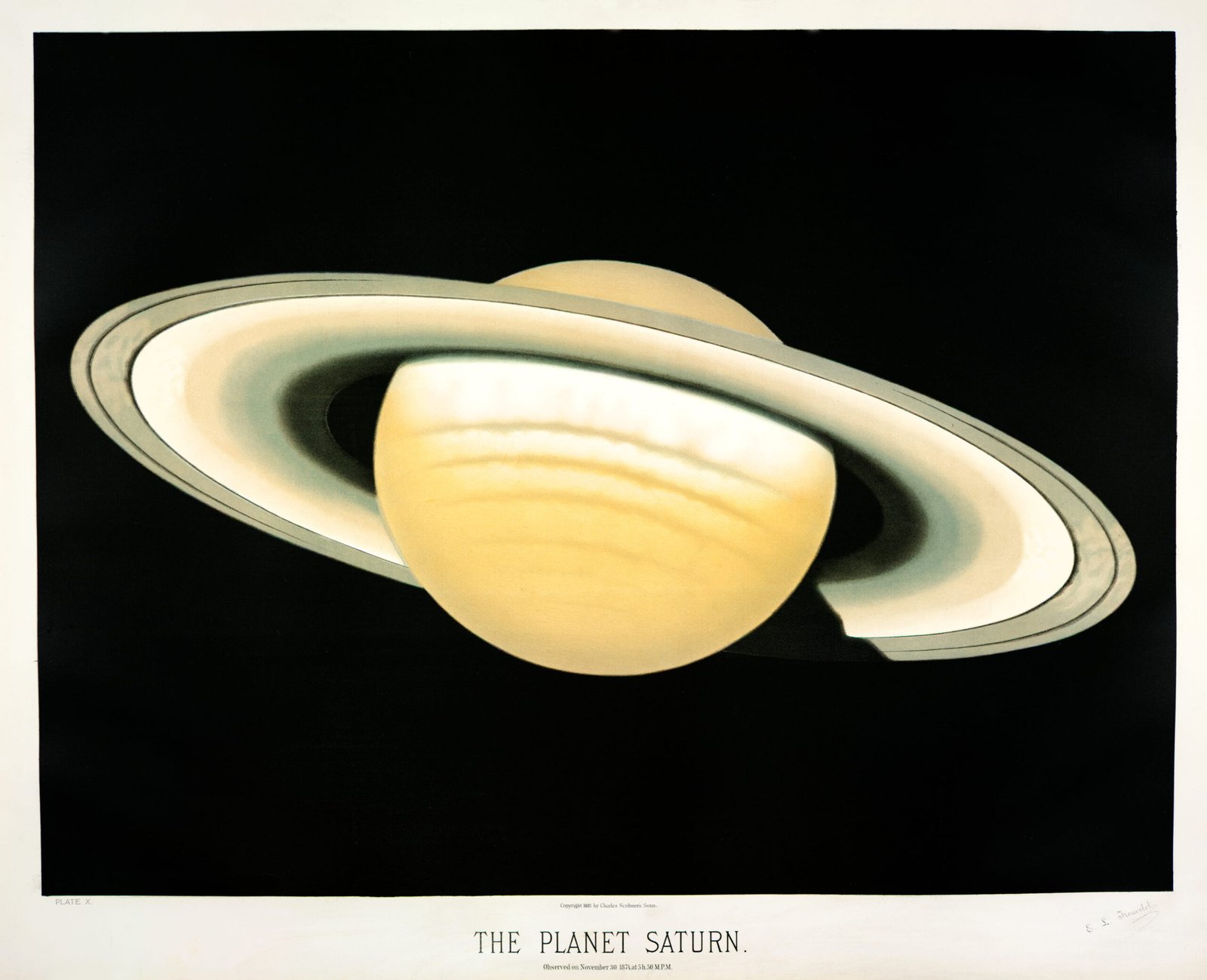
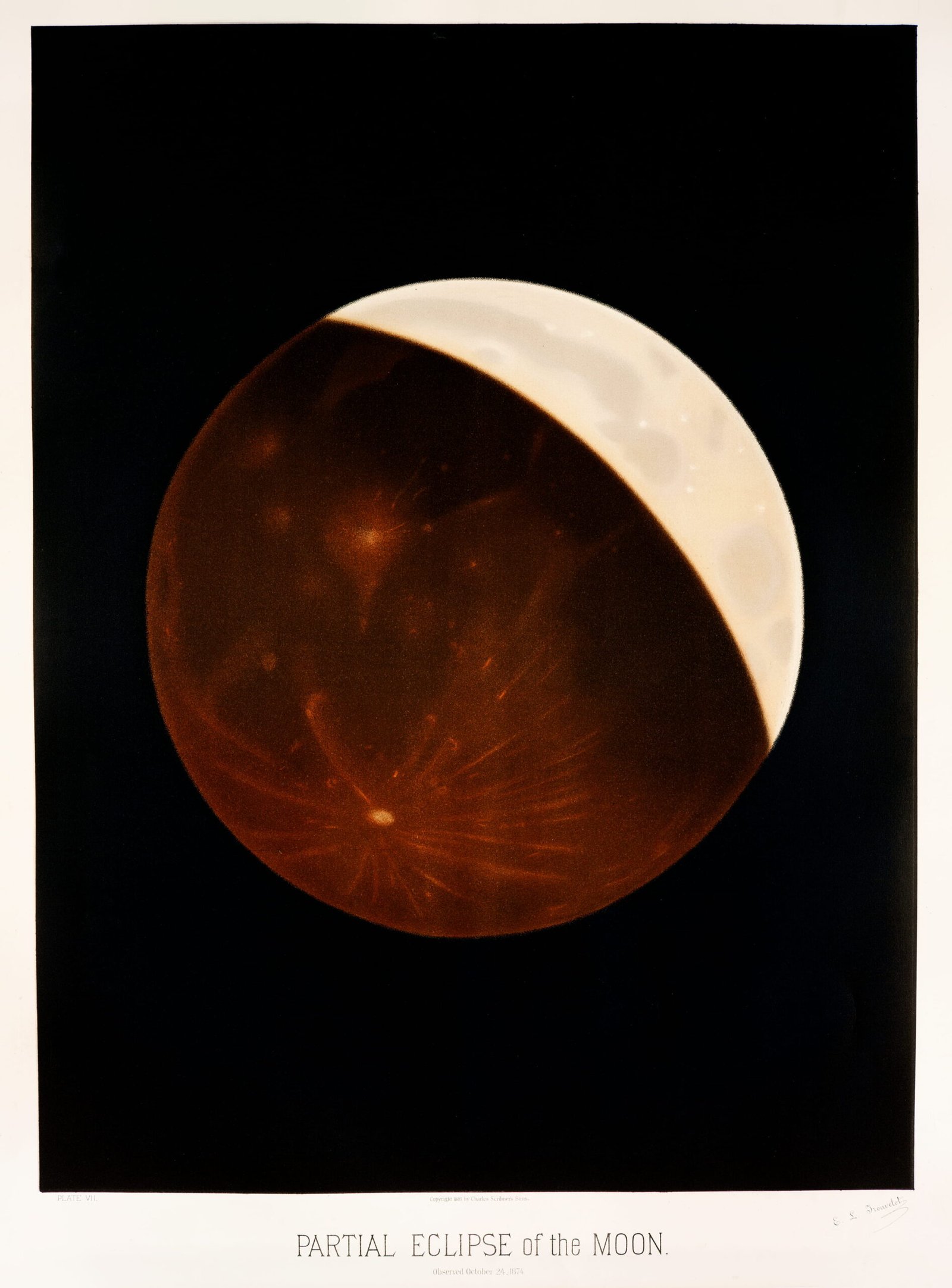
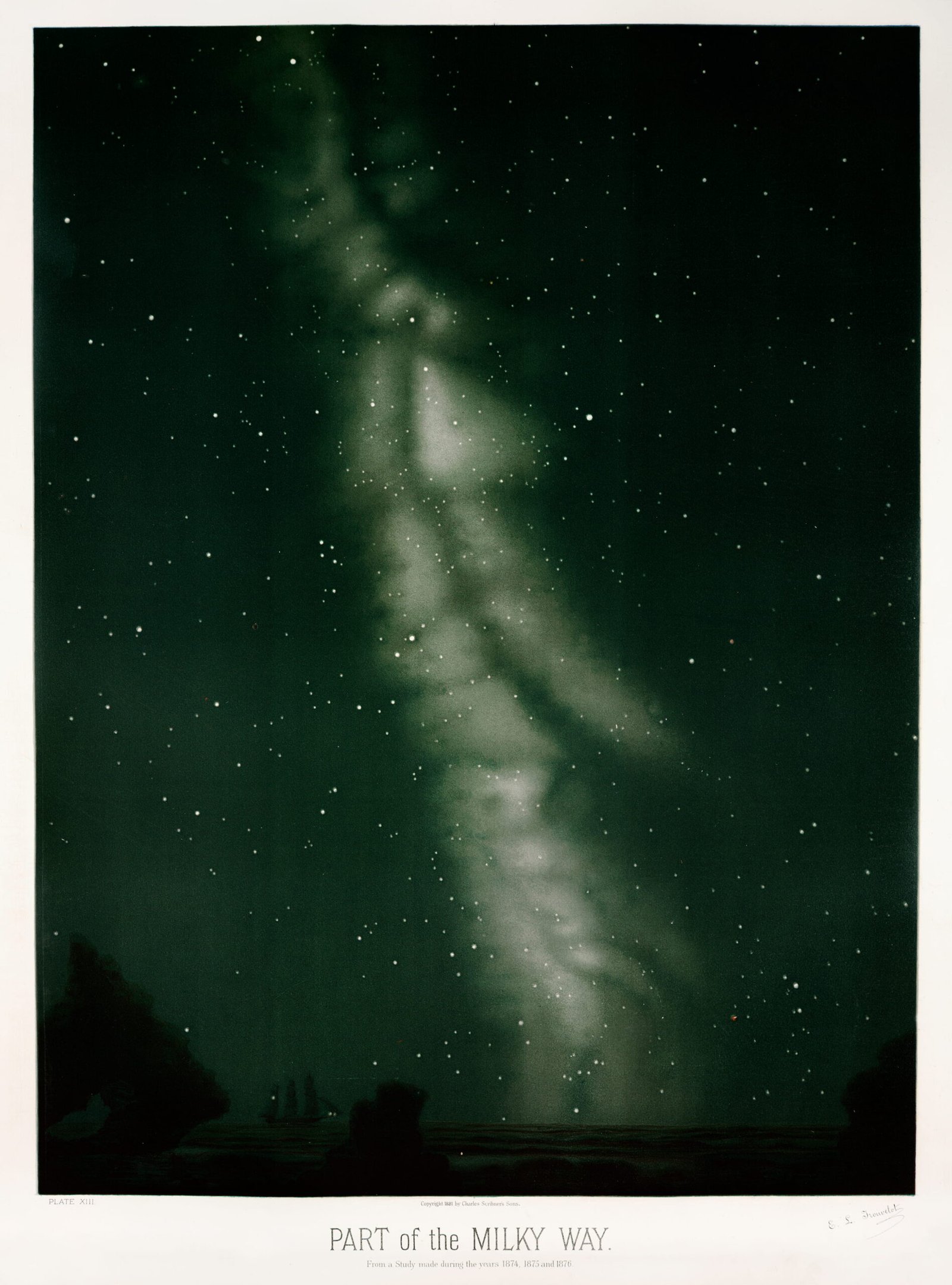
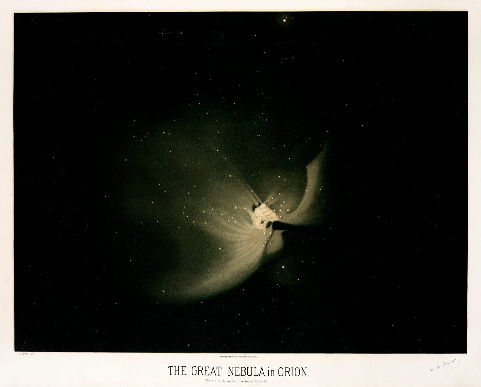
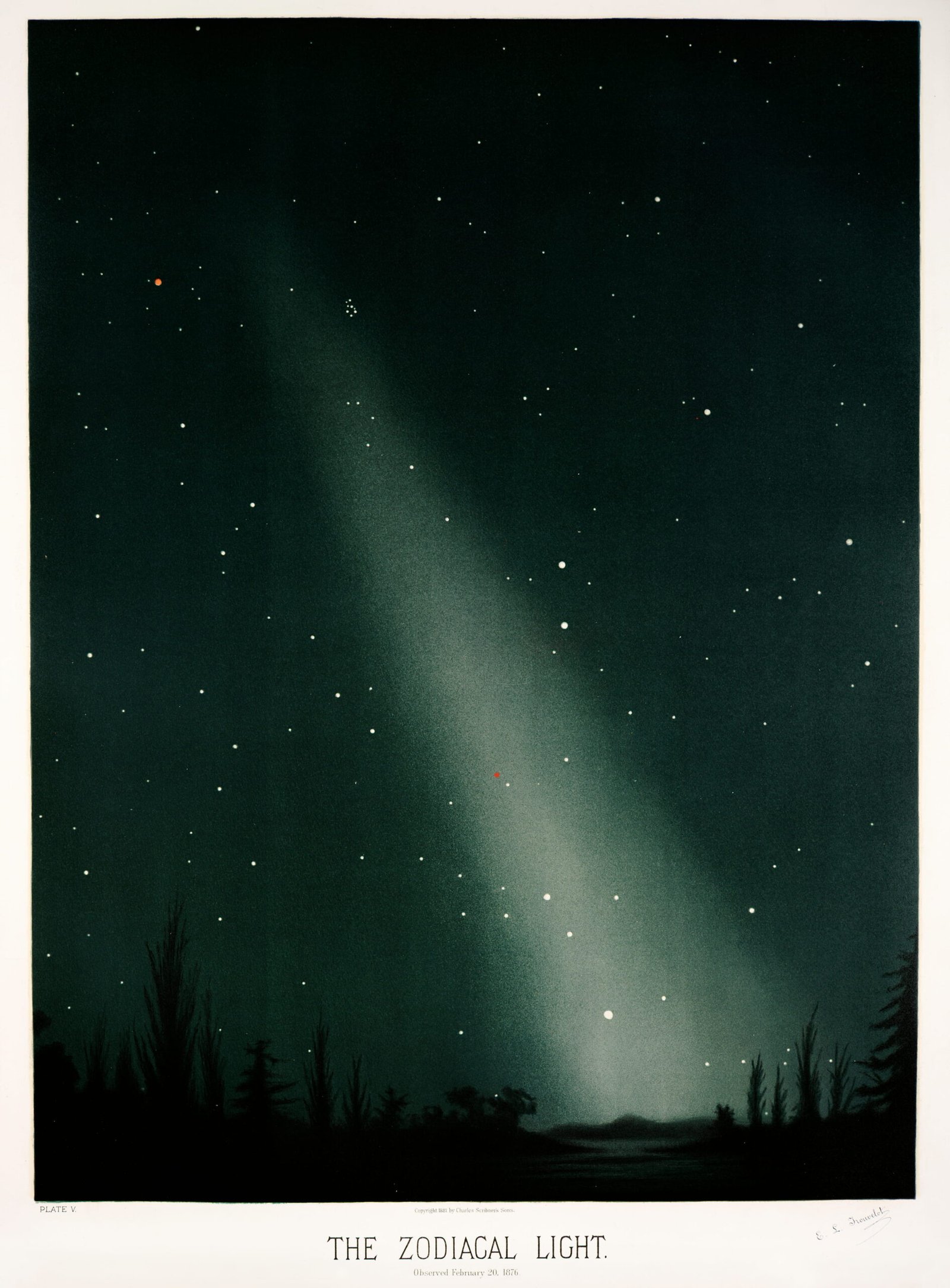
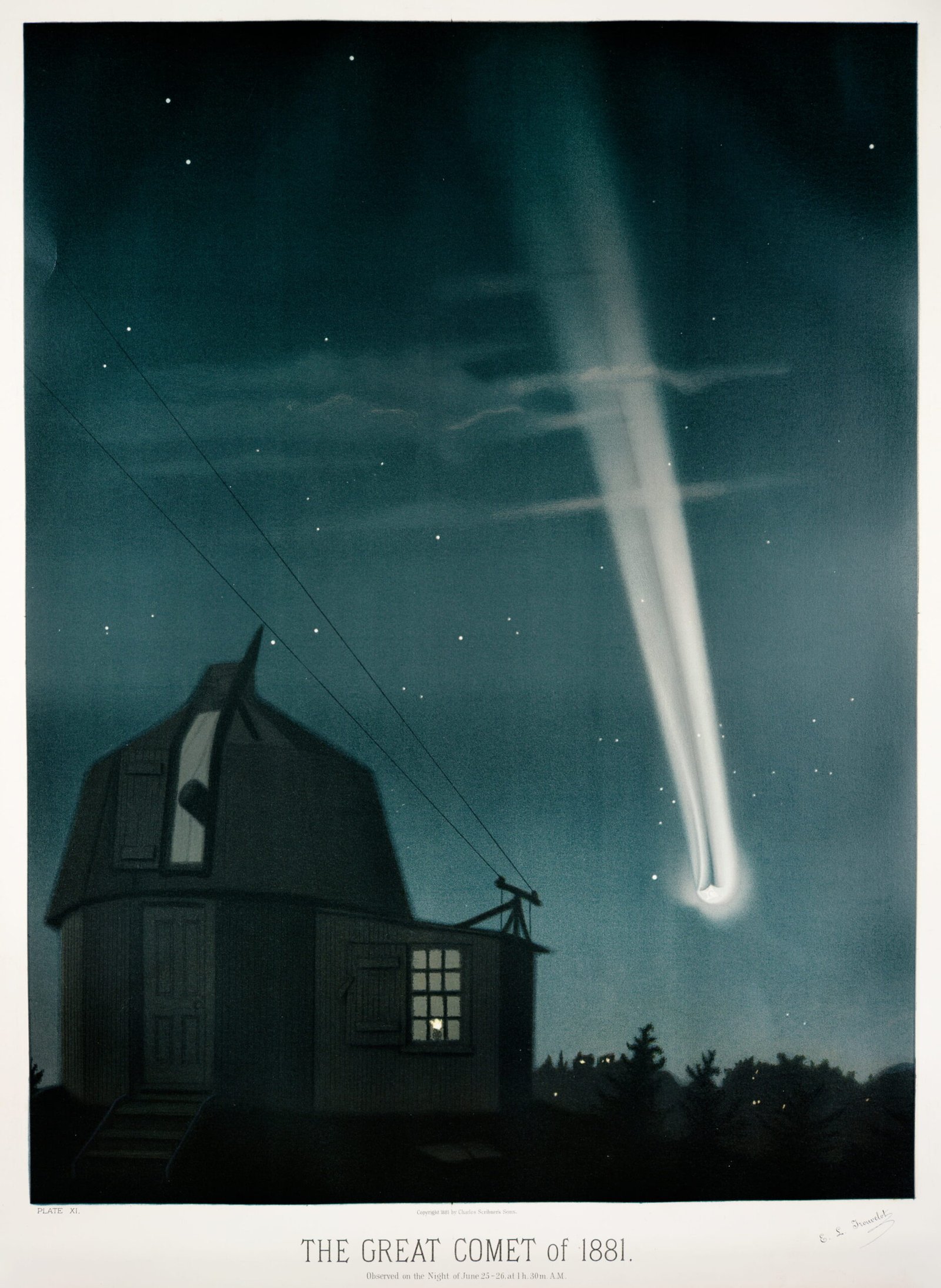
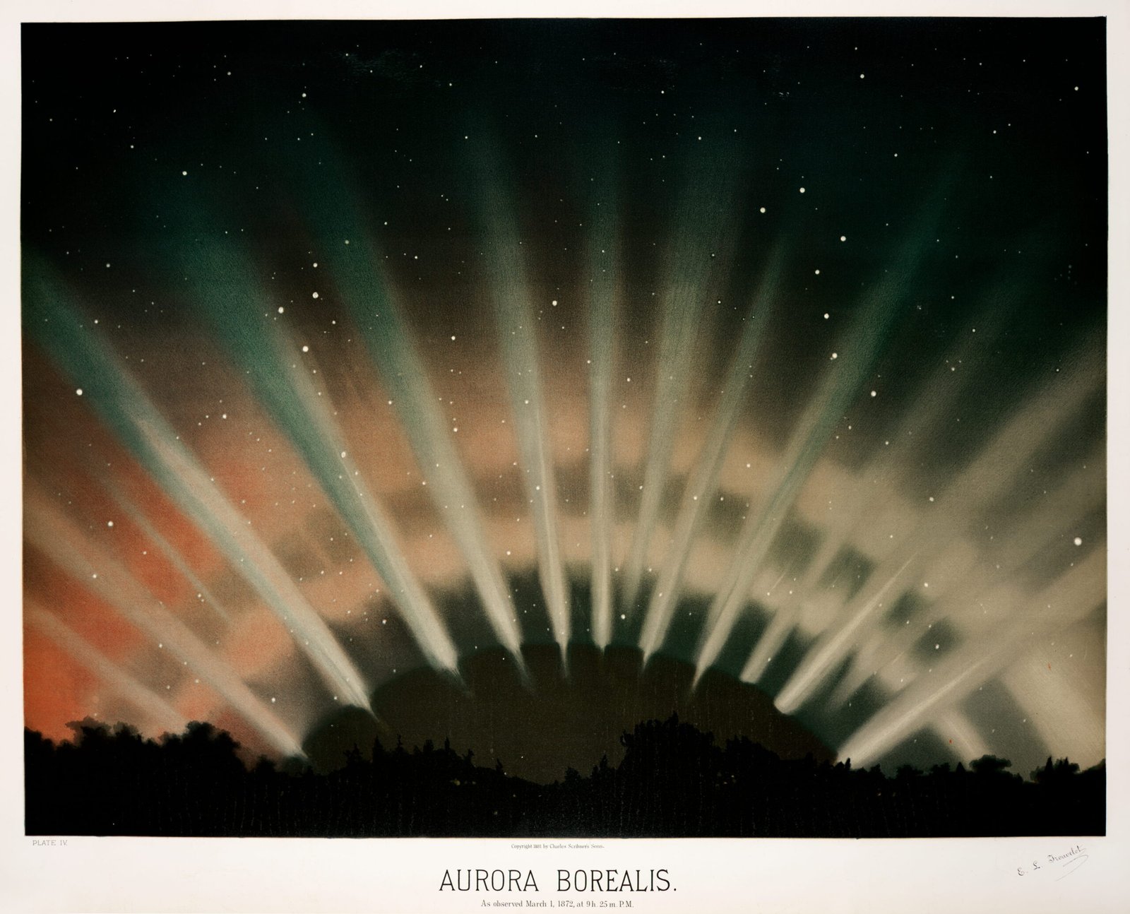
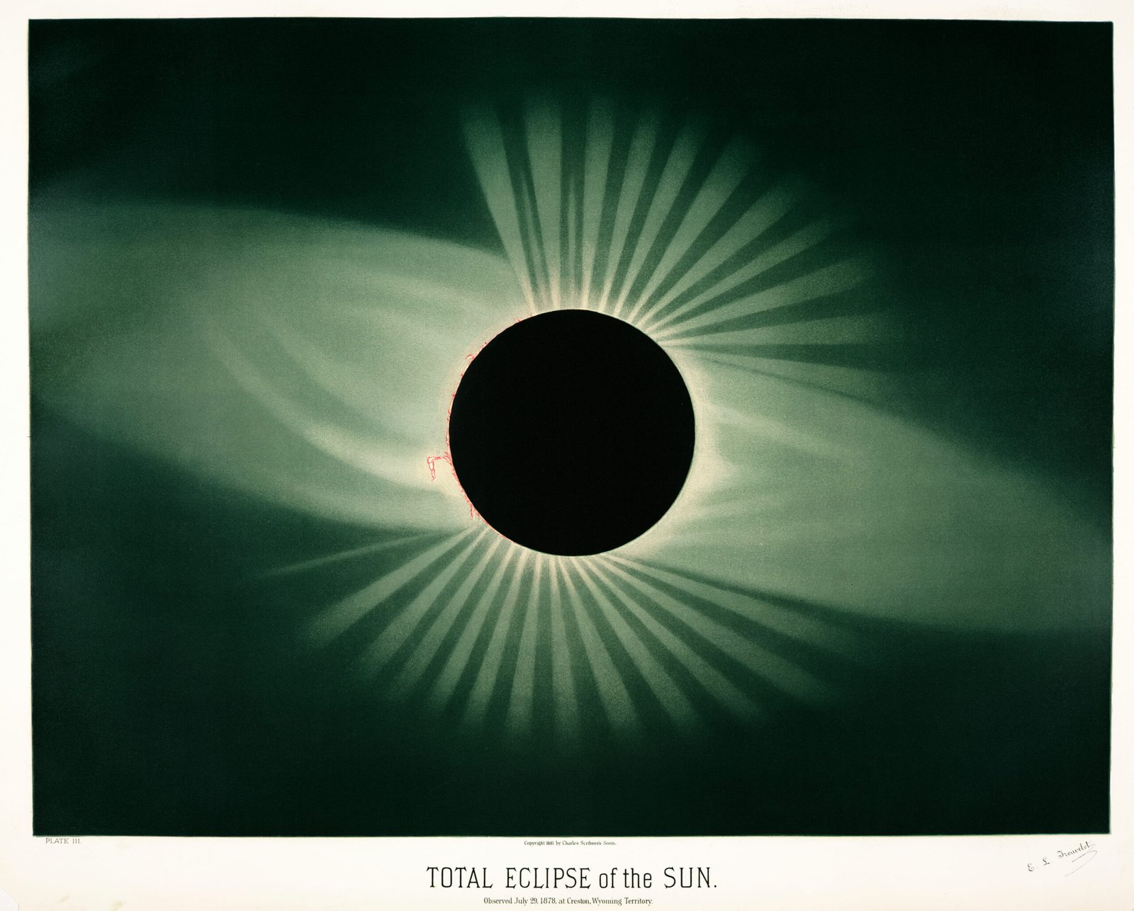
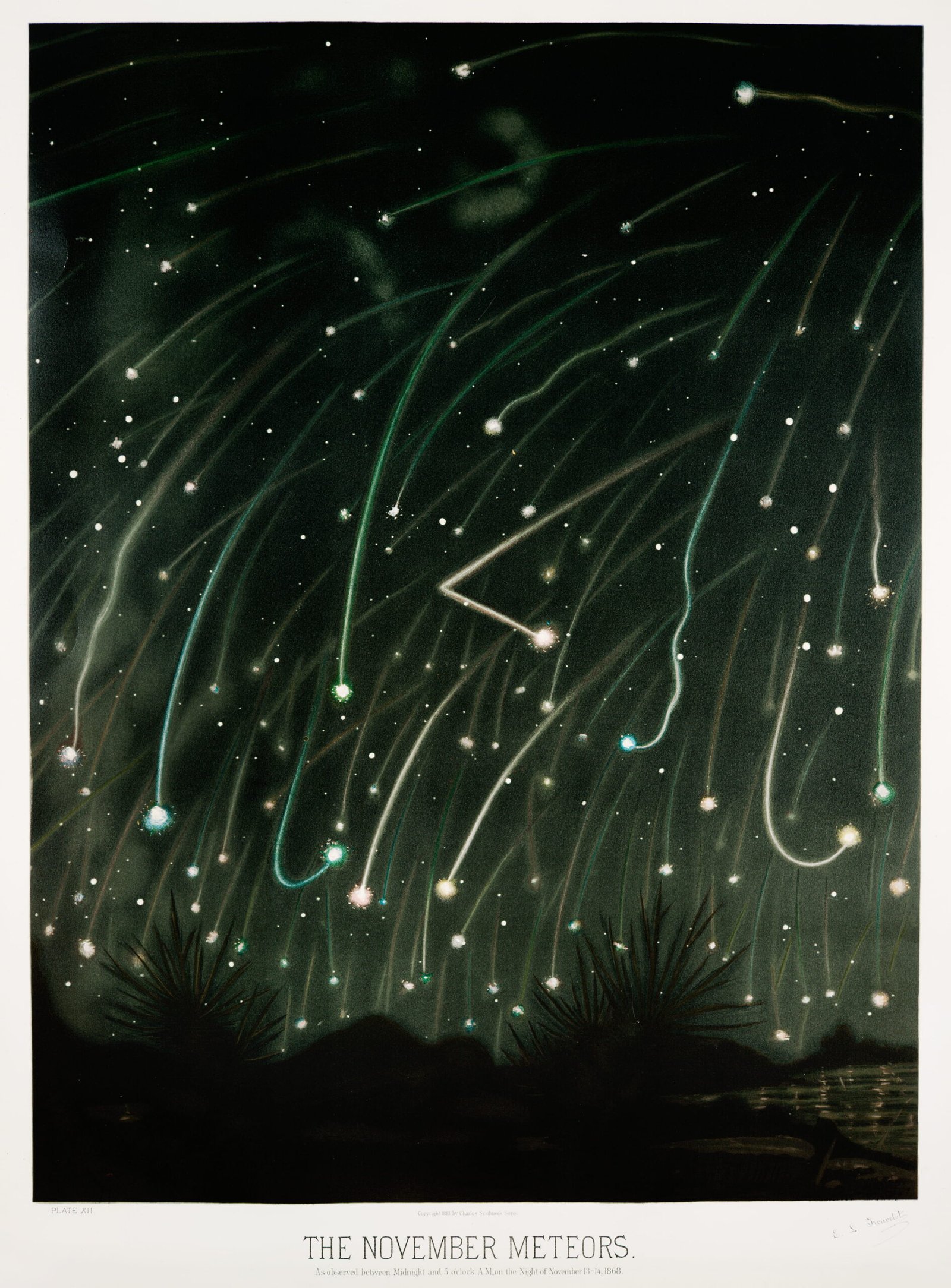
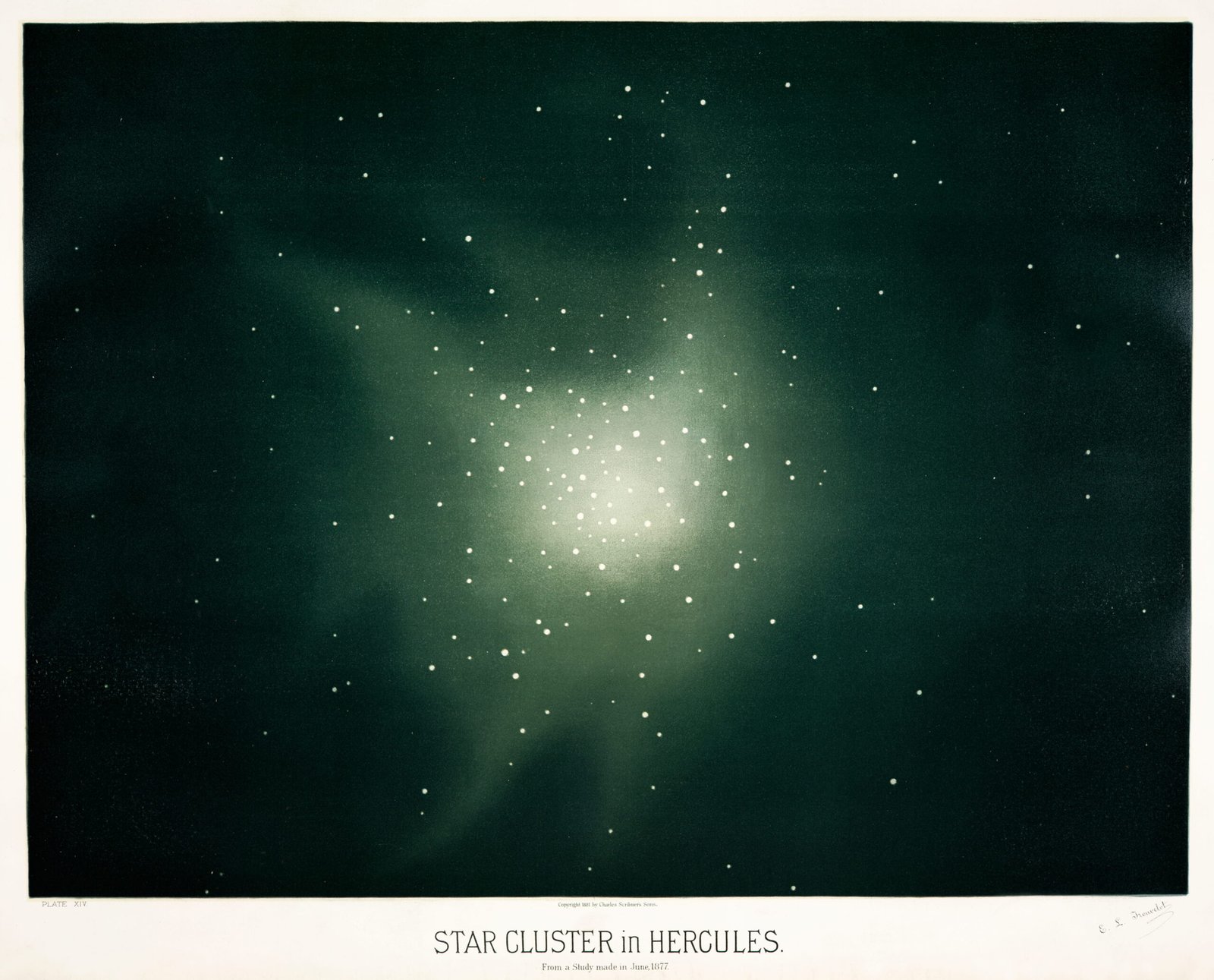
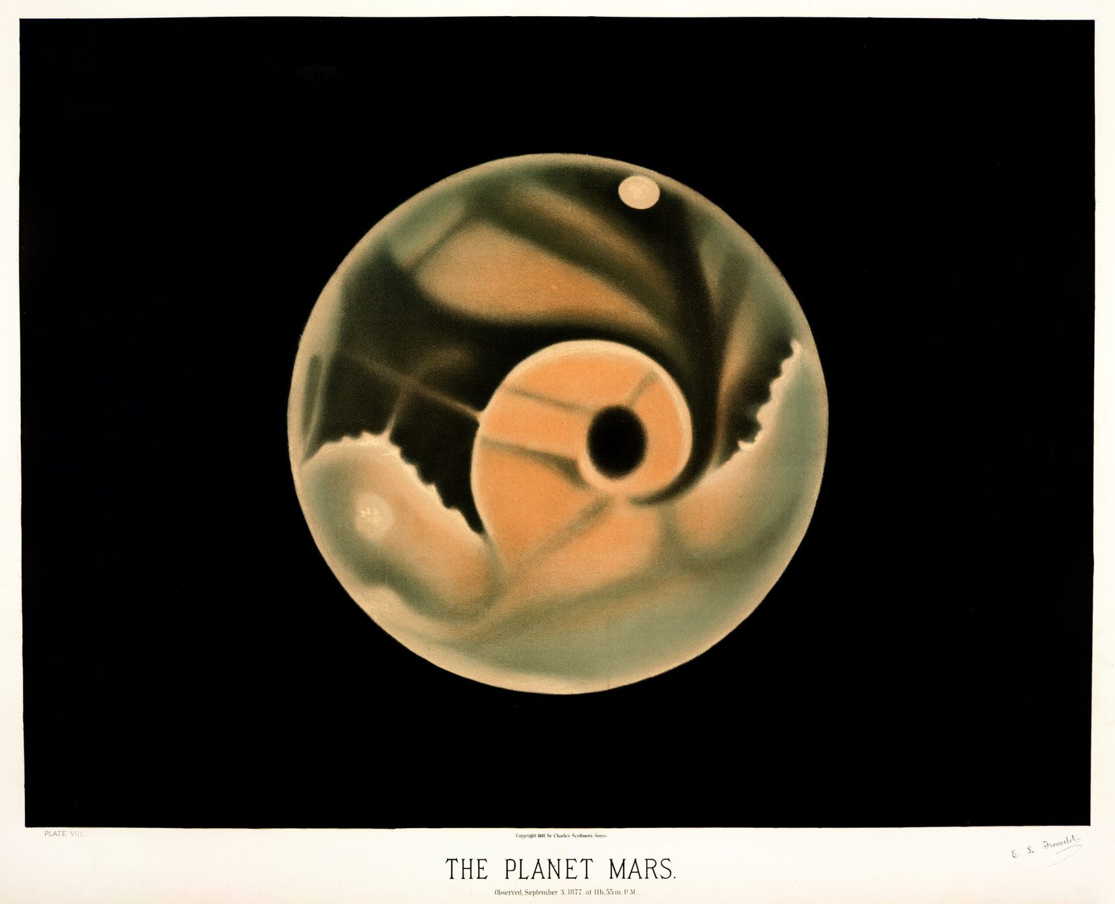
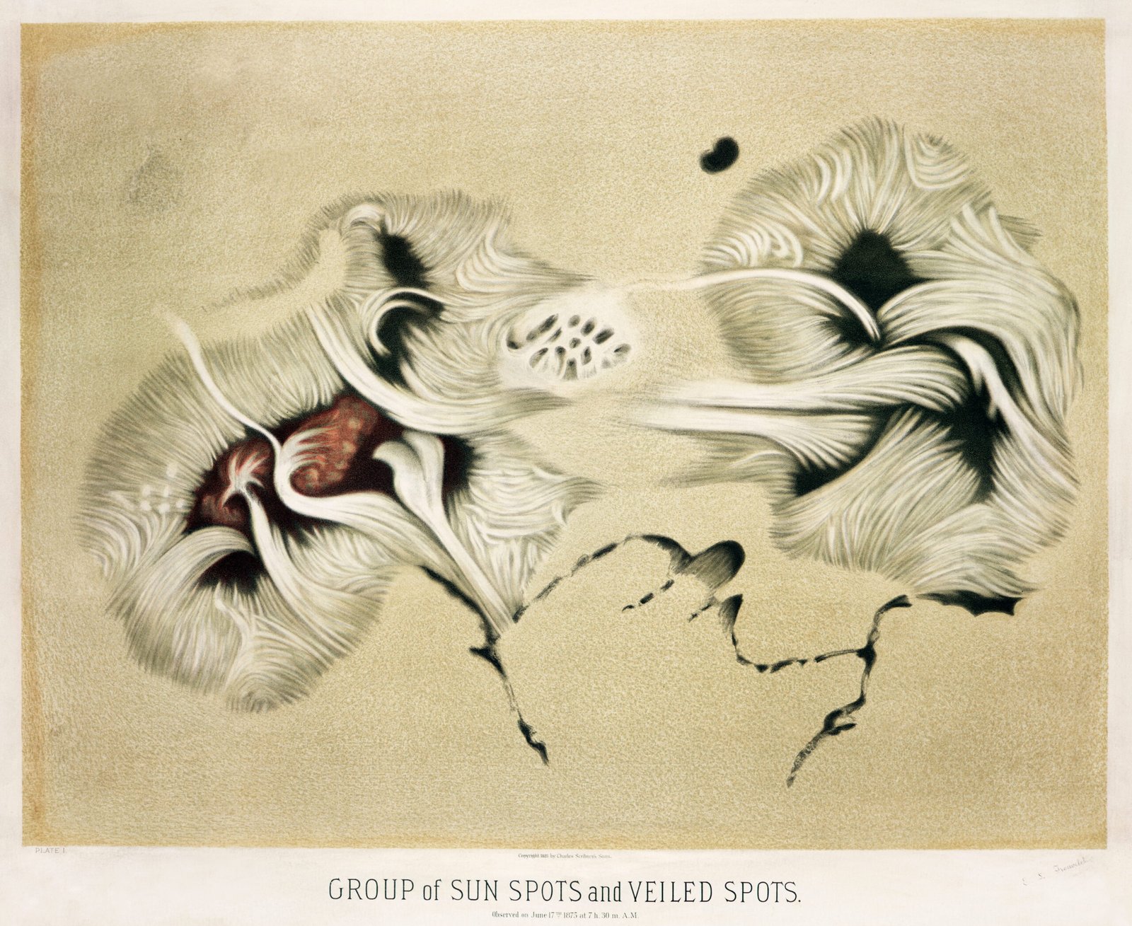
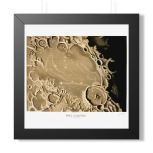
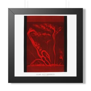
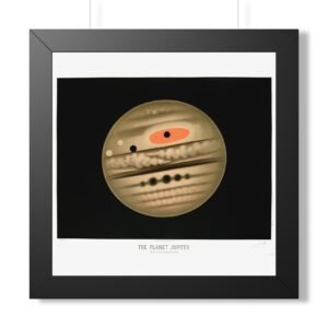
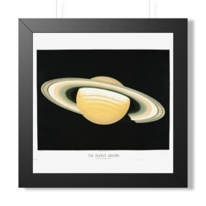
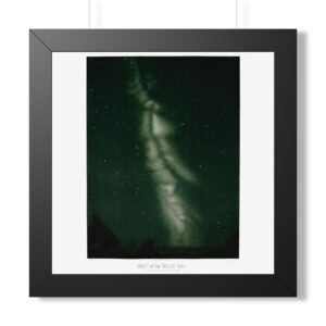
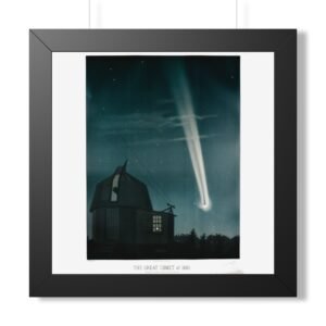
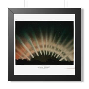
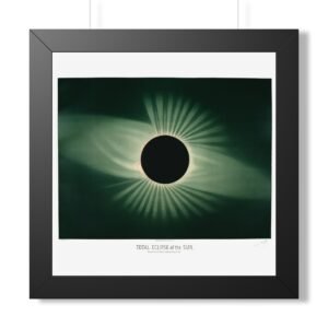
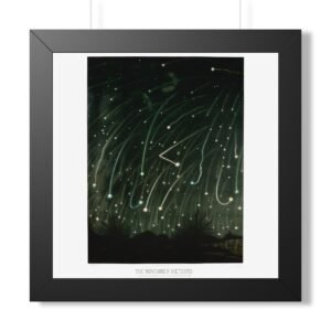
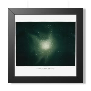
The French artist, astronomer and amateur entomologist Étienne Léopold Trouvelot is noted for two major contributions in his lifetime. The first, and the one we are celebrating in this post, is the 7000 or so illustrations he created from his astronomical observations, the quality of which reached their zenith in the 15 exquisite pastel works which were published as The Trouvelot Astronomical Drawings in 1882 (and reproduced in this post). Trouvelot was invited onto the staff of the Harvard College Observatory when the then director Joseph Winlock saw the quality of his illustrations, and in 1875 he was invited to use the U. S. Naval Observatory's 26-inch refractor for a year. As well as his illustrations, Trouvelot also published some 50 scientific papers, and was credited with discovering "veiled spots" on the Sun in 1875.
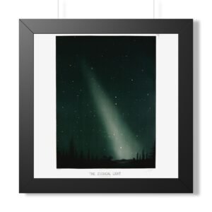
The second and rather more unfortunate legacy Trouvelot left the world was the accidental widespread introduction of the highly destructive European Gyspy moth onto North American soil. With the intention of interbreeding Gypsy moths with silk worms to develop a silkworm industry, he'd brought some egg masses over from Europe in the mid-1860s and began raising gypsy moth larvae in the forest behind his house. It is unclear what exactly happened, but some of the larvae ended up escaping into the nearby woods. Although he reportedly notified some nearby entomologists and relevant officials no action was taken. A few decades later the species was rife.

Explore all artists in this collection