Fine Art Focus: Artist: Emile-Allain Séguy & the Pochoir Method

Fine Art Focus: Artist: Emile-Allain Séguy & the Pochoir Method

The Fine Art Collection · Journal

E.A.
Séguy

& the Pochoir Method

How a Paris designer used hand-cut stencils and layered gouache to turn butterflies and beetles into some of the most dazzling prints of the Art Deco age.

Art DecoPrintmakingParis, 1920s

In the 1920s, as photography and fast rotary presses flooded Paris with cheap color, a small circle of designers went the other way: back to hand-cut stencils and a brush. Some of the most dazzling results were the butterfly and insect plates of Emile-Allain Séguy.

E.A. Séguy (1877–1951) was a French designer of patterns and textiles drawn from the natural world. His work sits at a rare crossroads: the flowing, organic line of Art Nouveau, which peaked around 1900, and the bold, faceted geometry of 1920s Art Deco. Few artists blended the two as convincingly.

Over his career he published eleven portfolios of designs, including butterflies, beetles, flowers, foliage, crystals, and animals. They were meant as source books, giving the makers of textiles and wallpaper a jolt of color and pattern to work from.

Two Séguys, one mix-up

Because E.A. loved insects, he is often confused with another Parisian working at the same time. The Papillons and Insectes portfolios are E.A.'s.

Emile-Allain SéguyDesigner. Made insects beautiful.
Eugène SéguyEntomologist. Classified flies.

01 — The methodWhat is pochoir?

Pochoir is simply French for "stencil." Stenciling was an old decorative trade, used for borders and wall ornament, usually in flat, crude patches of color outlined by the cutout itself.

In early 20th-century Paris, printers refined it into a fine-art process. They laid color over color, often on top of a lithograph, woodcut, wood engraving, or etching. The revival was a direct response to machine printing, whose color reproductions looked flat and muddy. A hand-laid layer of gouache had a depth and glow that no camera or press could match.

The field's handbook arrived in 1925: Jean Saudé's Traité d'enluminure d'art au pochoir, which did much to spread the technique.

02 — Layer by layerHow a print was built

Step 01Analyze

The original watercolor or gouache was broken down into its separate colors. An outline was often printed first as a black-and-white lithograph to guide the layout.

Step 02Cut

A separate stencil was cut for every color. Early ones were copper, zinc, or aluminum, later celluloid and oiled card, and today acetate.

Step 03Dab

Color went on through each stencil with a round brush called a pompon. The pigment had to be nearly dry. Too wet, and it crept under the edge.

Step 04Finish

Skilled colorists added gradation, stippling, and spatter, then touched in final details by hand. One image could need as many as 100 stencils.
100Stencils for a single print
11Séguy design portfolios
1925Saudé's pochoir treatise
0Machines involved

03 — The luxury printFashion's favorite medium

Done entirely by hand, pochoir was slow and expensive, and that suited the luxury press perfectly. From the early 1900s through the Jazz Age it filled the pages of elite fashion journals. Every print was inspected and approved before it left the studio.

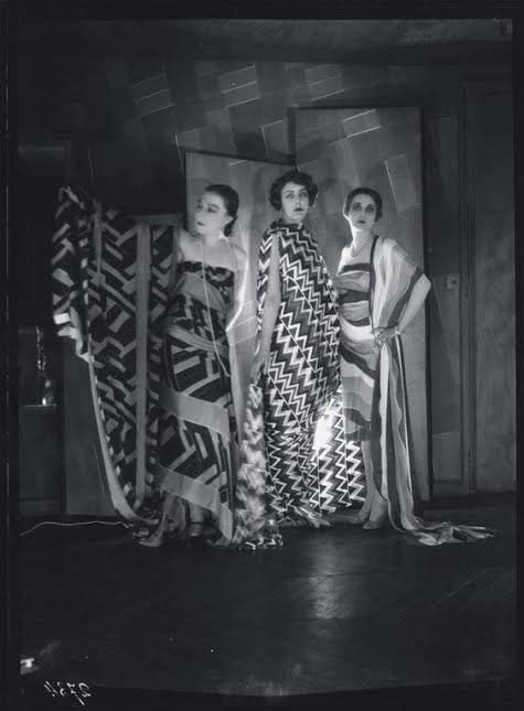
Designers such as George Barbier and Sonia Delaunay issued their costume and textile designs as lustrous pochoir folios. Bespoke furniture makers, wallpaper houses, and architects used it for catalogs aimed at very wealthy clients.

04 — The insectsNature as industrial designer

Séguy's plates take iridescent beetles, moths, and dragonflies and arrange them into dense, jewel-toned patterns. His brightly colored geometric designs were meant to inspire textiles and wallpaper. He wanted to bring to decorative artists the exotic creatures they had overlooked simply because they were rare in life and in illustration.

Butterflies, he knew, would be an easy sell. The other insects needed a defense. In his view they were built like wonderful machines and deserved the same admiration as an airplane fuselage, an ocean liner, or a locomotive.

"Nature was a successful industrial designer!"

— Dover Publications, on Séguy's vision

05 — Beyond the bugsFlowers, fish & pure rhythm

Séguy's eye went well past insects. Portfolios such as Floréal and the bilingual Suggestions for Stuffs and Carpets offered blooms, foliage, koi, and swirling abstractions, all stenciled in pochoir and meant to be lifted straight onto silks, upholstery, and rugs.

06 — LegacyA century later

Dover Publications later reissued the plates as Séguy's Decorative Butterflies and Insects in Full Color, keeping the work in circulation for new generations of designers. That is a big reason his butterflies still turn up on textiles, wallpaper, and prints today, and why his hand-stenciled color still looks startlingly modern.

Collect the color

Explore Séguy alongside the masters of modern design in the cgk.ink Fine Art Collection: art-inspired apparel, decor, and home goods, curated in Los Angeles.

E.A. SéguyPochoirArt DecoArt NouveauPrintmakingModernism 2027
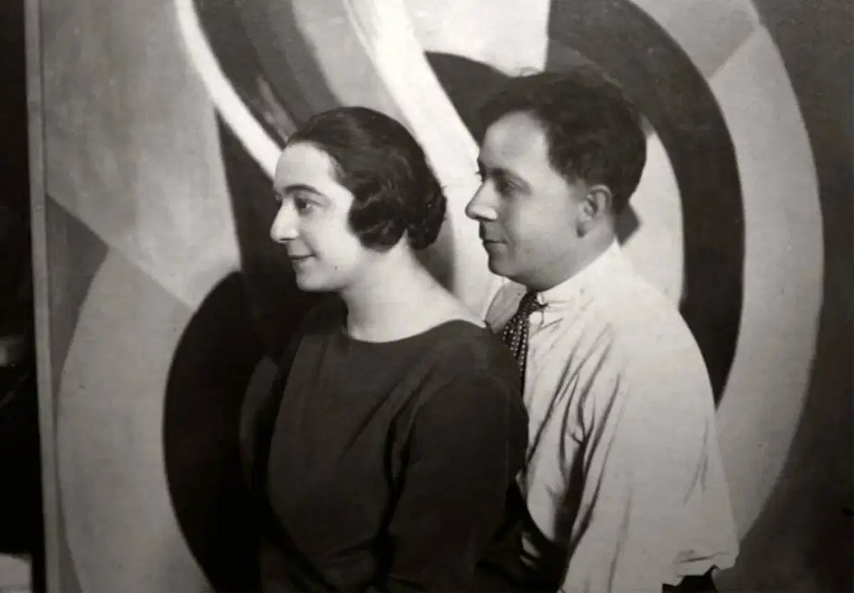
Robert & Sonia Delaunay

Robert & Sonia Delaunay

Robert
Sonia
Delaunay

The Delaunays: Two Artists, One Theory of Color

In 1910, two 25-year-old painters married in Paris. Over the next three decades, Robert and Sonia Delaunay built one of the most original ideas in modern art: that color by itself, without outlines or subject matter, could create light, movement and rhythm.

The poet Guillaume Apollinaire called their approach Orphism, after Orpheus, the mythical musician. The name fit. Their work is meant to be felt the way music is felt.

Both artists are now part of our Fine Art Collection. Here's why their story belongs together, and why their work still looks so modern more than a century later.

A Shared Language: Simultaneous Contrast

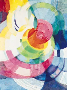
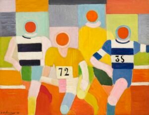
Robert Delaunay, The Runners, ca. 1924–26

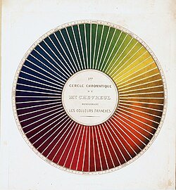
The Delaunays started from a 19th-century discovery by the chemist Michel-Eugène Chevreul. He found that colors change each other when placed side by side. Orange next to blue makes both look brighter and makes the edge between them seem to vibrate. The Delaunays called this simultaneous contrast and made it the base of everything they created.

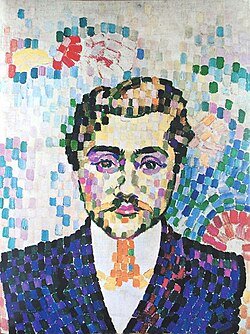
Cubism, the leading movement of their time, broke objects into muted browns and grays. The Delaunays kept Cubism's fractured structure and filled it with pure, saturated color: discs, arcs and interlocking planes that seem to spin and pulse.

Robert Delaunay, The Runners, ca. 1924–26

Robert Delaunay (1885–1941): Painting Modern Life

Robert Delaunay, The Runners, ca. 1924–26

Robert was the theorist of the pair. His paintings take on the energy of the new century: electric light, airplanes, crowds, speed.

Robert Delaunay, The Runners, ca. 1924–26

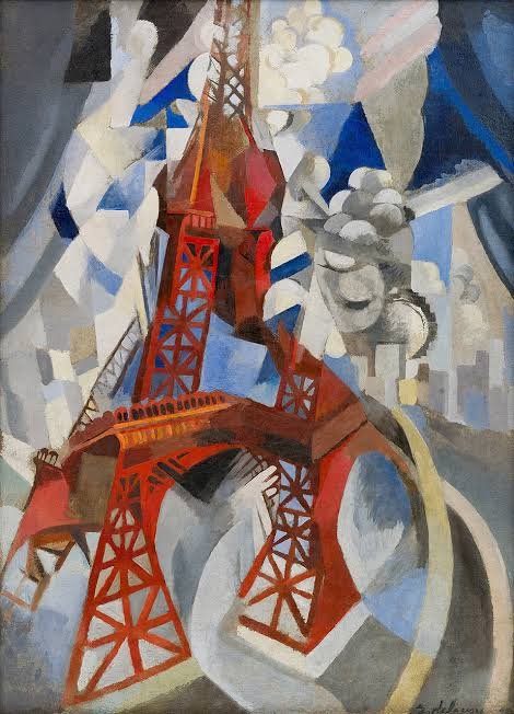
The Eiffel Tower series. He painted the tower more than thirty times between 1909 and 1928, breaking its iron frame into rhythmic, tumbling color. For him it stood for modernity: fractured, luminous and always in motion.


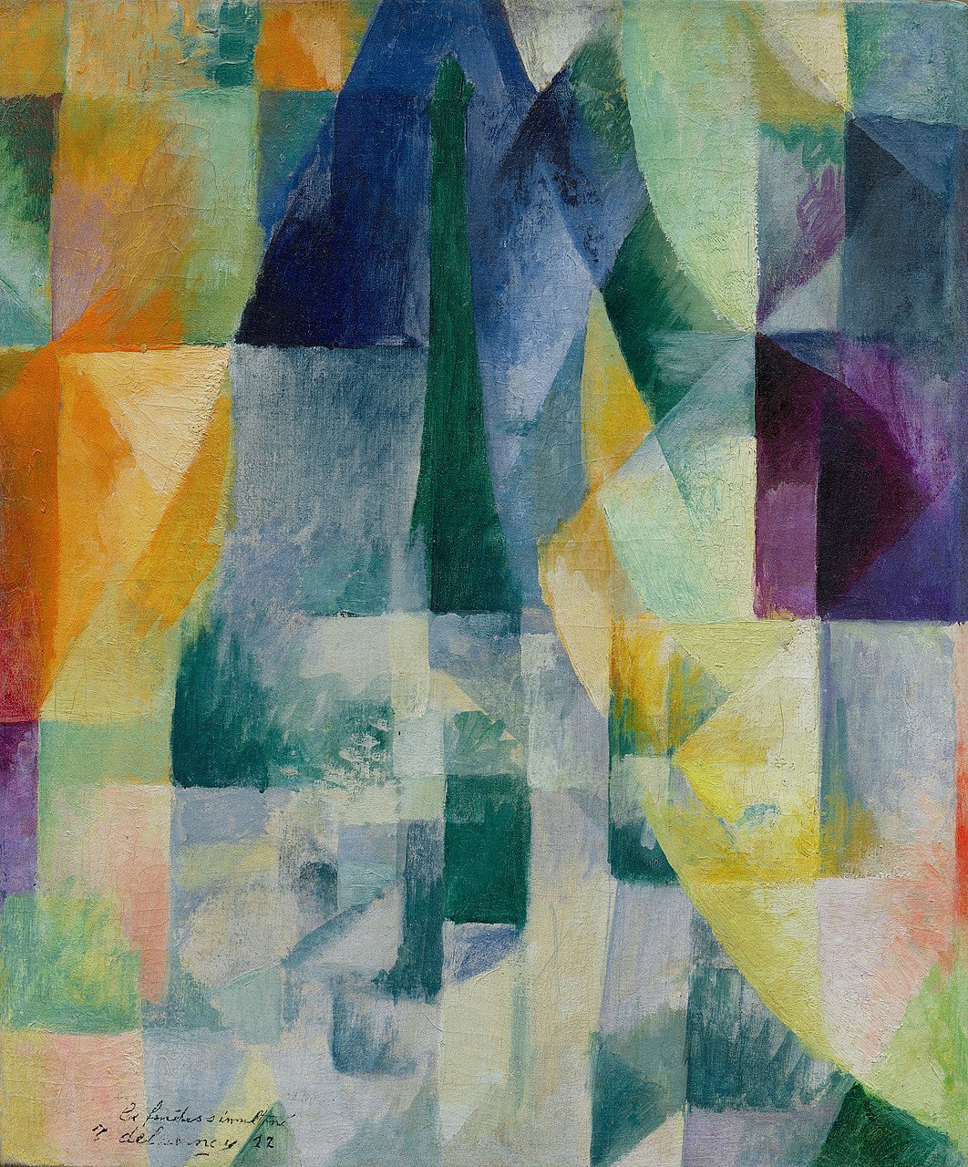
 The Windows series (1912). Views of Paris dissolve into overlapping transparent planes of color. These are some of the first paintings where color itself is the subject.

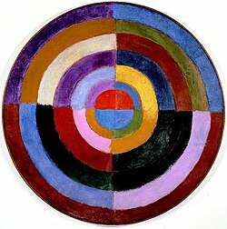
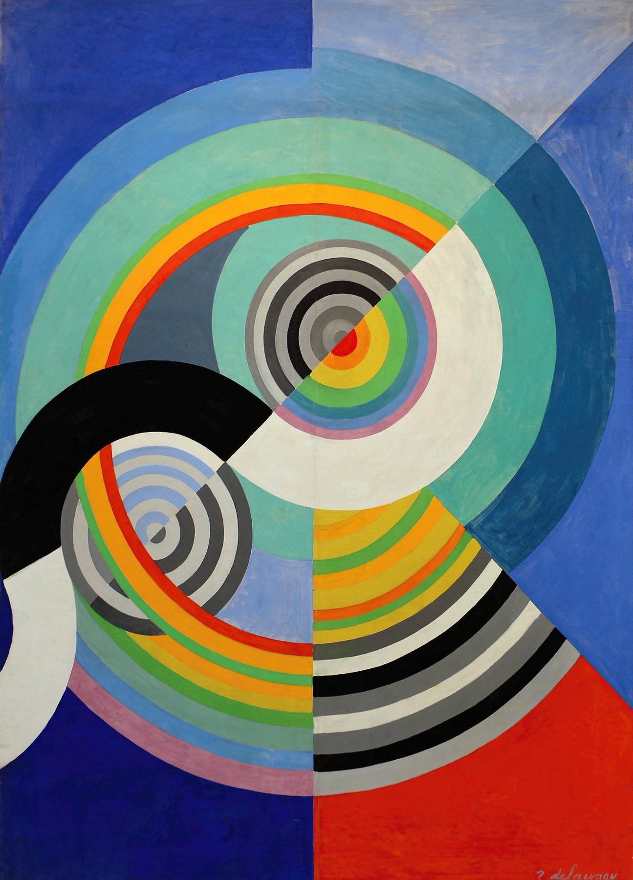
Circular Forms and Rythme. His concentric color discs, often likened to suns, moons and propellers, are among the earliest fully abstract paintings in Western art.

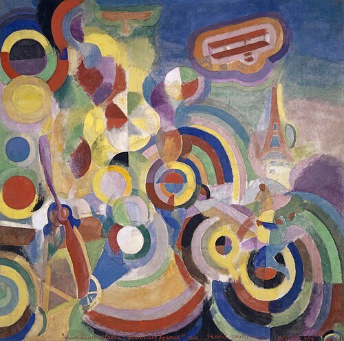
Homage to Blériot (1914). A celebration of flight built from whirling rings of color.

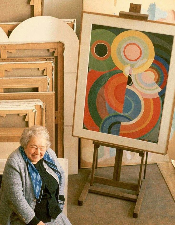
Sonia Delaunay (1885–1979): Taking Color Off the Canvas

Robert Delaunay, The Runners, ca. 1924–26

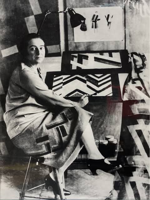
Sonia took the same theory and carried it into everyday life. Where Robert's ideas stayed mostly on the canvas, hers went into fashion, textiles, books, theater and even cars.

Robert Delaunay, The Runners, ca. 1924–26

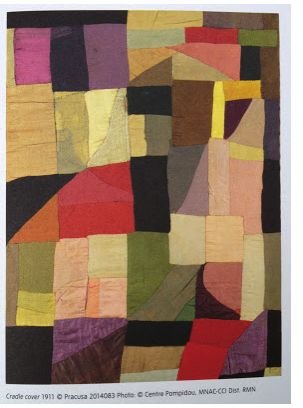
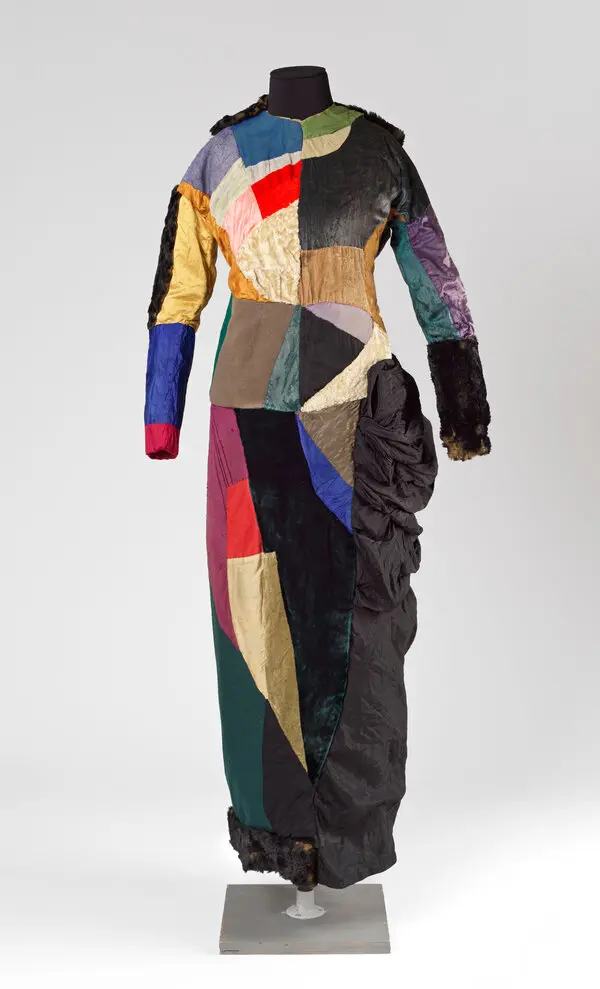
The Quilt (1911). She made a patchwork blanket for their infant son out of fabric scraps, and it became one of her first abstract works. It was art made to be used.

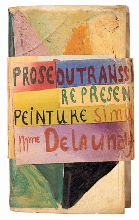
La Prose du Transsibérien (1913). Made with the poet Blaise Cendrars, this two-meter folding book sets poetry beside flowing color. It is one of the landmark artists' books of the century.

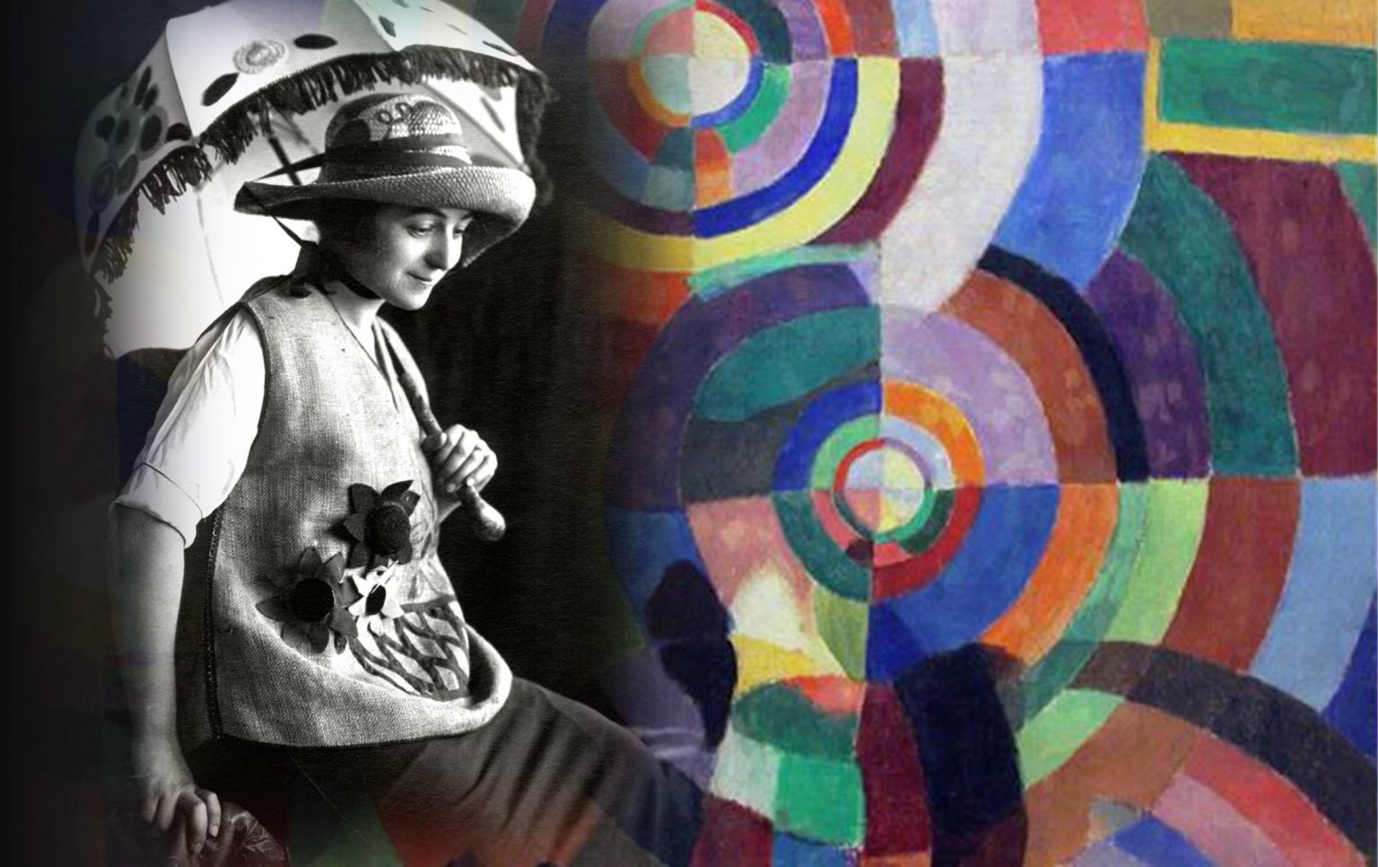
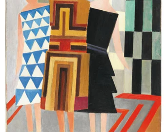
Simultaneous Dresses. She wore her own color-blocked designs to the Bal Bullier dance hall in Paris, turning the dance floor into a moving painting.

Textiles and fashion. Through the 1920s she ran her own design studio and boutique. She created printed fabrics, scarves, coats and costumes, and famously painted a Citroën to match an outfit.

The Louvre (1964). She became the first living woman to receive a retrospective at the Louvre, and she kept working into her nineties.

A Pioneering Couple

Pioneers of pure abstraction in painting

Pioneers of the idea that fine art and design are one

Painting versus living.

Robert thought of the canvas as a place to experiment and wrote long essays on color and light. Sonia rarely stopped to theorize. She tested ideas by making things: a quilt, a dress, a book cover. His work asks you to look. Hers asks you to wear it, hold it, live with it.

Structure versus flow

Robert's compositions are organized around a center: discs, towers and rings that radiate outward. Sonia's designs tend to be modular and rhythmic. Blocks, stripes and repeating bands of color can extend in any direction, which is exactly what fabric needs.

Recognition over time

Robert was treated as the movement's leading figure during his lifetime, and he died in 1941. Sonia's reputation grew over the following decades. Today many historians see her as the more radical of the two, because she refused to separate "high" art from design. That idea shapes how we think about fashion and product design today.

Why the Delaunays Belong at cgk.ink

At cgk.ink, we curate art-inspired pieces for everyday life. Sonia Delaunay was doing exactly that a hundred years ago. Robert's color discs and Sonia's rhythmic patterns translate naturally into apparel, blankets and home goods, because they were built on the belief that color should surround us.

Explore both artists in our Fine Art Collection, and see how two artists, one marriage and one theory of color changed the look of the modern world.

Fine Art Focus: Émile Prisse d’Avennes

Fine Art Focus: Émile Prisse d’Avennes

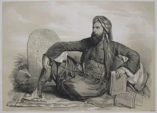
Prisse d'Avennes was born in Avesnes-sur-Helpe, France, on 27 January 1807, to a noble family of French origin. After the early death of his father in 1814, on the guidance of his grandfather he enrolled at college a year later to train for a career within the legal profession.

Prisse d'Avennes decided to become an archaeologist in 1836 after a period teaching at the infantry school in Damietta.

In 1827 when he reached Egypt, he was hired by the viceroy of Egypt, Muhammad Ali Pasha, as a civil engineer. He spent many years living as an Egyptian, adopting the name Idriss-effendi, learning to speak Arabic and practicing Islam. He stated that adopting Egyptian culture resulted in a greater understanding of Egyptian society and people.

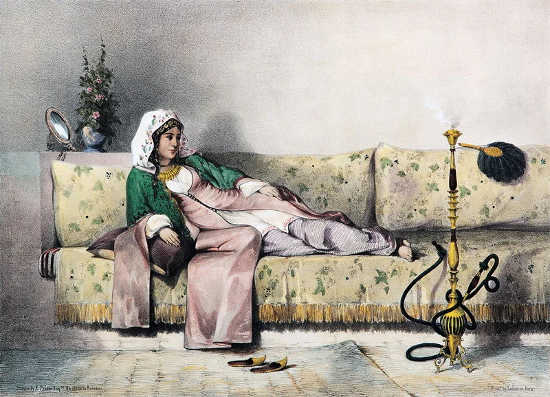
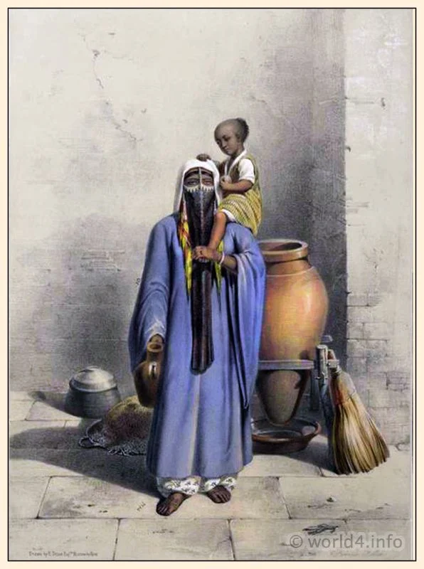
In 1848, he contributed 30 lithograph images depicting the people living on the Nile Valley to a costume book titled Oriental Album written by James Augustus St. John who was a British author and traveler.
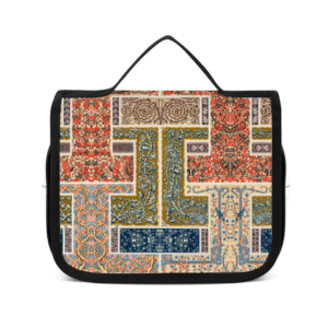
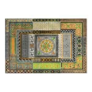
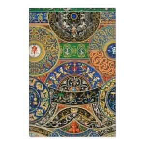
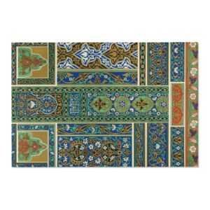
The Grammar of Ornament

The Grammar of Ornament

From the universal testimony of travelers it would appear, that there is scarcely a people, in however early stage of civilisation, with whom the desire to ornament is not a strong instinct. Man's earliest ambition is to create . . . to stamp on this earth the impress of an individual mind.

—Owen Jones, The Grammar of Ornament

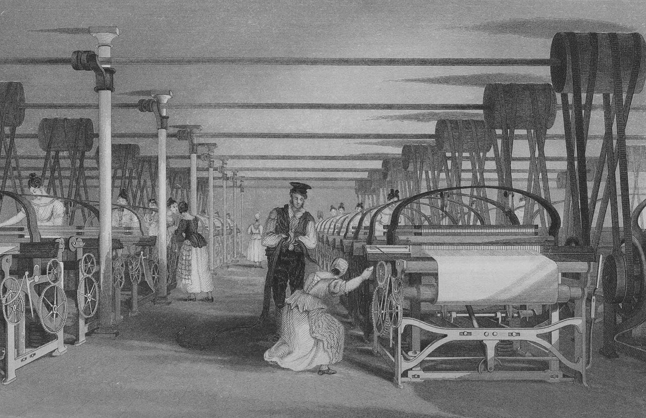
While we may often note that current society is changing at a breakneck speed, we do have to take note that this has happened before. Arguably, the 19th Century beats us at our own game on the fundamental-change level.

The 19th century was an era of rapidly accelerating scientific discovery and invention, with significant developments in the fields of mathematics, physics, chemistry, biology, electricity, and metallurgy that laid the groundwork for the technological advances of the 20th century. The Industrial Revolution began in Great Britain and spread to continental Europe, North America, and Japan. The Victorian era was notorious for the employment of young children in factories and mines, as well as strict social norms regarding modesty and gender roles.

The 19th century was characterized by vast social upheaval. Slavery was abolished in much of Europe and the Americas. The First Industrial Revolution, though it began in the late 18th century, expanding beyond its British homeland for the first time during this century, particularly remaking the economies and societies of the Low Countries, the Rhineland, Northern Italy, and the Northeastern United States. A few decades later, the Second Industrial Revolution led to ever more massive urbanization and much higher levels of productivity, profit, and prosperity, a pattern that continued into the 20th century.

The first electronics appeared in the 19th century, with the introduction of the electric relay in 1835, the telegraph and its Morse code protocol in 1837, the first telephone call in 1876,[2] and the first functional light bulb in 1878.[3] Society rapidly urbanized, bringing populations increasingly together into smaller spaces. The first notes of globalization brought influences from around the world to the same table, with varying results. From a Western perspective, the new cultures were ripe to be harvested. The Eastern-perspective, it presented new threats and cultural influence without precedent. The world, in fact, was becoming smaller.

The increasingly urbanization of Europe and the United States brought about new challenges to traditional aesthetics and behaviors. How does one distinguish oneself from a sea of common faces? What importance does a dwelling have and how does it become a home? An ever-evolving social hierarchy demanded that new styles, techniques and designs be invented -- and quickly.

the Emergence of Decorative Arts

dec·o·ra·tive arts

/ˌdek(ə)rədiv ˈärts,ˌdekəˌrādiv ˈärts/

noun

plural noun: decorative arts; noun: decorative art

the arts concerned with the production of high-quality objects that are both useful and beautiful.

Ceramics, glassware, basketry, jewelry, metalware, furniture, textiles, clothing, and other such goods are the objects most commonly associated with the decorative arts. Many decorative arts, such as basketry or pottery, are also commonly considered to be craft, but the definitions of both terms are arbitrary.

The term "decorative arts" is not meant to be derogative. It was popular in the 70s to dismiss this as a "lesser" art and thankfully, we've decided collectively to rather group all functional art under the term "design." The artists we discuss in our Fine Arts Collection are very much masters of fine art as well as exquisite craftspeople. I argue that decorative arts are actually more democratic and open to including fine art in our everyday life.

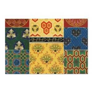
And then there's "retro." We constantly revisit previous eras to gain inspiration for our own, modern times. Likewise, The Victorian era is known for its interpretation and eclectic revival of historic styles mixed with the introduction of Asian and Middle Eastern influences in furniture, fittings, and interior decoration. The Arts and Crafts movement, the aesthetic movement, Anglo-Japanese style, and Art Nouveau style have their beginnings in the late Victorian era and gothic period.

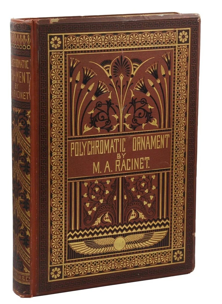
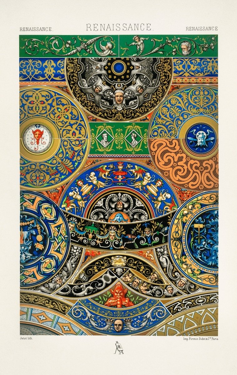
I'm specifically interested in a handful of artists who made a thoughtful, meaningful jump to bring arts to bear weight on everyday existence. We've talked about Racinet. And Morris. There are several dozen others including, Tiffany, Lalique, Tamara de Lempicka, Erté (a great article re: "the top 10" is here, click on it!) are among the most notable.

Owen Jones

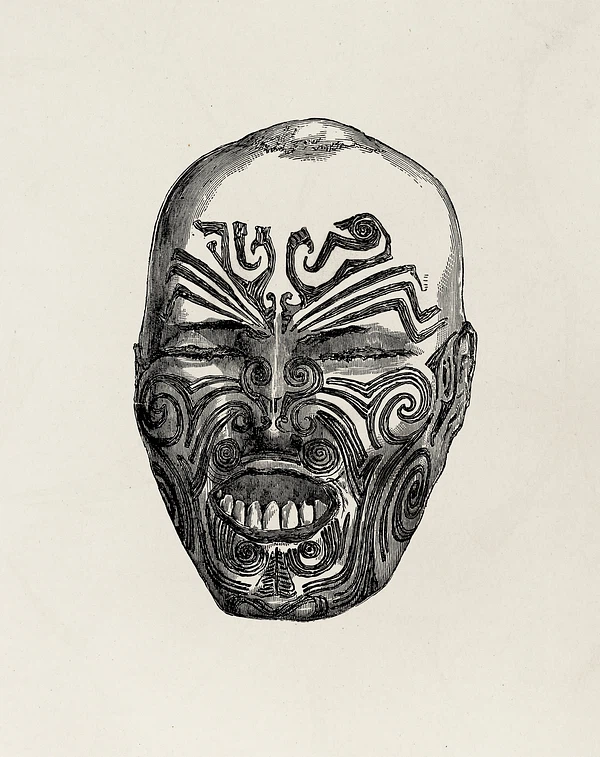
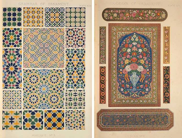
In the opening chapter to his seminal work The Grammar of Ornament, Owen Jones stresses the fact that one of the universal qualities among humankind is the desire to make beautiful things. To illustrate this point, he uses the somewhat macabre example of a severed preserved head of a Maori warrior (mokomokai), then thought to be a woman, which was covered in an elegant pattern of facial tattoos. He admired it particularly for the harmonious way in which the responsible artist had married the tattooed lines with the natural shapes of the human face. Rather than concluding that ornament belongs purely to the primitive, as others would argue later, Jones realized through his confrontation with this ethnological specimen that the Maori possessed an innate understanding of beauty that was alien to modern Western society.

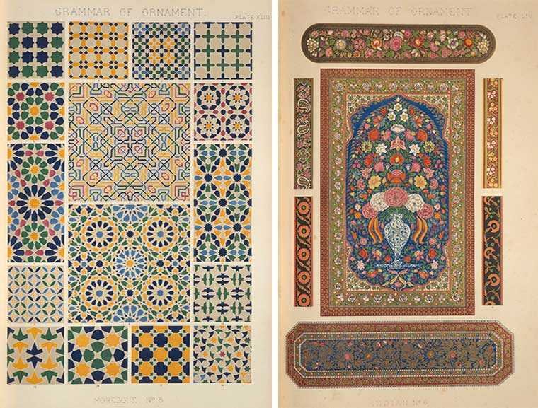
While Jones's ideas slowly took root in art education over the following decades, which in turn influenced the development of new artistic movements such as Arts & Crafts and Art Nouveau, The Grammar of Ornament did not bring about a direct change in artistic practice. In fact, as Jones himself anticipated, we often find patterns and motifs from the book copied and applied to objects and interiors dating from the third quarter of the nineteenth century.

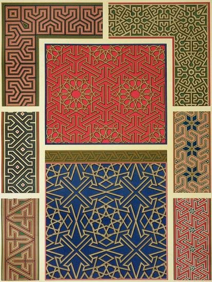
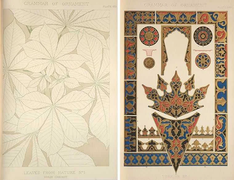
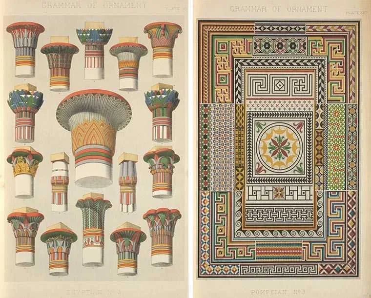
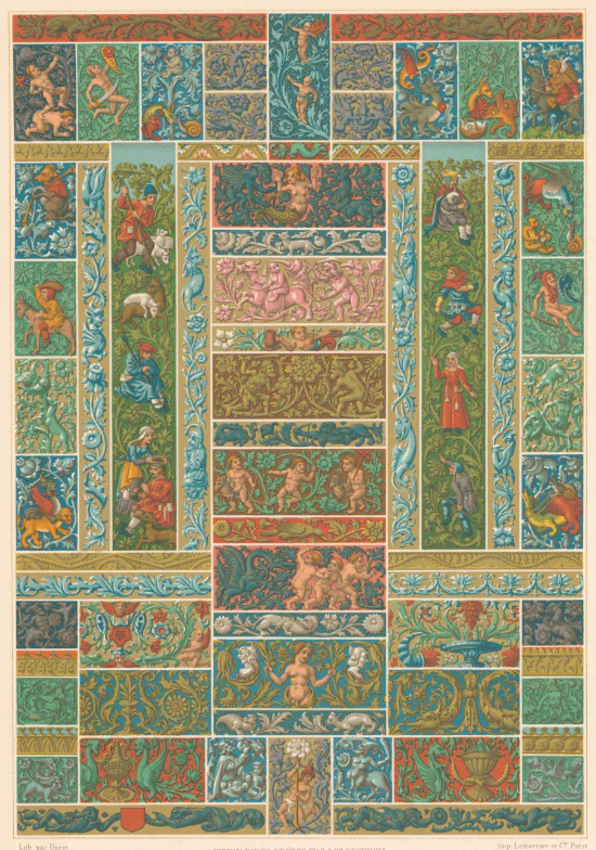
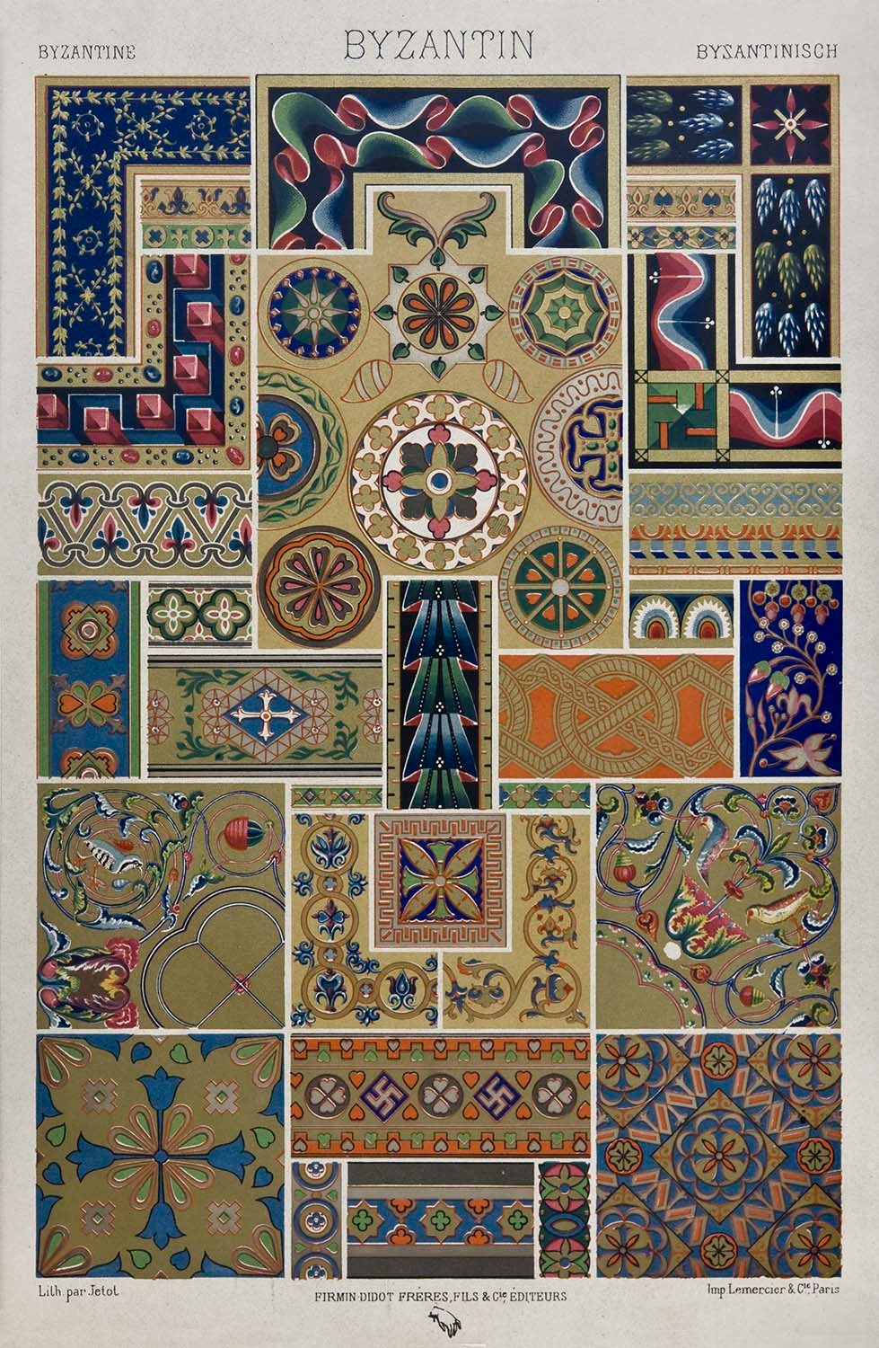
The Grammar was celebrated first and foremost for its outstanding folio-sized color lithographs, which represented the latest and most sophisticated innovations in the field of printmaking. Color lithography had been in use for several decades, but because each color was printed from a separate lithographic stone, most commercial publications were printed in a limited palette of three or four colors. Since color played a crucial role in Jones's work, he took charge of the production himself and employed assistants to work out the patterns on lithographic stones, with certain plates requiring as many as twenty distinct stones. The high quality of Jones's color plates quickly turned the luxurious first edition of the book into a collector's item. Their appeal greatly outlasted Jones’s intellectual arguments, which were omitted altogether in the various posthumous editions, and facsimile reproductions published in the later nineteenth and twentieth century.

As a writer, I have to include at least one reference to literature when discussing art, fine or otherwise.

While he is now seen as the epitome of wit and sophistication, Oscar Wilde was prosecuted and was killed under the same Victorian culture that produced the mentioned artwork.

It is important to note that his trial (3 April 1895) indeed changed the very vocabulary he wrote in: English. Before his trial, there were homosexual acts, however one could not be homosexual. It was not a noun. It was unthinkable to call someone a "homosexual." Certainly a "sodomite" but that's a different word altogether. Your identity was not in question, your acts were. That changed from an adjective to a noun due to his trial.

In 2017, Wilde was among an estimated 50,000 men who were pardoned for homosexual acts that were no longer considered offences under the Policing and Crime Act 2017 (homosexuality was decriminalised in England and Wales in 1967). The 2017 Act implements what is known informally as the Alan Turing law.

Oscar Wilde's Particular Aesthetic

Chief among the literary practitioners of decorative aestheticism was Oscar Wilde, who advocated Victorian decorative individualism in speech, fiction, and essay-form. Wilde’s notion of cultural enlightenment through visual cues echoes that of Alexander von Humboldt who maintained that imagination was not the Romantic figment of scarcity and mystery but rather something anyone could begin to develop with other methods, including organic elements in pteridomania.

By changing one’s immediate dwelling quarters, one changed one’s mind as well;  Wilde believed that the way forward in cosmopolitanism began with as a means eclipse the societally mundane, and that such guidance would be found not in books or classrooms, but through a lived Platonic epistemology. An aesthetic shift in the home’s Victorian decorative arts reached its highest outcome in the literal transformation of the individual into cosmopolitan, as Wilde was regarded and noted among others in his tour of America.

For Wilde, however, the inner meaning of Victorian decorative arts is fourfold: one must first reconstruct one’s inside so as to grasp what is outside in terms of both living quarters and mind, whilst hearkening back to von Humboldt on the way to Plato so as to be immersed in contemporaneous cosmopolitanism, thereby in the ideal state becoming oneself admirably aesthetical.