
Fine Art Focus: Artist: Emile-Allain Séguy & the Pochoir Method

Fine Art Focus: Artist: Emile-Allain Séguy & the Pochoir Method

The Fine Art Collection · Journal

E.A.
Séguy

& the Pochoir Method

How a Paris designer used hand-cut stencils and layered gouache to turn butterflies and beetles into some of the most dazzling prints of the Art Deco age.

Art DecoPrintmakingParis, 1920s

In the 1920s, as photography and fast rotary presses flooded Paris with cheap color, a small circle of designers went the other way: back to hand-cut stencils and a brush. Some of the most dazzling results were the butterfly and insect plates of Emile-Allain Séguy.

E.A. Séguy (1877–1951) was a French designer of patterns and textiles drawn from the natural world. His work sits at a rare crossroads: the flowing, organic line of Art Nouveau, which peaked around 1900, and the bold, faceted geometry of 1920s Art Deco. Few artists blended the two as convincingly.

Over his career he published eleven portfolios of designs, including butterflies, beetles, flowers, foliage, crystals, and animals. They were meant as source books, giving the makers of textiles and wallpaper a jolt of color and pattern to work from.

Two Séguys, one mix-up

Because E.A. loved insects, he is often confused with another Parisian working at the same time. The Papillons and Insectes portfolios are E.A.'s.

Emile-Allain SéguyDesigner. Made insects beautiful.
Eugène SéguyEntomologist. Classified flies.

01 — The methodWhat is pochoir?

Pochoir is simply French for "stencil." Stenciling was an old decorative trade, used for borders and wall ornament, usually in flat, crude patches of color outlined by the cutout itself.

In early 20th-century Paris, printers refined it into a fine-art process. They laid color over color, often on top of a lithograph, woodcut, wood engraving, or etching. The revival was a direct response to machine printing, whose color reproductions looked flat and muddy. A hand-laid layer of gouache had a depth and glow that no camera or press could match.

The field's handbook arrived in 1925: Jean Saudé's Traité d'enluminure d'art au pochoir, which did much to spread the technique.

02 — Layer by layerHow a print was built

Step 01Analyze

The original watercolor or gouache was broken down into its separate colors. An outline was often printed first as a black-and-white lithograph to guide the layout.

Step 02Cut

A separate stencil was cut for every color. Early ones were copper, zinc, or aluminum, later celluloid and oiled card, and today acetate.

Step 03Dab

Color went on through each stencil with a round brush called a pompon. The pigment had to be nearly dry. Too wet, and it crept under the edge.

Step 04Finish

Skilled colorists added gradation, stippling, and spatter, then touched in final details by hand. One image could need as many as 100 stencils.

100Stencils for a single print
11Séguy design portfolios
1925Saudé's pochoir treatise
0Machines involved

03 — The luxury printFashion's favorite medium

Done entirely by hand, pochoir was slow and expensive, and that suited the luxury press perfectly. From the early 1900s through the Jazz Age it filled the pages of elite fashion journals. Every print was inspected and approved before it left the studio.

Designers such as George Barbier and Sonia Delaunay issued their costume and textile designs as lustrous pochoir folios. Bespoke furniture makers, wallpaper houses, and architects used it for catalogs aimed at very wealthy clients.

04 — The insectsNature as industrial designer

Séguy's plates take iridescent beetles, moths, and dragonflies and arrange them into dense, jewel-toned patterns. His brightly colored geometric designs were meant to inspire textiles and wallpaper. He wanted to bring to decorative artists the exotic creatures they had overlooked simply because they were rare in life and in illustration.
Butterflies, he knew, would be an easy sell. The other insects needed a defense. In his view they were built like wonderful machines and deserved the same admiration as an airplane fuselage, an ocean liner, or a locomotive.

"Nature was a successful industrial designer!"

— Dover Publications, on Séguy's vision

05 — Beyond the bugsFlowers, fish & pure rhythm

Séguy's eye went well past insects. Portfolios such as Floréal and the bilingual Suggestions for Stuffs and Carpets offered blooms, foliage, koi, and swirling abstractions, all stenciled in pochoir and meant to be lifted straight onto silks, upholstery, and rugs.

06 — LegacyA century later

Dover Publications later reissued the plates as Séguy's Decorative Butterflies and Insects in Full Color, keeping the work in circulation for new generations of designers. That is a big reason his butterflies still turn up on textiles, wallpaper, and prints today, and why his hand-stenciled color still looks startlingly modern.

Collect the color

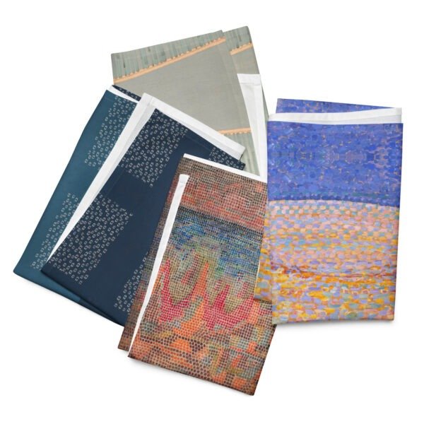
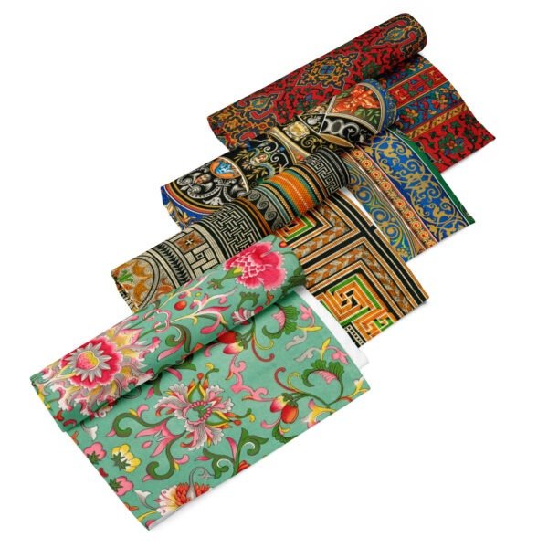
Explore Séguy alongside the masters of modern design in the cgk.ink Fine Art Collection: art-inspired apparel, decor, and home goods, curated in Los Angeles.

E.A. SéguyPochoirArt DecoArt NouveauPrintmakingModernism 2027
Bauhaus at Home: Six Rules from 1919 for a Room in 2027

Bauhaus at Home: Six Rules from 1919 for a Room in 2027

JournalModernism 2027

Bauhaus
at HomeSix rules from 1919
for a room in 2027

Weimar 1919Dessau 1925Berlin 1932
Staatliches BauhausWeimar · Dessau · Berlin
1919–1933

In 1919, the architect Walter Gropius opened a small art school in Weimar, Germany, with an unusual idea: that painters, weavers, metalworkers and architects should learn side by side, and that good design belonged in everyday life, not just in museums. The school was called the Bauhaus. It moved to Dessau in 1925, then to Berlin, and was forced to close in 1933. It lasted fourteen years.

A century later, you are almost certainly sitting near something it influenced: a tubular steel chair, a sans-serif typeface, a clean white kitchen, a rug in blocks of red, yellow and blue. As we head into 2027, our year of Modernism at cgk.ink, we wanted to go back to the source and ask a practical question. What would the Bauhaus tell you about the room you live in right now?

Here are six rules
worth borrowing.

01

Start with what the room is for

"Form follows function" was coined by the American architect Louis Sullivan, but the Bauhaus made it a working method. Before choosing a color or a lamp, ask what actually happens in the room. Do you read here? Host? Work from a laptop on the sofa? Design for the real use, not the photo. A reading corner needs good light and a soft throw within arm's reach far more than it needs a statement sculpture.

02

Use primary color as punctuation, not wallpaper

The Bauhaus loved red, yellow and blue, and Wassily Kandinsky even surveyed students in 1923 to pair them with shapes: a yellow triangle, a red square, a blue circle. But look closely at Bauhaus interiors and you'll notice the color is concentrated. Walls stay neutral; the color arrives in one chair, one cushion, one blanket folded over the end of a bed. Pick one bold piece per room and let it do the work.

03

Choose geometry over ornament

Circles, squares, stripes, grids. Bauhaus designers stripped away decoration that didn't serve a purpose and found beauty in pure shape instead. At home, that might mean choosing a round mirror over a gilded one, or a graphic print over a busy floral. Geometry calms a room, because the eye understands it instantly.

04

Let materials be honest

Marcel Breuer famously took inspiration from bicycle handlebars when he bent steel tubing into furniture, and he didn't disguise it as wood. The Bauhaus believed a material should look like what it is. Let wood grain show. Let linen wrinkle. Let metal be metal. Rooms built on honest materials age gracefully instead of looking dated.

05

Take textiles seriously

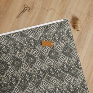
The weaving workshop was one of the Bauhaus's most successful, led by Gunta Stölzl and home to artists like Anni Albers, who went on to become one of the twentieth century's great textile designers. They treated fabric as architecture: something that shapes how a room feels, absorbs sound, and holds color. A well-chosen throw, rug or set of cushions can change a space more than new furniture, and for a fraction of the cost.
06

Let every object earn its place

"Less is more" is usually credited to Ludwig Mies van der Rohe, the Bauhaus's last director. It isn't a rule against owning things. It's a rule about choosing them. Before something comes into your home, ask whether it's useful, beautiful, or both. If it's neither, leave it on the shelf. Fewer, better objects is also a more sustainable way to live, which is something we think about every time we add a piece to our shop.

The Bauhaus,
a century on

The school was only open for fourteen years, but its teachers and students scattered across the world and took these ideas with them. That's why they feel so familiar. They aren't a style so much as a way of thinking: clear, functional, colorful where it counts, and honest about what things are.

Throughout 2027, we'll be exploring Modernism in all its forms, from the Bauhaus to the Delaunays and beyond.

Robert & Sonia Delaunay

Robert & Sonia Delaunay

Robert
Sonia
Delaunay

The Delaunays: Two Artists, One Theory of Color

In 1910, two 25-year-old painters married in Paris. Over the next three decades, Robert and Sonia Delaunay built one of the most original ideas in modern art: that color by itself, without outlines or subject matter, could create light, movement and rhythm.

The poet Guillaume Apollinaire called their approach Orphism, after Orpheus, the mythical musician. The name fit. Their work is meant to be felt the way music is felt.

Both artists are now part of our Fine Art Collection. Here's why their story belongs together, and why their work still looks so modern more than a century later.

A Shared Language: Simultaneous Contrast

Robert Delaunay, The Runners, ca. 1924–26

The Delaunays started from a 19th-century discovery by the chemist Michel-Eugène Chevreul. He found that colors change each other when placed side by side. Orange next to blue makes both look brighter and makes the edge between them seem to vibrate. The Delaunays called this simultaneous contrast and made it the base of everything they created.

Cubism, the leading movement of their time, broke objects into muted browns and grays. The Delaunays kept Cubism's fractured structure and filled it with pure, saturated color: discs, arcs and interlocking planes that seem to spin and pulse.

Robert Delaunay, The Runners, ca. 1924–26

Robert Delaunay (1885–1941): Painting Modern Life

Robert Delaunay, The Runners, ca. 1924–26

Robert was the theorist of the pair. His paintings take on the energy of the new century: electric light, airplanes, crowds, speed.

Robert Delaunay, The Runners, ca. 1924–26

The Eiffel Tower series. He painted the tower more than thirty times between 1909 and 1928, breaking its iron frame into rhythmic, tumbling color. For him it stood for modernity: fractured, luminous and always in motion.


 The Windows series (1912). Views of Paris dissolve into overlapping transparent planes of color. These are some of the first paintings where color itself is the subject.

Circular Forms and Rythme. His concentric color discs, often likened to suns, moons and propellers, are among the earliest fully abstract paintings in Western art.

Homage to Blériot (1914). A celebration of flight built from whirling rings of color.

Sonia Delaunay (1885–1979): Taking Color Off the Canvas

Robert Delaunay, The Runners, ca. 1924–26

Sonia took the same theory and carried it into everyday life. Where Robert's ideas stayed mostly on the canvas, hers went into fashion, textiles, books, theater and even cars.

Robert Delaunay, The Runners, ca. 1924–26

The Quilt (1911). She made a patchwork blanket for their infant son out of fabric scraps, and it became one of her first abstract works. It was art made to be used.

La Prose du Transsibérien (1913). Made with the poet Blaise Cendrars, this two-meter folding book sets poetry beside flowing color. It is one of the landmark artists' books of the century.

Simultaneous Dresses. She wore her own color-blocked designs to the Bal Bullier dance hall in Paris, turning the dance floor into a moving painting.

Textiles and fashion. Through the 1920s she ran her own design studio and boutique. She created printed fabrics, scarves, coats and costumes, and famously painted a Citroën to match an outfit.

The Louvre (1964). She became the first living woman to receive a retrospective at the Louvre, and she kept working into her nineties.

A Pioneering Couple

Pioneers of pure abstraction in painting

Pioneers of the idea that fine art and design are one

Painting versus living.

Robert thought of the canvas as a place to experiment and wrote long essays on color and light. Sonia rarely stopped to theorize. She tested ideas by making things: a quilt, a dress, a book cover. His work asks you to look. Hers asks you to wear it, hold it, live with it.

Structure versus flow

Robert's compositions are organized around a center: discs, towers and rings that radiate outward. Sonia's designs tend to be modular and rhythmic. Blocks, stripes and repeating bands of color can extend in any direction, which is exactly what fabric needs.

Recognition over time

Robert was treated as the movement's leading figure during his lifetime, and he died in 1941. Sonia's reputation grew over the following decades. Today many historians see her as the more radical of the two, because she refused to separate "high" art from design. That idea shapes how we think about fashion and product design today.

Why the Delaunays Belong at cgk.ink

At cgk.ink, we curate art-inspired pieces for everyday life. Sonia Delaunay was doing exactly that a hundred years ago. Robert's color discs and Sonia's rhythmic patterns translate naturally into apparel, blankets and home goods, because they were built on the belief that color should surround us.

Explore both artists in our Fine Art Collection, and see how two artists, one marriage and one theory of color changed the look of the modern world.

Modernism: A Brief History of the Future

Modernism: A Brief History of the Future

The National Congress of Brazil in Brasília is a masterpiece of modernist architecture designed by Oscar Niemeyer and completed in 1960.

Field Notes / Art & Design

Modernism Never Left: How a Century-Old Idea Still Shapes Culture

Modernism is usually filed away as art history — a movement with a start date, an end date, and a museum wing. But the instincts behind it never actually stopped working. They just moved into new materials: our phones, our apartments, our feeds, our closets.

Every few years, someone declares Modernism dead. Postmodernism buried it in the '70s and '80s with irony and ornament. Maximalism keeps trying to bury it again with pattern-clash and clutter-core. And yet the white walls, the grid layouts, the unornamented objects, the "form follows function" reflex — they keep coming back, because Modernism was never really a look. It was an argument: that design should be honest about what it is and what it's for. A century later, that argument is still the operating system for most of what we build, use, and scroll past every day.

Three Yves Saint Laurent cocktail dresses from 1965, each a mod silhouette panelled in Mondrian's red, blue, yellow, and black color blocks

It's the reason your apps look like that

Open your phone and you're looking at Modernism. The flat icons, the generous white space, the sans-serif type, the grid of tiles — that's Bauhaus logic running on a screen instead of a page. Apple's industrial design under Jony Ive borrowed directly from Dieter Rams, who borrowed directly from the Bauhaus principle that ornament is a distraction from function. "Flat design," the style that swept UI in the 2010s and still dominates, is essentially a restatement of Mondrian and the De Stijl grid: primary shapes, clean color blocks, no fake shadows pretending to be real objects. Every time a startup ships a minimalist landing page — one bold headline, a lot of empty space, a single accent color — it's running a hundred-year-old playbook without knowing it.

Primary colors, real life.

The Color Collection carries that same De Stijl red-blue-yellow logic into everyday pieces.

Shop the Color Collection

Cities keep arguing about it

Walk through almost any growing skyline and you're standing inside an unresolved Modernist argument. Glass-and-steel towers descended from Mies van der Rohe's Seagram Building still define "serious" corporate architecture worldwide, even as critics call them cold and interchangeable — the same critique Robert Venturi made in the 1960s when he pushed back with "less is a bore." That tension never resolved; it just cycles. Neo-modernist architects like Tadao Ando and Richard Meier reintroduced Modernist discipline in the '80s and '90s, stripped of its utopian claims. Now developers reach for the same clean geometry again, because minimal towers are cheaper to build and easier to sell as "timeless." The style keeps getting rediscovered by people who think they're doing something new.

Minimalism isn't a trend that resurfaces. It's a default that culture keeps drifting back toward.

The Seagram Building is a famous 38-story skyscraper located at 375 Park Avenue in Manhattan, New York City.

Architects: Designed by the iconic modernist architect Ludwig Mies van der Rohe and architect Philip Johnson.

Completed: Finished in 1958 after construction began in 1954.

Architectural Style: Built in the International Style, known for its clean lines and simple geometric shapes.

Materials: Uses a steel frame covered with amber-tinted glass and distinct bronze metal outer beams.

Open Plaza: Features a wide open public plaza with fountains at the street level, which changed how city skyscrapers were designed

Barcelona chair by Mies van der Rohe for Knoll, a tufted leather lounge chair on a chrome X-frame base
Black abstract-base coffee table with a glass top, minimalist sculptural silhouette
Arne Jacobsen Egg Chair for Fritz Hansen with matching ottoman, upholstered curved shell design

Your closet and your kitchen are in on it too

The instinct shows up well outside art and architecture. "Capsule wardrobes," neutral palettes, unbranded packaging, the entire aesthetic of a certain kind of design-forward home goods brand — all of it descends from the same root as the Bauhaus and the International Style: strip away what isn't earning its place. Muji built a global retail empire on almost nothing but that idea. IKEA's flat-pack logic is functionalism applied to furniture logistics. Even the backlash trends — cottagecore, maximalism, grandmillennial clutter — define themselves in opposition to Modernism, which is its own kind of proof that it's still the thing everyone is reacting to.

Form follows function, sustainably.

The Eco-Logic Collection shares that same instinct: no ornament that isn't earning its place.

Shop Eco-Logic

The argument is the legacy

What makes Modernism different from most art-historical movements is that it never really closed. Impressionism, Cubism, Futurism — these are chapters people study. Modernism is a set of live questions people are still fighting over: Does a thing need decoration to be beautiful? Does new technology demand a new visual language? Should form serve function, or is function itself a kind of aesthetic? Every generation answers those questions a little differently, and every answer ends up looking, in some way, like a rerun of Cézanne breaking a landscape into planes or Mies deciding that less could be more. That's not nostalgia. That's a century-old idea that turned out to be durable enough to keep being useful.

An idea that's still being made.

The Fine Art Collection draws from the same instincts that are still shaping design today — pieces built on a century of arguments that never really ended.

Shop the Fine Art Collection

Modernism: A History of Rupture and Renewal

From the industrial upheavals of the 1860s to the glass towers of the postwar city, Modernism was less a single style than a century-long argument about what art should do once tradition could no longer be trusted. It's also the throughline behind our Fine Art Collection.

From Edo to Art Nouveau

From Edo to Art Nouveau

The 1800s Design Revolution

How Asian Art Fueled the Western Decorative Arts Boom

The 19th century witnessed a spectacular revolution in how everyday objects were made, viewed, and integrated into the home. As the Industrial Revolution swept across the globe, it sparked an unprecedented explosion of decorative arts, forever altering interior design, furniture, and textiles.

The most profound catalyst for this transformation did not come from Western factories—it arrived from the East. When global trade routes reopened, an influx of East Asian art fundamentally reshaped E​uropean design, shattering rigid Western traditions and paving the way for modernism.

The Opening of Japan and the Paris World's Fair

For over two centuries, Japan remained largely closed to the West under a strict policy of national isolation. That status quo ended abruptly in 1853 when trade borders reopened. What followed was a cultural tidal wave.

Shiploads of East Asian treasures flooded Western markets: Japanese ukiyo-e woodblock prints, painted porcelain, lacquerware fans, brilliant silks. By the time Japan officially showcased its craftsmanship at the Paris World’s Fair of 1867, a full-blown obsession had taken hold.

Napoleon III receives the rulers and illustrious men who visited the Exposition universelle of 1867.

Napoleon III receives the rulers and illustrious men who visited the Exposition universelle of 1867.

The Birth of Japonisme

The French dubbed this craze "Japonisme," a fervor ​that rapidly spread across Europe. It permanently infected the decorative arts, shifting the Western aesthetic paradigm away from dense Victorian clutter toward elegant, intentional placement.

Major Artists and Works

Vincent van Gogh: Painted Portrait of Père Tanguy (1887) and Agostina Segatori Sitting in the Café du Tambourin, incorporating background Japanese prints.

Mary Cassatt: Created a famous series of color etchings like Maternal Caress (1890–91) heavily influenced by Japanese spatial design.

James McNeill Whistler: Painted Harmony in Blue and Gold: The Peacock Room (1876–77), blending interior design and Japanese aesthetics.

Edgar Degas: Used high angles and odd off-center placement inspired by prints seen during the era.

Henri de TOULOUSE-LAUTREC
Divan Japonais 1893

Breaking the Victorian Mold:

Three Principles Borrowed from the East

To European designers, Asian art offered a thrilling alternative to the stuffy, symmetrical, and over-ornamented historical styles of the Victorian era. Western crafters eagerly adopted three revolutionary design philosophies from Eastern masters:

Asymmetry & Space:

Flatness & Geometry

Organic Naturalism

Unlike European design, which demanded absolute symmetry, Asian compositions embraced dynamic imbalance. Designers left intentional empty spaces, allowing the visual layout to breathe.

Traditional Western shading and forced perspective were swapped for bold, flat planes of color, distinct silhouettes, and strong, eye-catching diagonal lines.

Instead of idealized or heavily stylized motifs, Asian art celebrated the raw, unedited beauty of nature—capturing insects, birds, waves, and botanical forms with sweeping fluidity.

From Anglo-Japanese Silver to French Art Nouveau Glass

The artistic cross-pollination completely transformed major European decorative movements on both sides of the English Channel.

The Aesthetic Movement (Great Britain)

Art Nouveau (France)

In Great Britain, the Aesthetic Movement adopted an "Art for Art’s Sake" ethos heavily inspired by Eastern interiors.

Furniture makers crafted "Anglo-Japanese" side chairs, using dark stains to mimic rare Asian ebony and carving crane motifs directly into the woodwork.

Prestigious silversmiths, including Tiffany & Co., abandoned classical scrollwork to engrave sleek, asymmetrical patterns of bamboo and foliage onto their holloware.

Simultaneously, the Art Nouveau movement bloomed in France.

Renowned glassmaker Émile Gallé and jeweler René Lalique directly channeled the sinuous, whip-lash lines of Japanese art into their works.

Masterpieces of French furniture and architecture began incorporating the organic curvature of plant stems and waves, a direct nod to the flowing linework popularized by Eastern masters.

The Lasting Legacy of 19th-Century Fusion

The 19th-century decorative art explosion proved that household items could be elevated beyond mere functional utility. By absorbing the minimalism, craftsmanship, and material sensitivity of Asian design, European artisans successfully broke away from the weight of their own past.

In doing so, they laid down the foundational design principles—clean lines, functional beauty, and geometric simplicity—that would eventually define 20th-century modernism.

explore further >

We've created a more in-depth page about this important  culural movement and its context, timeline and important works.

Explore the collection >

This post is part of our expanding FINE ARTS COLLECTION where we write about what inspires us to create the designs that we sell here on cgk.ink