The anti-Trump: The NEW DEAL & HOW THOUGHTFUL GOVERNMENT RESTORED A BATTERED Nation

It’s difficult to imagine today that, at one point, the US led the world in creating societal safety nets; made signifigant investments in the arts and enouraged diversity (and equity and inclusion).
The Great Depression, starting in 1929, was a severe global economic downturn characterized by widespread unemployment, poverty, and financial instability. The U.S. saw a quarter of its workforce unemployed, industrial production plummet, and millions lose their homes and savings. The crisis impacted not just the U.S. but also economies worldwide, marking the deepest and longest economic recession in modern history.
These programs reached the entire popoulation and made sizeable, results-driven improvements to the US and world economies.
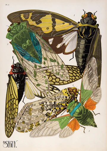
We’re exploring some of the period’s artwork. Explore:
It’s important to remind ourselves that we are all immigrants to this nation.
")
The logo of the Federal Art Project (FAP), a component of the Works Progress Administration (WPA) during the Great Depression era in the United States.
Federal Project Number One
A significant aspect of the Works Progress Administration was the Federal Project Number One, which had five different parts: the Federal Art Project, the Federal Music Project, the Federal Theatre Project, the Federal Writers’ Project, and the Historical Records Survey. The government wanted to provide new federal cultural support instead of just providing direct grants to private institutions. After only one year, over 40,000 artists and other talented workers had been employed through this project in the United States. Cedric Larson stated that “The impact made by the five major cultural projects of the WPA upon the national consciousness is probably greater in total than anyone readily realizes. As channels of communication between the administration and the country at large, both directly and indirectly, the importance of these projects cannot be overestimated, for they all carry a tremendous appeal to the eye, the ear, or the intellect—or all three.”
Federal Art Project
This project was directed by Holger Cahill, and in 1936 employment peaked at over 5,300 artists. The Arts Service Division created illustrations and posters for the WPA writers, musicians, and theaters. The Exhibition Division had public exhibitions of artwork from the WPA, and artists from the Art Teaching Division were employed in settlement houses and community centers to give classes to an estimated 50,000 children and adults. They set up over 100 art centers around the country that served an estimated eight million individuals.
Federal Music Project

Directed by Nikolai Sokoloff, former principal conductor of the Cleveland Orchestra, the Federal Music Project employed over 16,000 musicians at its peak. Its purpose was to create jobs for unemployed musicians, It established new ensembles such as chamber groups, orchestras, choral units, opera units, concert bands, military bands, dance bands, and theater orchestras. They gave 131,000 performances and programs to 92 million people each week. The Federal Music Project performed plays and dances, as well as radio dramas. In addition, the Federal Music Project gave music classes to an estimated 132,000 children and adults every week, recorded folk music, served as copyists, arrangers, and librarians to expand the availability of music, and experimented in music therapy. Sokoloff stated, “Music can serve no useful purpose unless it is heard, but these totals on the listeners’ side are more eloquent than statistics as they show that in this country there is a great hunger and eagerness for music.”
Federal Theatre Program
Main article: Federal Theatre Project
In 1929, Broadway alone had employed upwards of 25,000 workers, onstage and backstage; in 1933, only 4,000 still had jobs. The Actors’ Dinner Club and the Actors’ Betterment Association were giving out free meals every day. Every theatrical district in the country suffered as audiences dwindled. The New Deal project was directed by playwright Hallie Flanagan, and employed 12,700 performers and staff at its peak. They presented more than 1,000 performances each month to almost one million people, produced 1,200 plays in the four years it was established, and introduced 100 new playwrights. Many performers later became successful in Hollywood including Orson Welles, John Houseman, Burt Lancaster, Joseph Cotten, Canada Lee, Will Geer, Joseph Losey, Virgil Thomson, Nicholas Ray, E.G. Marshall and Sidney Lumet. The Federal Theatre Project was the first project to end; it was terminated in June 1939 after Congress zeroed out the funding.
Federal Writers’ Project
Main article: Federal Writers’ Project
This project was directed by Henry Alsberg and employed 6,686 writers at its peak in 1936. The FWP created the American Guide Series which, when completed, consisted of 378 books and pamphlets providing a thorough analysis of the history, social life and culture for every state, city and village in the United States including descriptions of towns, waterways, historic sites, oral histories, photographs, and artwork. An association or group that put up the cost of publication sponsored each book, the cost was anywhere from $5,000 to $10,000. In almost all cases, the book sales were able to reimburse their sponsors. Additionally, another important part of this project was to record oral histories to create archives such as the Slave Narratives and collections of folklore. These writers also participated in research and editorial services to other government agencies.
Historical Records Survey
Main article: Historical Records Survey
This project was the smallest of Federal Project Number One and served to identify, collect, and conserve United States’ historical records. It is one of the biggest bibliographical efforts and was directed by Luther H. Evans. At its peak, this project employed more than 4,400 workers.

The Works Progress Administration (WPA; from 1935 to 1939, then known as the Work Projects Administration from 1939 to 1943) was an American New Deal agency that employed millions of jobseekers (mostly men who were not formally educated) to carry out public works projects, including the construction of public buildings and roads. It was set up on May 6, 1935, by presidential order, as a key part of the Second New Deal.
The WPA’s first appropriation in 1935 was $4.9 billion (about $15 per person in the U.S., around 6.7 percent of the 1935 GDP). Headed by Harry Hopkins, the WPA supplied paid jobs to the unemployed during the Great Depression in the United States, while building up the public infrastructure of the US, such as parks, schools, and roads. Most of the jobs were in construction, building more than 620,000 miles (1,000,000 km) of streets and over 10,000 bridges, in addition to many airports and much housing. In 1942, the WPA played a key role in both building and staffing internment camps to incarcerate Japanese Americans.
These ordinary men and women proved to be extraordinary beyond all expectation. They were golden threads woven in the national fabric. In this, they shamed the political philosophy that discounted their value and rewarded the one that placed its faith in them, thus fulfilling the founding vision of a government by and for its people. All its people.
The WPA reached its peak employment of 3,334,594 people in November 1938. To be eligible for WPA employment, an individual had to be an American citizen, 18 or older, able-bodied, unemployed, and certified as in need by a local public relief agency approved by the WPA. The WPA Division of Employment selected the worker’s placement to WPA projects based on previous experience or training. Worker pay was based on three factors: the region of the country, the degree of urbanization, and the individual’s skill. It varied from $19 per month to $94 per month, with the average wage being about $52.50 (equivalent to $1,200 in 2024). The goal was to pay the local prevailing wage, but limit the hours of work to 8 hours a day or 40 hours a week; the stated minimum being 30 hours a week, or 120 hours a month.
National Park Service


WPA's INFLUENCE


GIVE ME your wretched refuse
Send these, the homeless, tempest-tost to me,
Something quite important happened in the US from 1939-1943. The New Deal. Crippled by an economic collapse, a sitting US President actually did something good. FDR had the clarity to see what America stands for: equality, freedome and agency.
_(1)")

Not like the brazen giant of Greek fame,
With conquering limbs astride from land to land;
Here at our sea-washed, sunset gates shall stand
A mighty woman with a torch, whose flame
Is the imprisoned lightning, and her name
Mother of Exiles. From her beacon-hand
Glows world-wide welcome; her mild eyes command
The air-bridged harbor that twin cities frame.
“Keep, ancient lands, your storied pomp!” cries she
With silent lips. “Give me your tired, your poor,
Your huddled masses yearning to breathe free,
The wretched refuse of your teeming shore.
Send these, the homeless, tempest-tost to me,
I lift my lamp beside the golden door!”
Emma Lazarus
November 2, 1883


")