Robert & Sonia Delaunay

Robert & Sonia Delaunay

Robert
Sonia
Delaunay

The Delaunays: Two Artists, One Theory of Color

In 1910, two 25-year-old painters married in Paris. Over the next three decades, Robert and Sonia Delaunay built one of the most original ideas in modern art: that color by itself, without outlines or subject matter, could create light, movement and rhythm.

The poet Guillaume Apollinaire called their approach Orphism, after Orpheus, the mythical musician. The name fit. Their work is meant to be felt the way music is felt.

Both artists are now part of our Fine Art Collection. Here's why their story belongs together, and why their work still looks so modern more than a century later.
A Shared Language: Simultaneous Contrast
Robert Delaunay, The Runners, ca. 1924–26

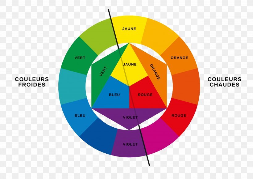
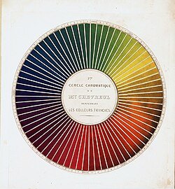
The Delaunays started from a 19th-century discovery by the chemist Michel-Eugène Chevreul. He found that colors change each other when placed side by side. Orange next to blue makes both look brighter and makes the edge between them seem to vibrate. The Delaunays called this simultaneous contrast and made it the base of everything they created.

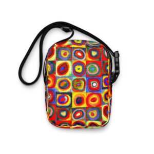
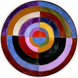
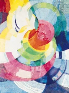
Cubism, the leading movement of their time, broke objects into muted browns and grays. The Delaunays kept Cubism's fractured structure and filled it with pure, saturated color: discs, arcs and interlocking planes that seem to spin and pulse.
Robert Delaunay, The Runners, ca. 1924–26

Robert Delaunay (1885–1941): Painting Modern Life
Robert Delaunay, The Runners, ca. 1924–26

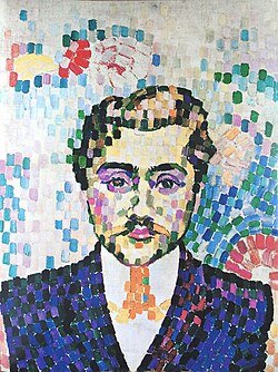
Robert was the theorist of the pair. His paintings take on the energy of the new century: electric light, airplanes, crowds, speed.
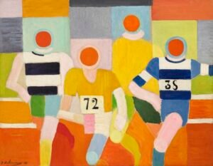
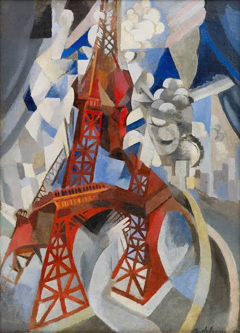
Robert Delaunay, The Runners, ca. 1924–26

The Eiffel Tower series. He painted the tower more than thirty times between 1909 and 1928, breaking its iron frame into rhythmic, tumbling color. For him it stood for modernity: fractured, luminous and always in motion.


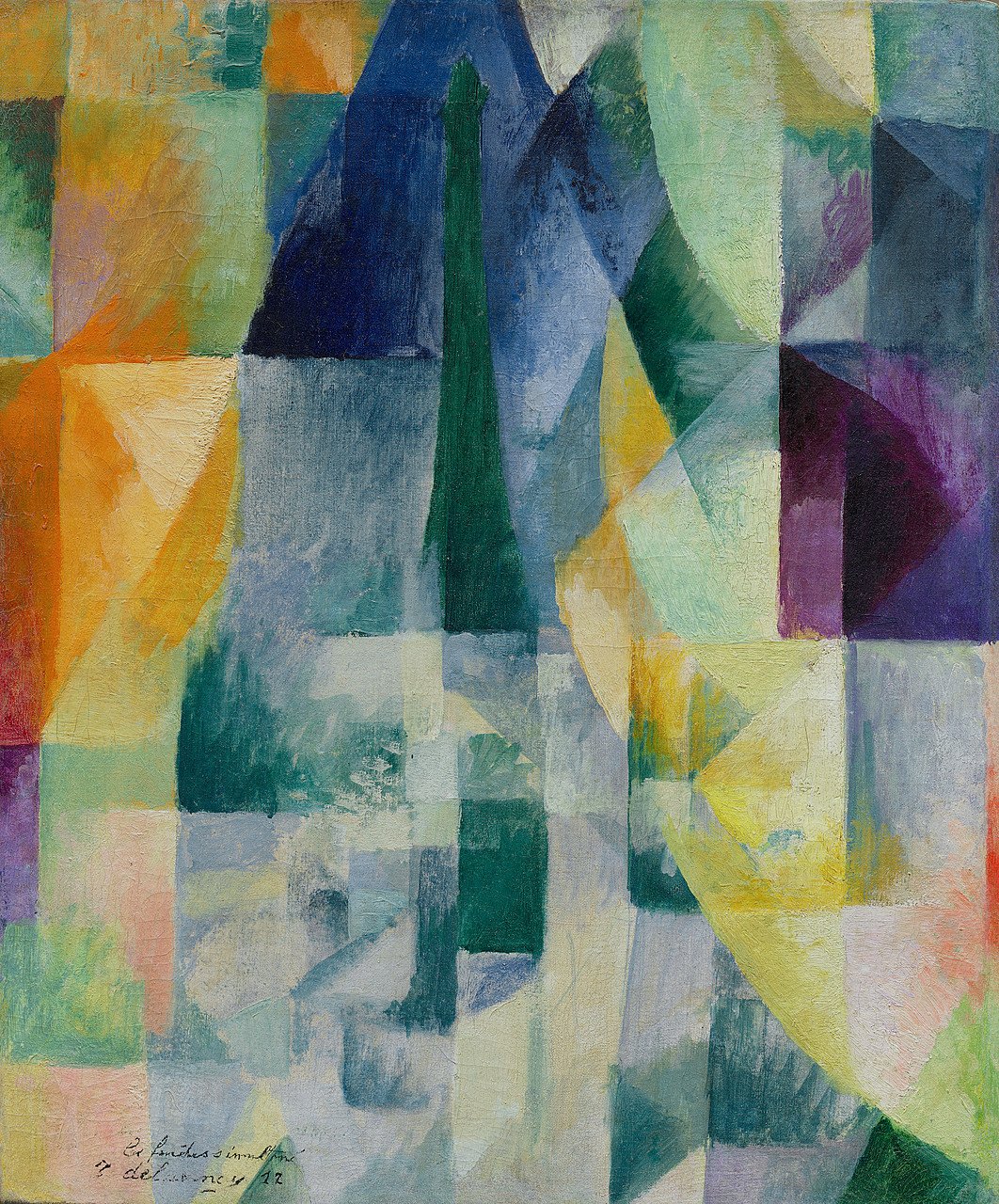
 The Windows series (1912). Views of Paris dissolve into overlapping transparent planes of color. These are some of the first paintings where color itself is the subject.

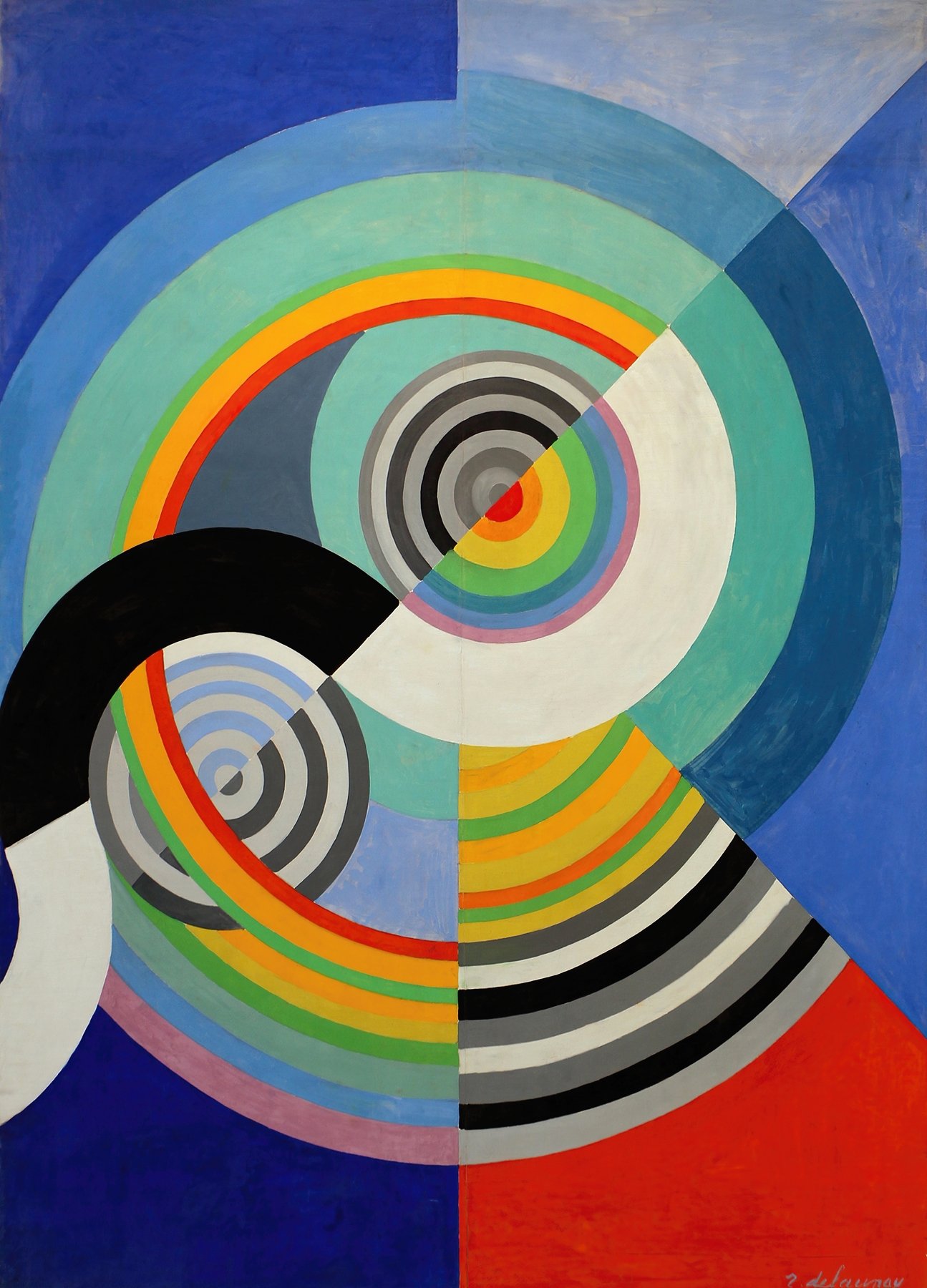
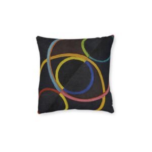
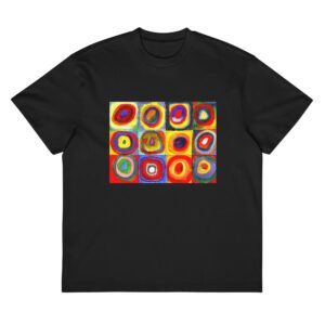
Circular Forms and Rythme. His concentric color discs, often likened to suns, moons and propellers, are among the earliest fully abstract paintings in Western art.

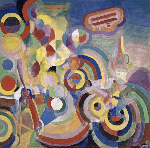
Homage to Blériot (1914). A celebration of flight built from whirling rings of color.

Sonia Delaunay (1885–1979): Taking Color Off the Canvas
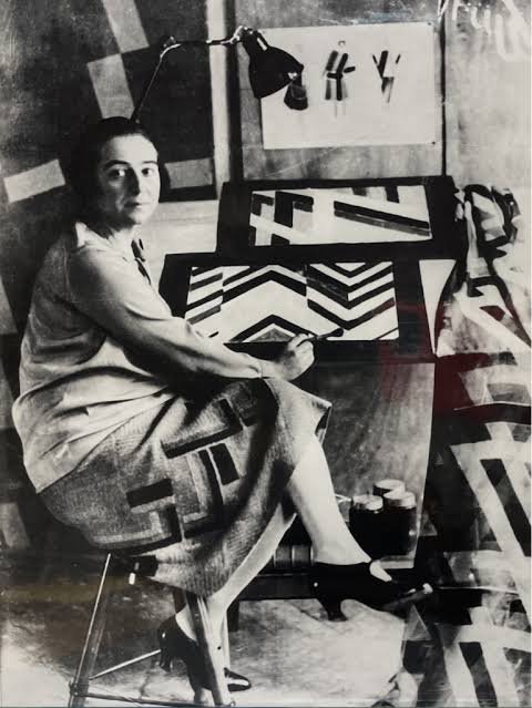
Robert Delaunay, The Runners, ca. 1924–26

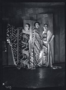
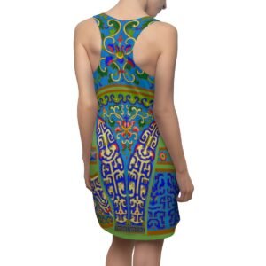
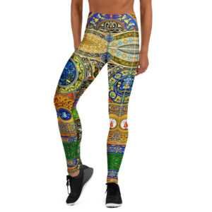
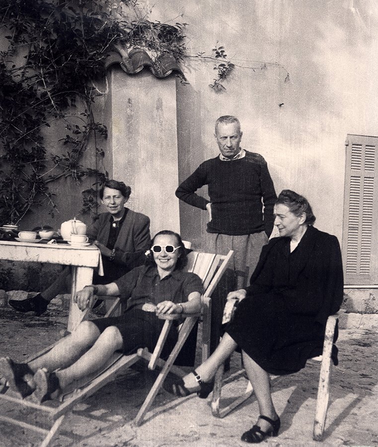
Sonia took the same theory and carried it into everyday life. Where Robert's ideas stayed mostly on the canvas, hers went into fashion, textiles, books, theater and even cars.
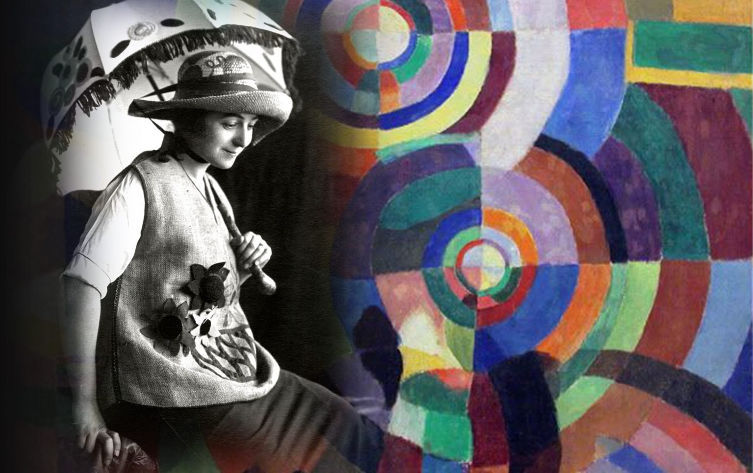
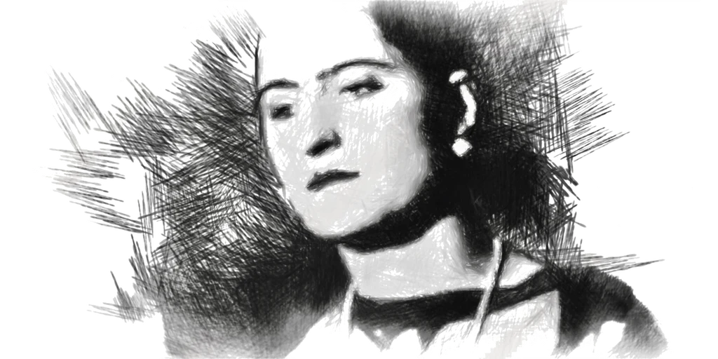
Robert Delaunay, The Runners, ca. 1924–26

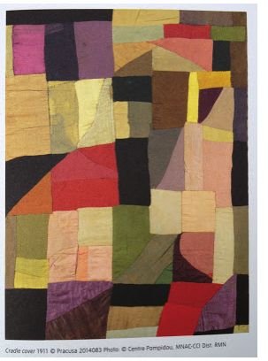
The Quilt (1911). She made a patchwork blanket for their infant son out of fabric scraps, and it became one of her first abstract works. It was art made to be used.

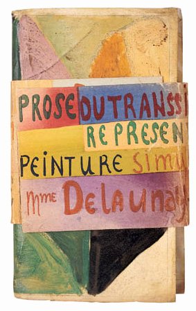
La Prose du Transsibérien (1913). Made with the poet Blaise Cendrars, this two-meter folding book sets poetry beside flowing color. It is one of the landmark artists' books of the century.

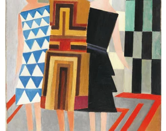
Simultaneous Dresses. She wore her own color-blocked designs to the Bal Bullier dance hall in Paris, turning the dance floor into a moving painting.
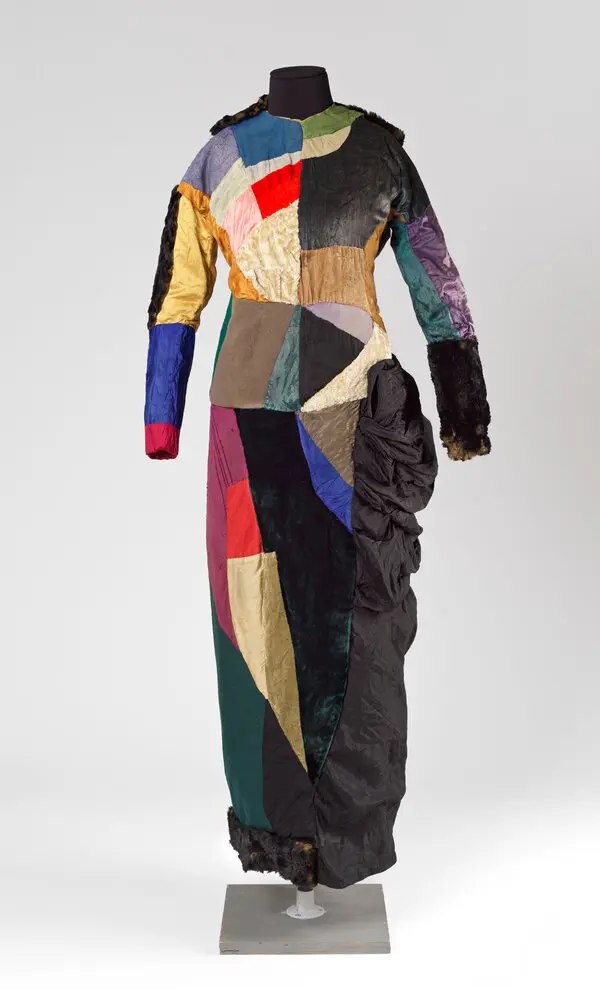
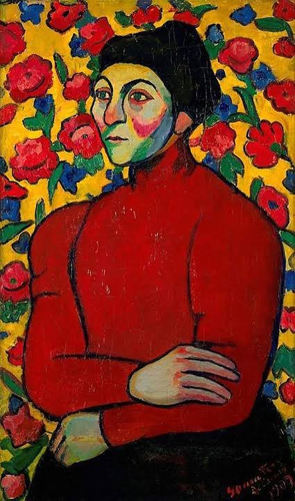
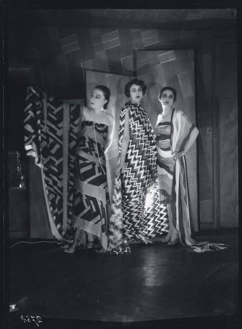
Textiles and fashion. Through the 1920s she ran her own design studio and boutique. She created printed fabrics, scarves, coats and costumes, and famously painted a Citroën to match an outfit.

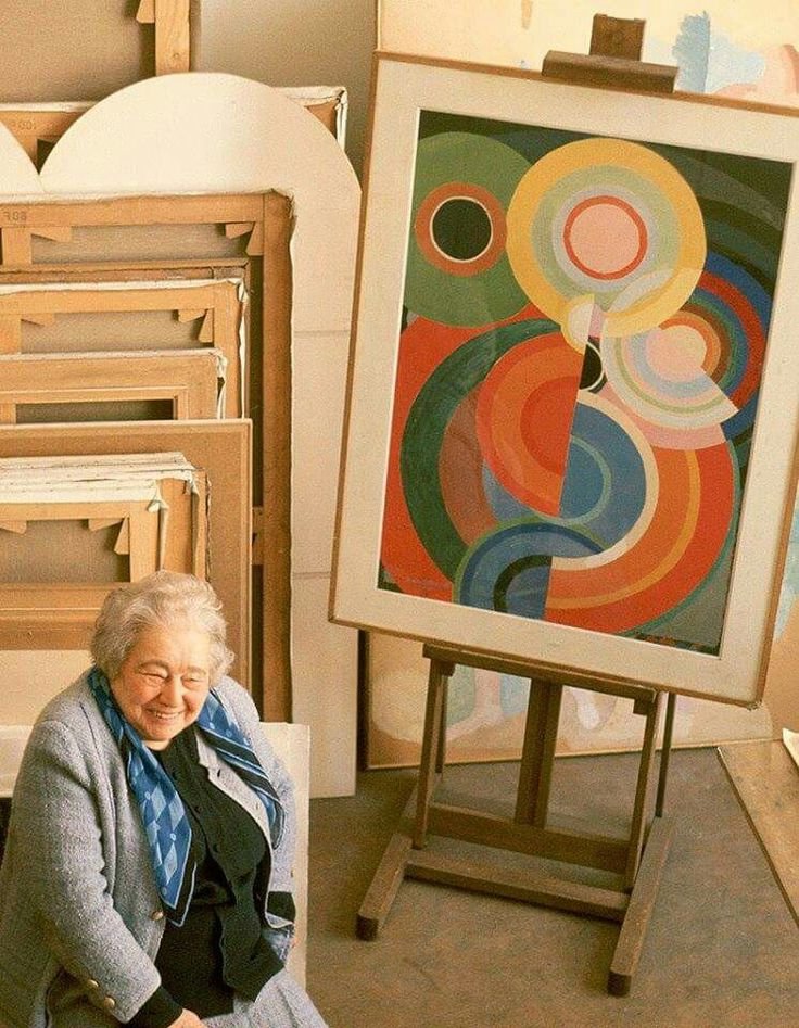
The Louvre (1964). She became the first living woman to receive a retrospective at the Louvre, and she kept working into her nineties.

A Pioneering Couple
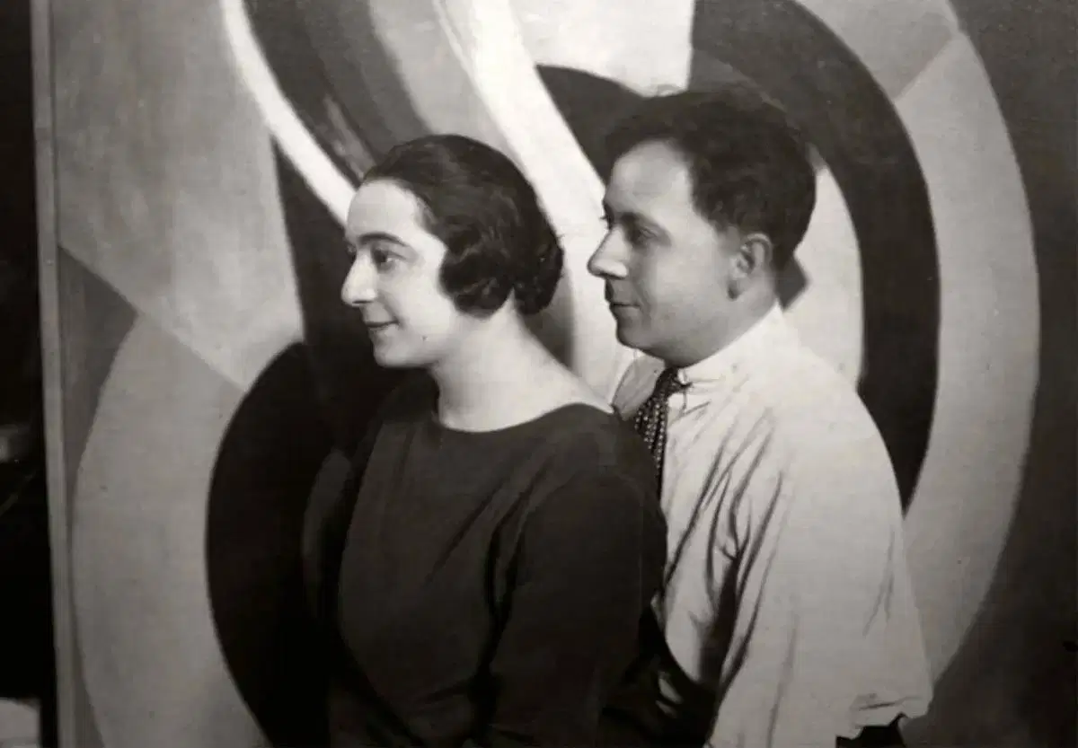
Pioneers of pure abstraction in painting

Pioneers of the idea that fine art and design are one

Painting versus living.

Robert thought of the canvas as a place to experiment and wrote long essays on color and light. Sonia rarely stopped to theorize. She tested ideas by making things: a quilt, a dress, a book cover. His work asks you to look. Hers asks you to wear it, hold it, live with it.

Structure versus flow

Robert's compositions are organized around a center: discs, towers and rings that radiate outward. Sonia's designs tend to be modular and rhythmic. Blocks, stripes and repeating bands of color can extend in any direction, which is exactly what fabric needs.

Recognition over time

Robert was treated as the movement's leading figure during his lifetime, and he died in 1941. Sonia's reputation grew over the following decades. Today many historians see her as the more radical of the two, because she refused to separate "high" art from design. That idea shapes how we think about fashion and product design today.

Why the Delaunays Belong at cgk.ink

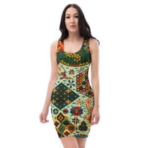
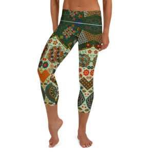
At cgk.ink, we curate art-inspired pieces for everyday life. Sonia Delaunay was doing exactly that a hundred years ago. Robert's color discs and Sonia's rhythmic patterns translate naturally into apparel, blankets and home goods, because they were built on the belief that color should surround us.

Explore both artists in our Fine Art Collection, and see how two artists, one marriage and one theory of color changed the look of the modern world.
Modernism: A Brief History of the Future

Modernism: A Brief History of the Future

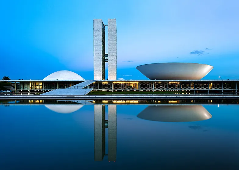
The National Congress of Brazil in Brasília is a masterpiece of modernist architecture designed by Oscar Niemeyer and completed in 1960.

Field Notes / Art & Design

Modernism Never Left: How a Century-Old Idea Still Shapes Culture

Modernism is usually filed away as art history — a movement with a start date, an end date, and a museum wing. But the instincts behind it never actually stopped working. They just moved into new materials: our phones, our apartments, our feeds, our closets.

Every few years, someone declares Modernism dead. Postmodernism buried it in the '70s and '80s with irony and ornament. Maximalism keeps trying to bury it again with pattern-clash and clutter-core. And yet the white walls, the grid layouts, the unornamented objects, the "form follows function" reflex — they keep coming back, because Modernism was never really a look. It was an argument: that design should be honest about what it is and what it's for. A century later, that argument is still the operating system for most of what we build, use, and scroll past every day.

Three Yves Saint Laurent cocktail dresses from 1965, each a mod silhouette panelled in Mondrian's red, blue, yellow, and black color blocks

It's the reason your apps look like that

Open your phone and you're looking at Modernism. The flat icons, the generous white space, the sans-serif type, the grid of tiles — that's Bauhaus logic running on a screen instead of a page. Apple's industrial design under Jony Ive borrowed directly from Dieter Rams, who borrowed directly from the Bauhaus principle that ornament is a distraction from function. "Flat design," the style that swept UI in the 2010s and still dominates, is essentially a restatement of Mondrian and the De Stijl grid: primary shapes, clean color blocks, no fake shadows pretending to be real objects. Every time a startup ships a minimalist landing page — one bold headline, a lot of empty space, a single accent color — it's running a hundred-year-old playbook without knowing it.

Primary colors, real life.

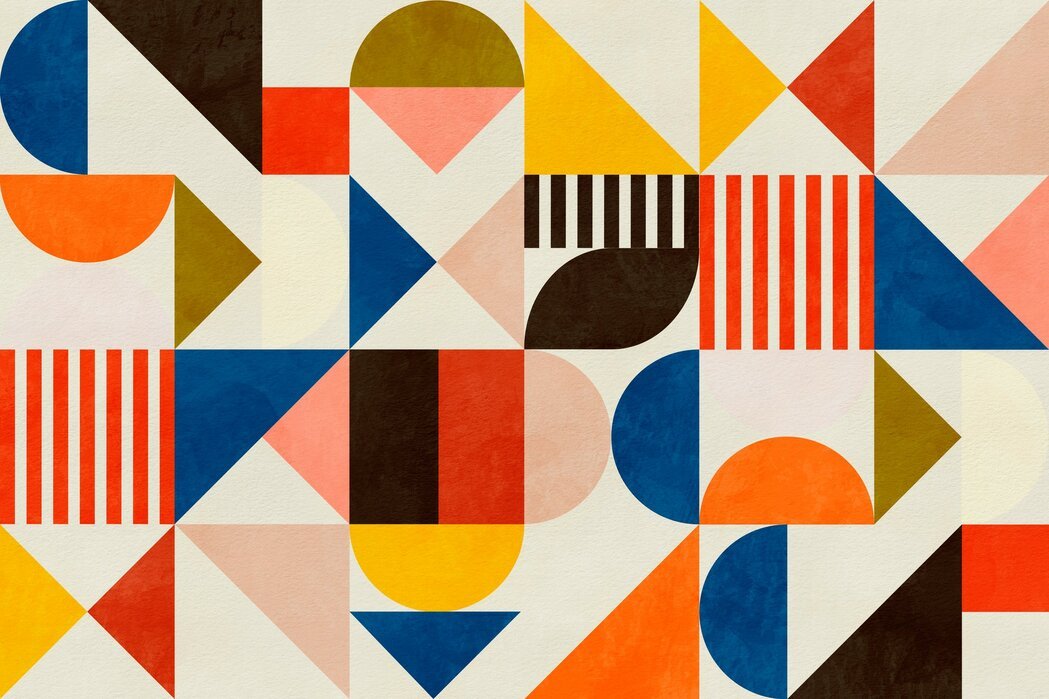
The Color Collection carries that same De Stijl red-blue-yellow logic into everyday pieces.

Shop the Color Collection

Cities keep arguing about it

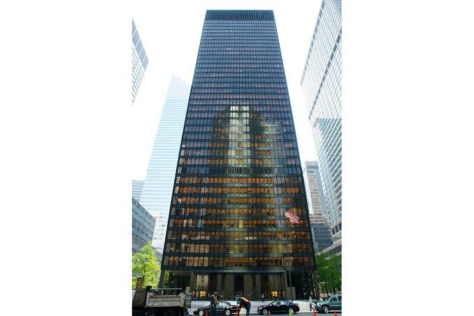
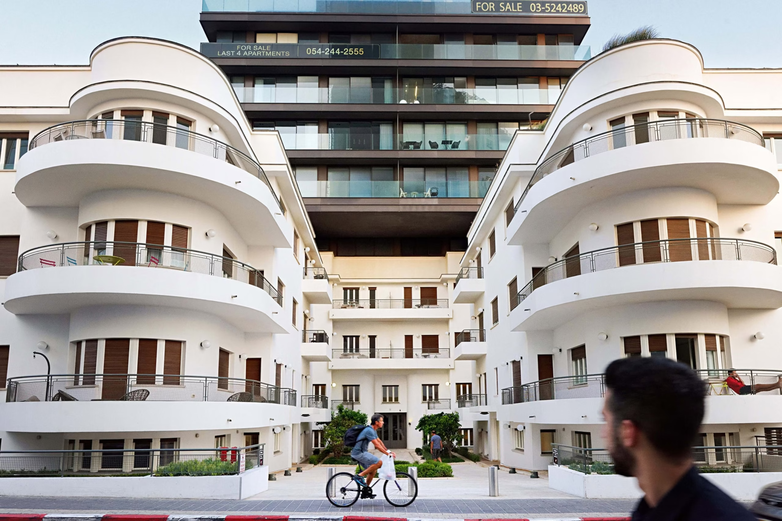
Walk through almost any growing skyline and you're standing inside an unresolved Modernist argument. Glass-and-steel towers descended from Mies van der Rohe's Seagram Building still define "serious" corporate architecture worldwide, even as critics call them cold and interchangeable — the same critique Robert Venturi made in the 1960s when he pushed back with "less is a bore." That tension never resolved; it just cycles. Neo-modernist architects like Tadao Ando and Richard Meier reintroduced Modernist discipline in the '80s and '90s, stripped of its utopian claims. Now developers reach for the same clean geometry again, because minimal towers are cheaper to build and easier to sell as "timeless." The style keeps getting rediscovered by people who think they're doing something new.

Minimalism isn't a trend that resurfaces. It's a default that culture keeps drifting back toward.

The Seagram Building is a famous 38-story skyscraper located at 375 Park Avenue in Manhattan, New York City.

Architects: Designed by the iconic modernist architect Ludwig Mies van der Rohe and architect Philip Johnson.

Completed: Finished in 1958 after construction began in 1954.

Architectural Style: Built in the International Style, known for its clean lines and simple geometric shapes.

Materials: Uses a steel frame covered with amber-tinted glass and distinct bronze metal outer beams.

Open Plaza: Features a wide open public plaza with fountains at the street level, which changed how city skyscrapers were designed

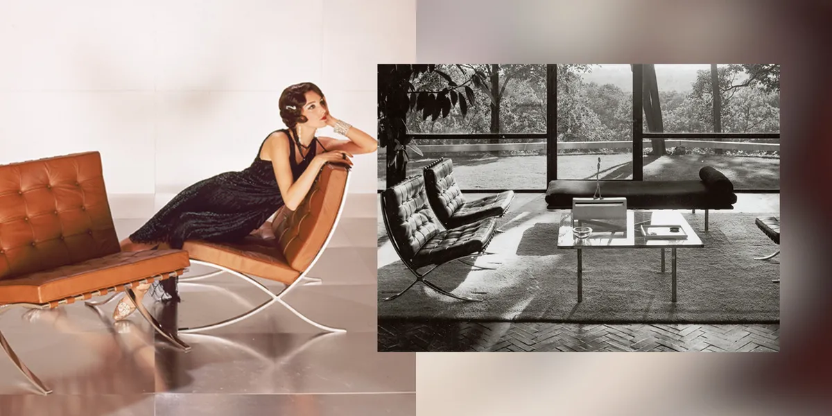
Barcelona chair by Mies van der Rohe for Knoll, a tufted leather lounge chair on a chrome X-frame base
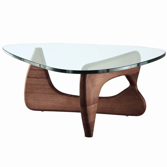
Black abstract-base coffee table with a glass top, minimalist sculptural silhouette
Arne Jacobsen Egg Chair for Fritz Hansen with matching ottoman, upholstered curved shell design

Your closet and your kitchen are in on it too

The instinct shows up well outside art and architecture. "Capsule wardrobes," neutral palettes, unbranded packaging, the entire aesthetic of a certain kind of design-forward home goods brand — all of it descends from the same root as the Bauhaus and the International Style: strip away what isn't earning its place. Muji built a global retail empire on almost nothing but that idea. IKEA's flat-pack logic is functionalism applied to furniture logistics. Even the backlash trends — cottagecore, maximalism, grandmillennial clutter — define themselves in opposition to Modernism, which is its own kind of proof that it's still the thing everyone is reacting to.

Form follows function, sustainably.

The Eco-Logic Collection shares that same instinct: no ornament that isn't earning its place.

Shop Eco-Logic

The argument is the legacy

What makes Modernism different from most art-historical movements is that it never really closed. Impressionism, Cubism, Futurism — these are chapters people study. Modernism is a set of live questions people are still fighting over: Does a thing need decoration to be beautiful? Does new technology demand a new visual language? Should form serve function, or is function itself a kind of aesthetic? Every generation answers those questions a little differently, and every answer ends up looking, in some way, like a rerun of Cézanne breaking a landscape into planes or Mies deciding that less could be more. That's not nostalgia. That's a century-old idea that turned out to be durable enough to keep being useful.

An idea that's still being made.

The Fine Art Collection draws from the same instincts that are still shaping design today — pieces built on a century of arguments that never really ended.

Shop the Fine Art Collection

Modernism: A History of Rupture and Renewal

From the industrial upheavals of the 1860s to the glass towers of the postwar city, Modernism was less a single style than a century-long argument about what art should do once tradition could no longer be trusted. It's also the throughline behind our Fine Art Collection.

Color is a Scam

Color is a Scam

Color is a Myth

It's all in your head

Color is the ultimate cosmic scam, but your brain is the one pulling the con. 

In physics, objects do not possess inherent color. A strawberry is not red, and the sky is not blue. The universe is a colorless landscape of matter interacting with electromagnetic radiation.
Here is why color is essentially a beautifully orchestrated biological illusion:

Your Brain Makes It All Up 

Color only exists inside your skull. When those reflected light waves hit your retina, they trigger three types of cone cells (tuned to red, green, and blue). These cells send electrical pulses to your brain. Your brain processes these signals and paints a conscious experience we call "color" so you can tell a ripe berry from a poisonous leaf. Outside of a conscious mind, color does not exist.


We Are Blind to Most of Reality

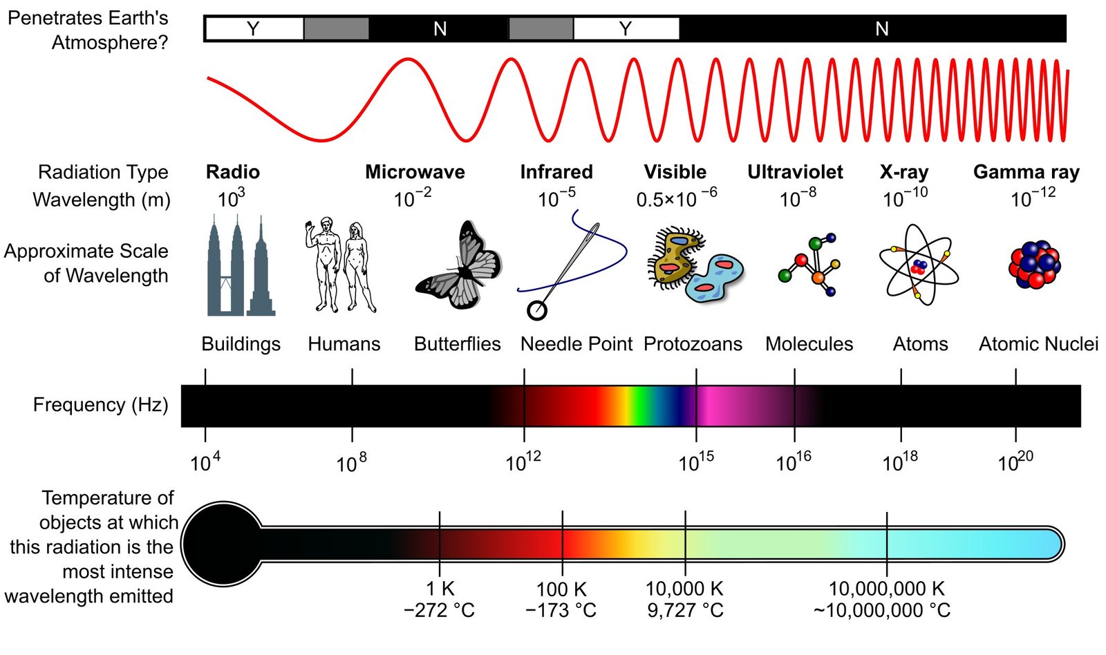
Human vision is incredibly limited. The visible light spectrum is a microscopic sliver—about 0.0035%—of the entire electromagnetic spectrum. We are completely blind to:

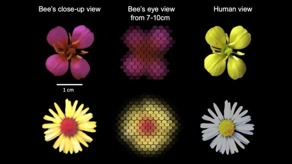
Ultraviolet light: Which bees use to see secret patterns on flowers.

Infrared light: Which pit vipers use to see the heat signatures of prey.

X-rays and Radio waves: Which pass right through or around us undetected.

If human color vision is a scam, animals are the whistleblowers exposing how much of reality we are actually missing.

The Mantis Shrimp (The Ultimate Color Snob)

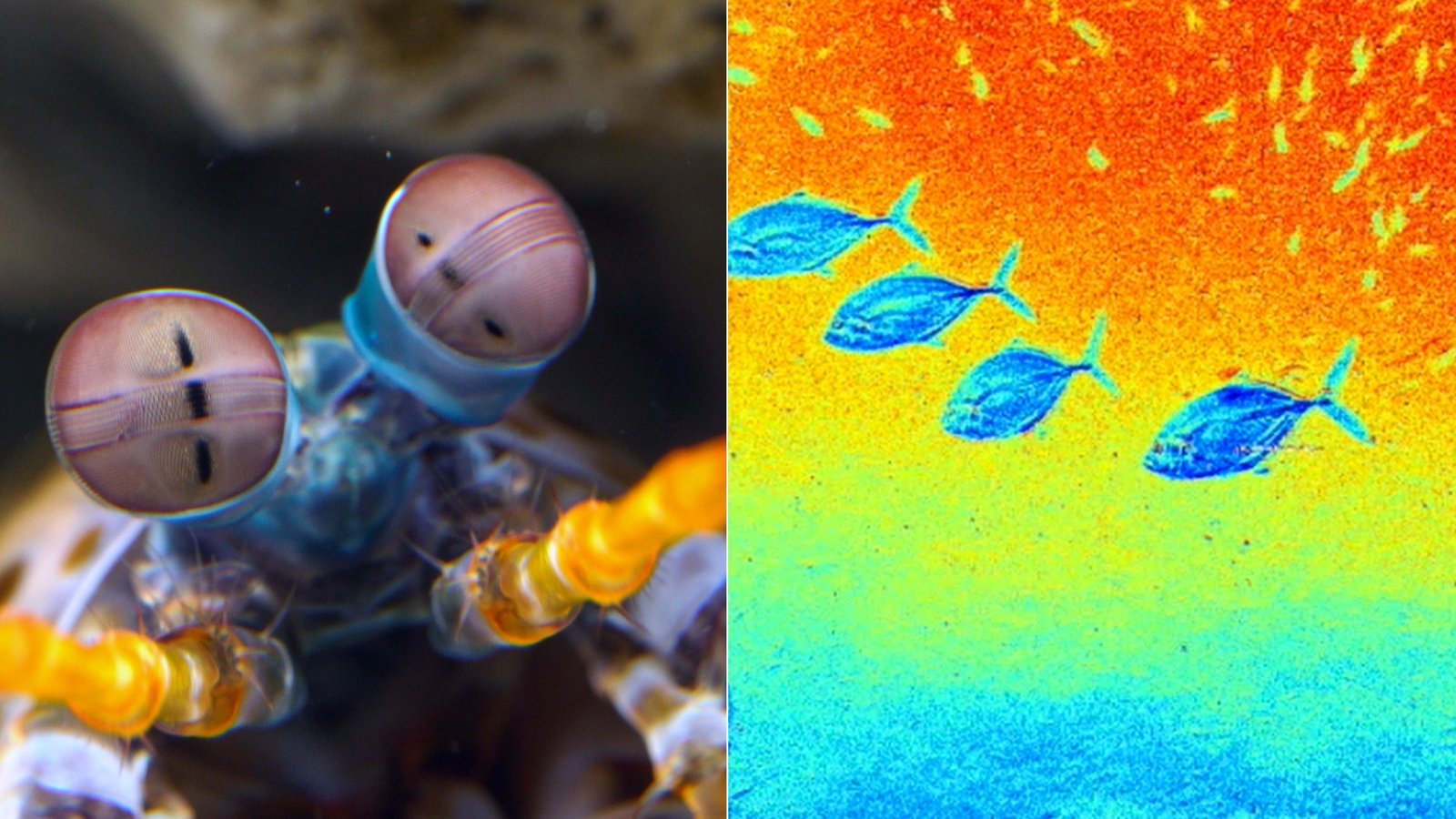
Humans navigate the world using three types of color-receptive cones (red, green, and blue). The mantis shrimp possesses 12 to 16 different color receptors. They do not just see colors more intensely; they can see ultraviolet light, infrared light, and polarized light. To a mantis shrimp, a human eye is essentially colorblind. 

Mantis Shrimp can see cancerous cells (NPR)

Bees and Birds (The Secret Pattern Viewers)

Bees cannot see the color red, but they see ultraviolet (UV) light. Flowers have evolved secret, invisible ultraviolet patterns—like runway landing strips—that guide bees directly to the nectar. Birds also have a fourth cone for UV light, allowing them to spot camouflaged insects and fruits that look completely invisible to humans against green leaves.

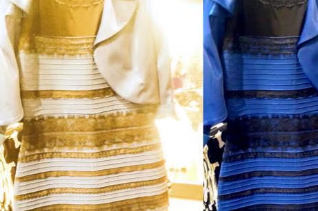
The Dress (2015)

The internet nearly broke over whether a dress was blue and black or white and gold. This happened because of chromatic adaptation. 

The Setup: The photo was taken in ambiguous lighting.

The Trick: Some brains assumed the dress was illuminated by bright daylight, so they filtered out the blue light, seeing the dress as white and gold. Other brains assumed it was under warm, artificial indoor light, so they filtered out the gold, seeing it as blue and black.

Your brain made a split-second executive decision about the lighting source and altered your conscious reality to fit its assumption.

Color is not a static truth; it is a live, edited broadcast produced by your mind.

Read more about how cgk.ink designs with color, seen and unseen:

The Enduring Bauhaus: How It Shapes Our World

The Enduring Bauhaus: How It Shapes Our World


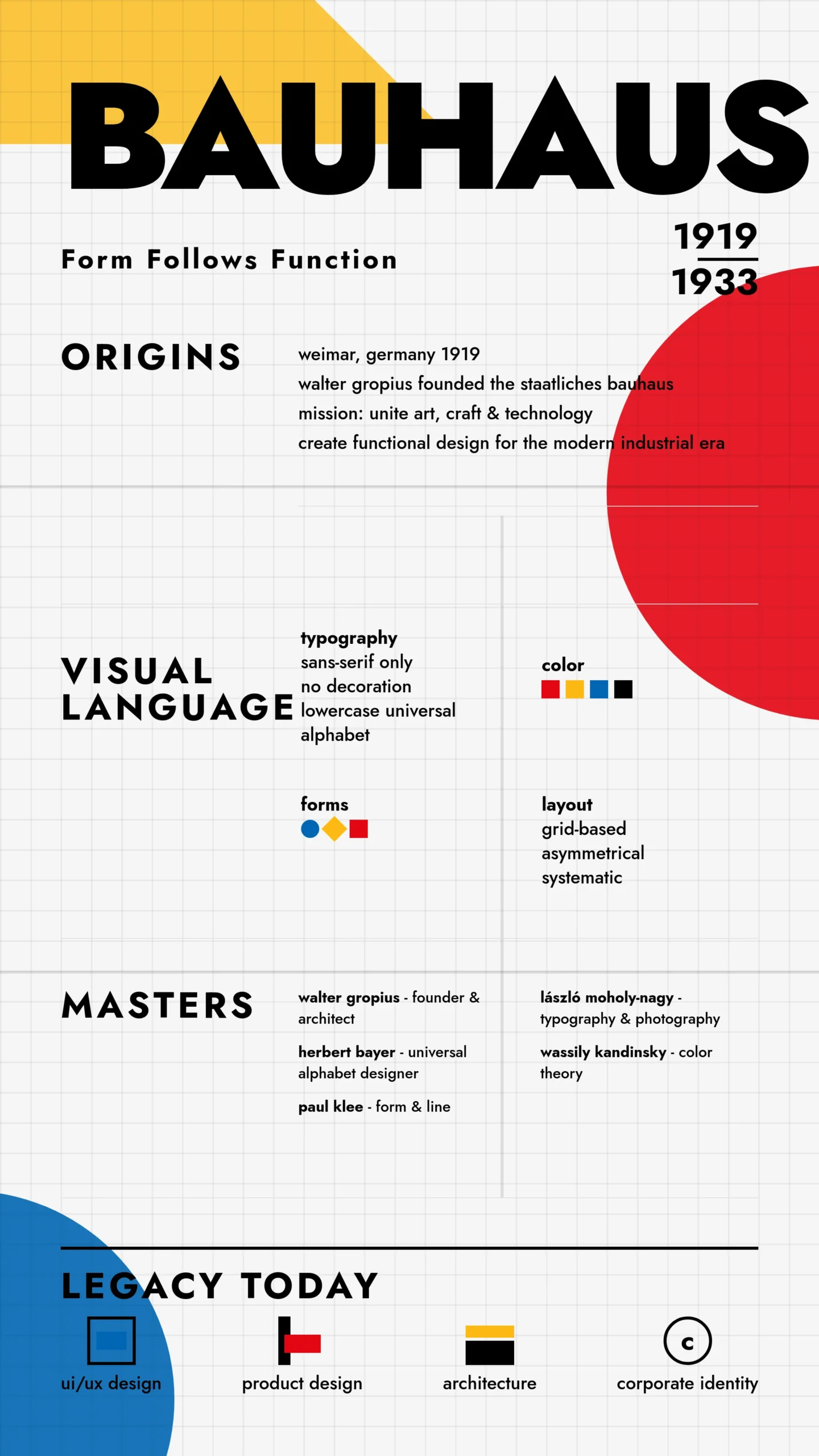
The Bauhaus school (1919–1933) is, arguably, the single most influential design movement of the 20th century. Its impact runs through virtually every discipline of modern design:

Core Philosophy

The Bauhaus broke down the hierarchy between "fine art" and "craft," insisting that good design should unite beauty and function. The famous motto — form follows function — shaped how designers think about every object they make.


Typography & graphic design

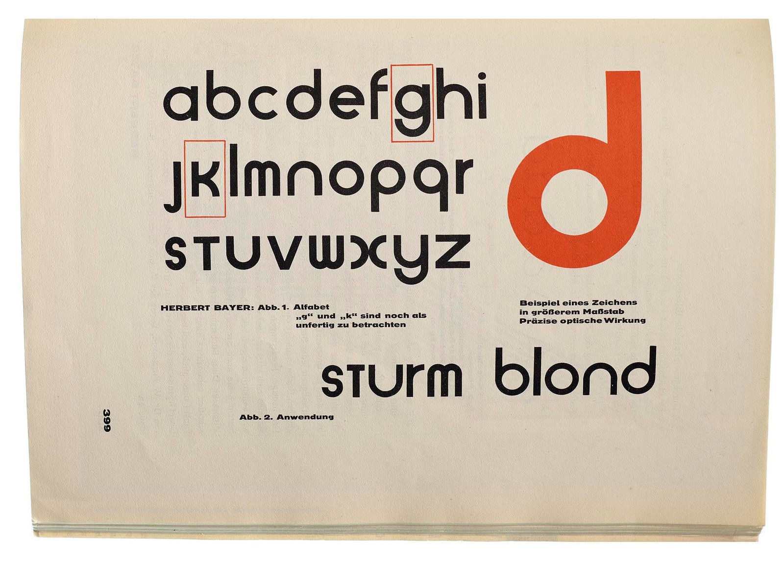
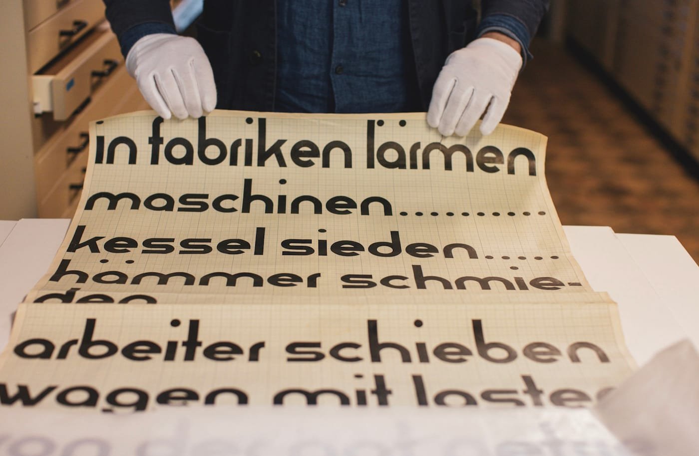
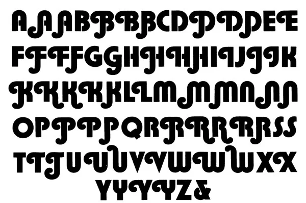
Bauhaus experimented radically with sans-serif typefaces, grid systems, and asymmetric layouts. Designers like Herbert Bayer developed typefaces that stripped away decorative flourishes. You see this DNA in modern UI design, brand identity systems, and the clean sans-serif dominance of digital typography (think Helvetica, Futura, and their descendants).
Industrial & product design

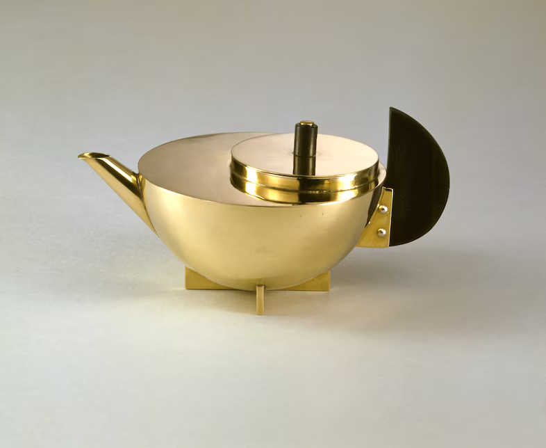
Marcel Breuer's tubular steel furniture, Marianne Brandt's metalwork, and Wilhelm Wagenfeld's lamp are still in production today. The Bauhaus pioneered designing for mass production — objects that were elegant and manufacturable at scale. This is the philosophical foundation of companies like Braun, Apple, and IKEA.

Architecture

Walter Gropius and Ludwig Mies van der Rohe helped launch International Style modernism — open floor plans, flat roofs, glass curtain walls, structural honesty. The glass-and-steel office towers that define every city skyline are a direct inheritance.

UI/UX and digital design

The Bauhaus grid, modular composition, and emphasis on usability translate almost directly into digital interfaces. The idea that a design should guide the user intuitively — without ornamentation for its own sake — is foundational to how apps and websites are built today.

Color theory

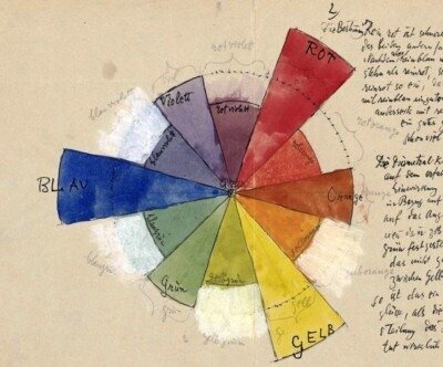
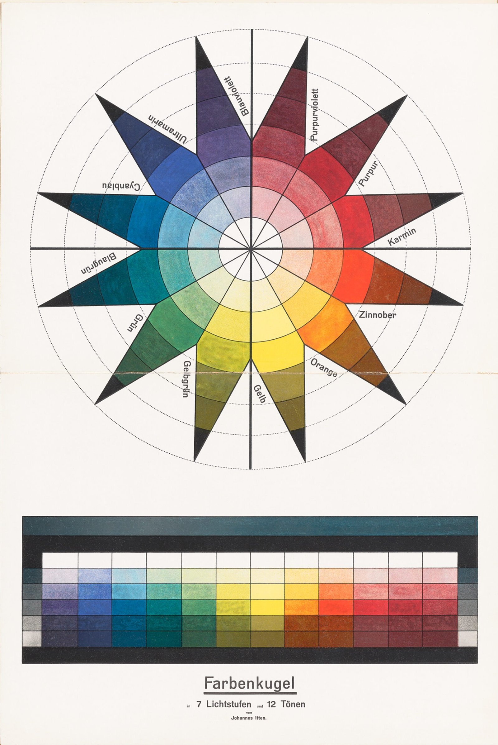
Johannes Itten and Josef Albers developed rigorous, systematic approaches to color interaction that are still taught in every design school and used by brand designers and filmmakers.

Education

Perhaps the deepest legacy: the Bauhaus pedagogical model — foundation courses, interdisciplinary workshops, learning by making — restructured design education worldwide. Most art and design schools still follow a version of it.

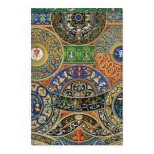
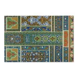
The Grammar of Ornament

The Grammar of Ornament

From the universal testimony of travelers it would appear, that there is scarcely a people, in however early stage of civilisation, with whom the desire to ornament is not a strong instinct. Man's earliest ambition is to create . . . to stamp on this earth the impress of an individual mind.

—Owen Jones, The Grammar of Ornament

While we may often note that current society is changing at a breakneck speed, we do have to take note that this has happened before. Arguably, the 19th Century beats us at our own game on the fundamental-change level.

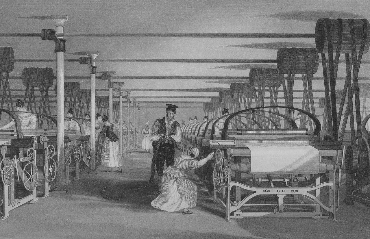
The 19th century was an era of rapidly accelerating scientific discovery and invention, with significant developments in the fields of mathematics, physics, chemistry, biology, electricity, and metallurgy that laid the groundwork for the technological advances of the 20th century. The Industrial Revolution began in Great Britain and spread to continental Europe, North America, and Japan. The Victorian era was notorious for the employment of young children in factories and mines, as well as strict social norms regarding modesty and gender roles.

The 19th century was characterized by vast social upheaval. Slavery was abolished in much of Europe and the Americas. The First Industrial Revolution, though it began in the late 18th century, expanding beyond its British homeland for the first time during this century, particularly remaking the economies and societies of the Low Countries, the Rhineland, Northern Italy, and the Northeastern United States. A few decades later, the Second Industrial Revolution led to ever more massive urbanization and much higher levels of productivity, profit, and prosperity, a pattern that continued into the 20th century.

The first electronics appeared in the 19th century, with the introduction of the electric relay in 1835, the telegraph and its Morse code protocol in 1837, the first telephone call in 1876,[2] and the first functional light bulb in 1878.[3] Society rapidly urbanized, bringing populations increasingly together into smaller spaces. The first notes of globalization brought influences from around the world to the same table, with varying results. From a Western perspective, the new cultures were ripe to be harvested. The Eastern-perspective, it presented new threats and cultural influence without precedent. The world, in fact, was becoming smaller.

The increasingly urbanization of Europe and the United States brought about new challenges to traditional aesthetics and behaviors. How does one distinguish oneself from a sea of common faces? What importance does a dwelling have and how does it become a home? An ever-evolving social hierarchy demanded that new styles, techniques and designs be invented -- and quickly.

the Emergence of Decorative Arts

dec·o·ra·tive arts

/ˌdek(ə)rədiv ˈärts,ˌdekəˌrādiv ˈärts/

noun

plural noun: decorative arts; noun: decorative art

the arts concerned with the production of high-quality objects that are both useful and beautiful.

Ceramics, glassware, basketry, jewelry, metalware, furniture, textiles, clothing, and other such goods are the objects most commonly associated with the decorative arts. Many decorative arts, such as basketry or pottery, are also commonly considered to be craft, but the definitions of both terms are arbitrary.

The term "decorative arts" is not meant to be derogative. It was popular in the 70s to dismiss this as a "lesser" art and thankfully, we've decided collectively to rather group all functional art under the term "design." The artists we discuss in our Fine Arts Collection are very much masters of fine art as well as exquisite craftspeople. I argue that decorative arts are actually more democratic and open to including fine art in our everyday life.

And then there's "retro." We constantly revisit previous eras to gain inspiration for our own, modern times. Likewise, The Victorian era is known for its interpretation and eclectic revival of historic styles mixed with the introduction of Asian and Middle Eastern influences in furniture, fittings, and interior decoration. The Arts and Crafts movement, the aesthetic movement, Anglo-Japanese style, and Art Nouveau style have their beginnings in the late Victorian era and gothic period.

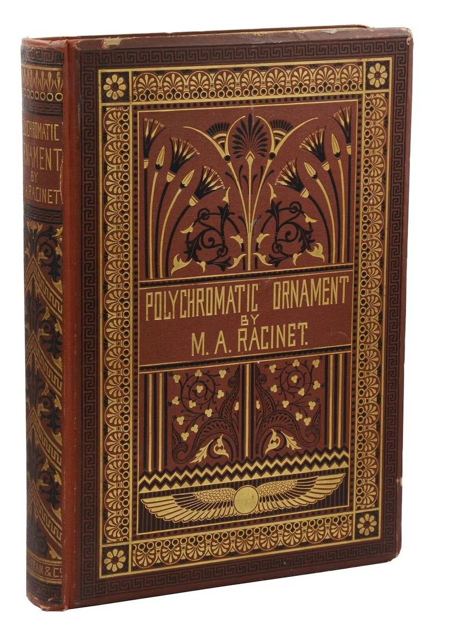
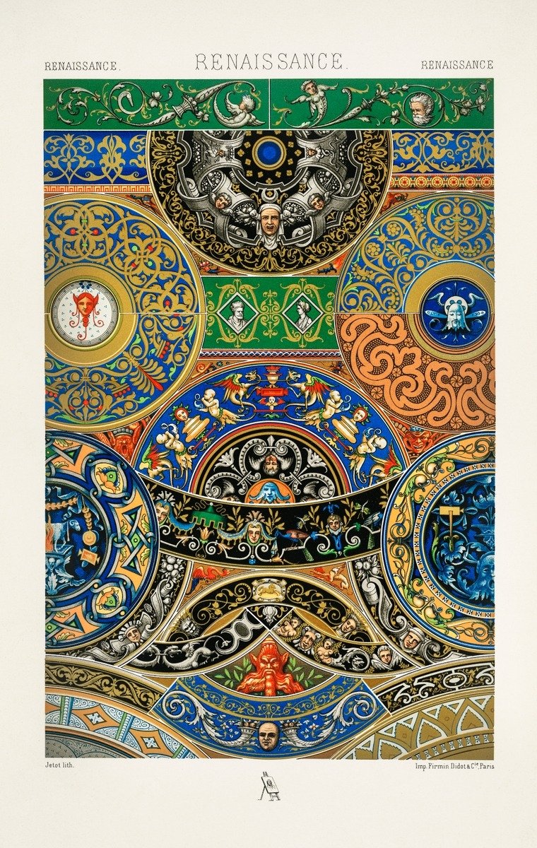
I'm specifically interested in a handful of artists who made a thoughtful, meaningful jump to bring arts to bear weight on everyday existence. We've talked about Racinet. And Morris. There are several dozen others including, Tiffany, Lalique, Tamara de Lempicka, Erté (a great article re: "the top 10" is here, click on it!) are among the most notable.

Owen Jones

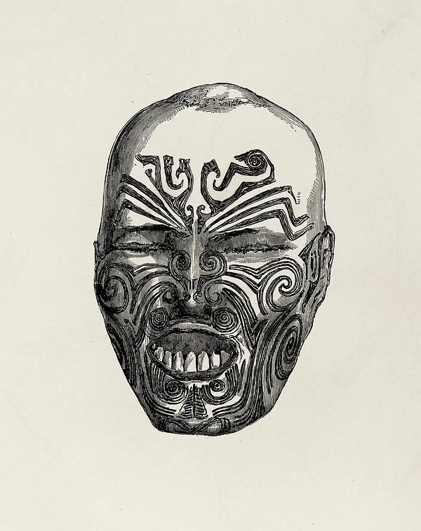
In the opening chapter to his seminal work The Grammar of Ornament, Owen Jones stresses the fact that one of the universal qualities among humankind is the desire to make beautiful things. To illustrate this point, he uses the somewhat macabre example of a severed preserved head of a Maori warrior (mokomokai), then thought to be a woman, which was covered in an elegant pattern of facial tattoos. He admired it particularly for the harmonious way in which the responsible artist had married the tattooed lines with the natural shapes of the human face. Rather than concluding that ornament belongs purely to the primitive, as others would argue later, Jones realized through his confrontation with this ethnological specimen that the Maori possessed an innate understanding of beauty that was alien to modern Western society.

While Jones's ideas slowly took root in art education over the following decades, which in turn influenced the development of new artistic movements such as Arts & Crafts and Art Nouveau, The Grammar of Ornament did not bring about a direct change in artistic practice. In fact, as Jones himself anticipated, we often find patterns and motifs from the book copied and applied to objects and interiors dating from the third quarter of the nineteenth century.

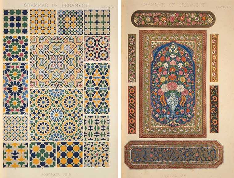
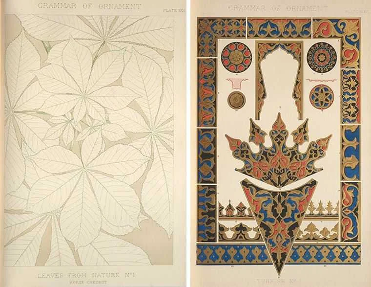
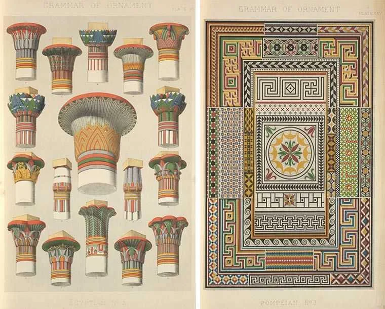
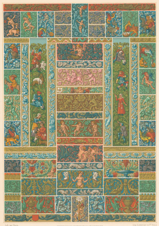
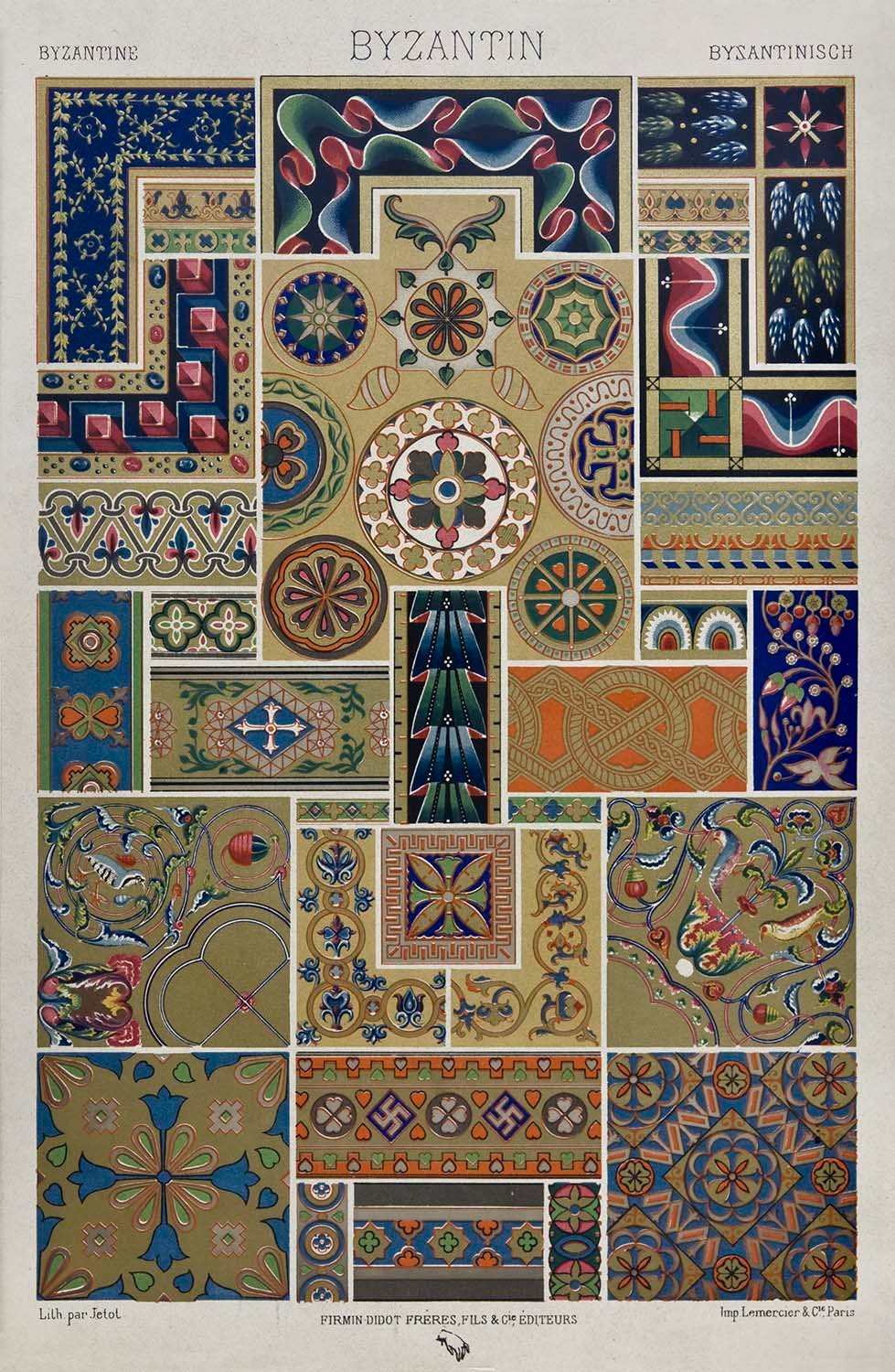
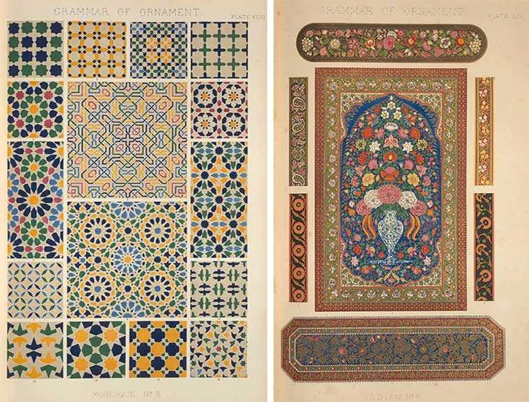
The Grammar was celebrated first and foremost for its outstanding folio-sized color lithographs, which represented the latest and most sophisticated innovations in the field of printmaking. Color lithography had been in use for several decades, but because each color was printed from a separate lithographic stone, most commercial publications were printed in a limited palette of three or four colors. Since color played a crucial role in Jones's work, he took charge of the production himself and employed assistants to work out the patterns on lithographic stones, with certain plates requiring as many as twenty distinct stones. The high quality of Jones's color plates quickly turned the luxurious first edition of the book into a collector's item. Their appeal greatly outlasted Jones’s intellectual arguments, which were omitted altogether in the various posthumous editions, and facsimile reproductions published in the later nineteenth and twentieth century.

As a writer, I have to include at least one reference to literature when discussing art, fine or otherwise.

While he is now seen as the epitome of wit and sophistication, Oscar Wilde was prosecuted and was killed under the same Victorian culture that produced the mentioned artwork.

It is important to note that his trial (3 April 1895) indeed changed the very vocabulary he wrote in: English. Before his trial, there were homosexual acts, however one could not be homosexual. It was not a noun. It was unthinkable to call someone a "homosexual." Certainly a "sodomite" but that's a different word altogether. Your identity was not in question, your acts were. That changed from an adjective to a noun due to his trial.

In 2017, Wilde was among an estimated 50,000 men who were pardoned for homosexual acts that were no longer considered offences under the Policing and Crime Act 2017 (homosexuality was decriminalised in England and Wales in 1967). The 2017 Act implements what is known informally as the Alan Turing law.
Oscar Wilde's Particular Aesthetic

Chief among the literary practitioners of decorative aestheticism was Oscar Wilde, who advocated Victorian decorative individualism in speech, fiction, and essay-form. Wilde’s notion of cultural enlightenment through visual cues echoes that of Alexander von Humboldt who maintained that imagination was not the Romantic figment of scarcity and mystery but rather something anyone could begin to develop with other methods, including organic elements in pteridomania.

By changing one’s immediate dwelling quarters, one changed one’s mind as well;  Wilde believed that the way forward in cosmopolitanism began with as a means eclipse the societally mundane, and that such guidance would be found not in books or classrooms, but through a lived Platonic epistemology. An aesthetic shift in the home’s Victorian decorative arts reached its highest outcome in the literal transformation of the individual into cosmopolitan, as Wilde was regarded and noted among others in his tour of America.

For Wilde, however, the inner meaning of Victorian decorative arts is fourfold: one must first reconstruct one’s inside so as to grasp what is outside in terms of both living quarters and mind, whilst hearkening back to von Humboldt on the way to Plato so as to be immersed in contemporaneous cosmopolitanism, thereby in the ideal state becoming oneself admirably aesthetical.

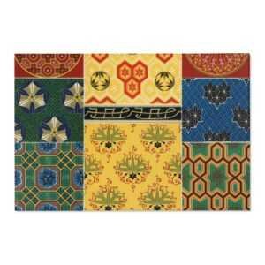
Sashiko, Kimonos & History

Sashiko, Kimonos & History

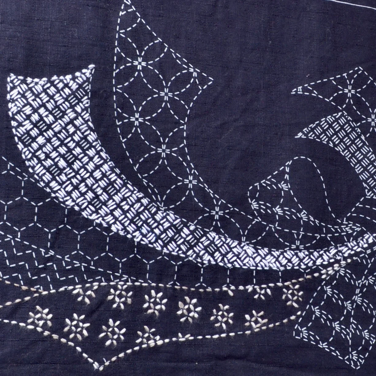
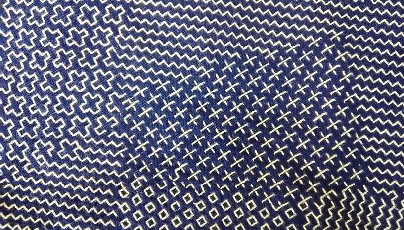
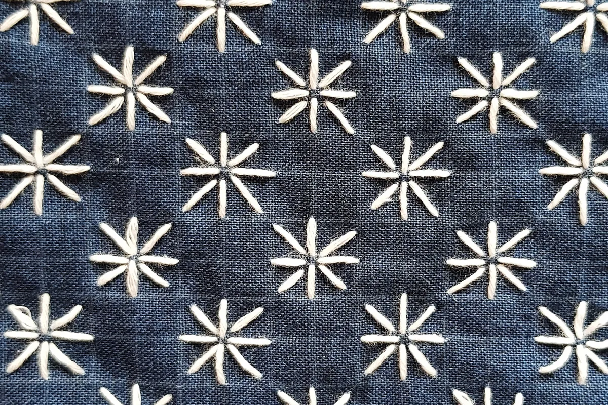
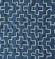
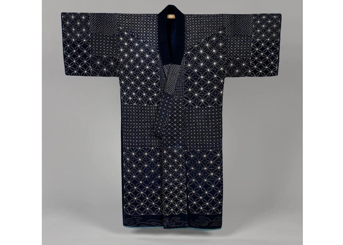
A recent BBC Culture story by Bel Jacobs: The 300-year-old Japanese method of upcycling explores the method of sashiko.

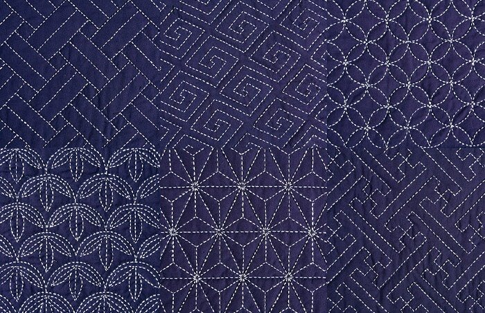
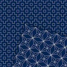
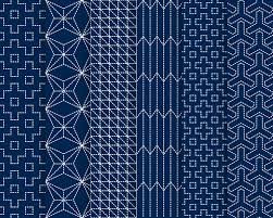
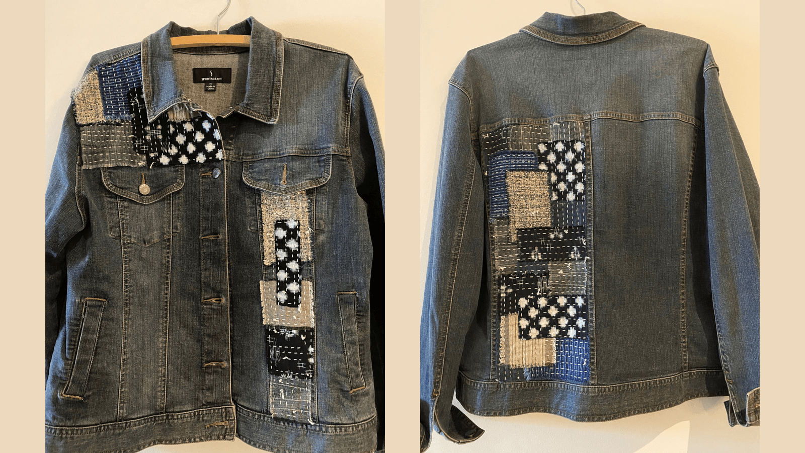
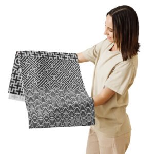
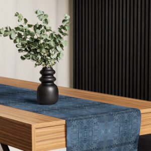
Sashiko emerged through necessity, particularly in poor rural areas, during the Edo period. "Cotton came late to the north of Japan," explains craft and design writer Katie Treggiden. "So the only way people could get hold of it was as tiny rags of fabrics, that were either passed around or bought from tradesmen from the south. Sashiko – literally, 'little stabs' – was a way of connecting all those little pieces into a quilted fabric, known as boro, that would keep them warm."

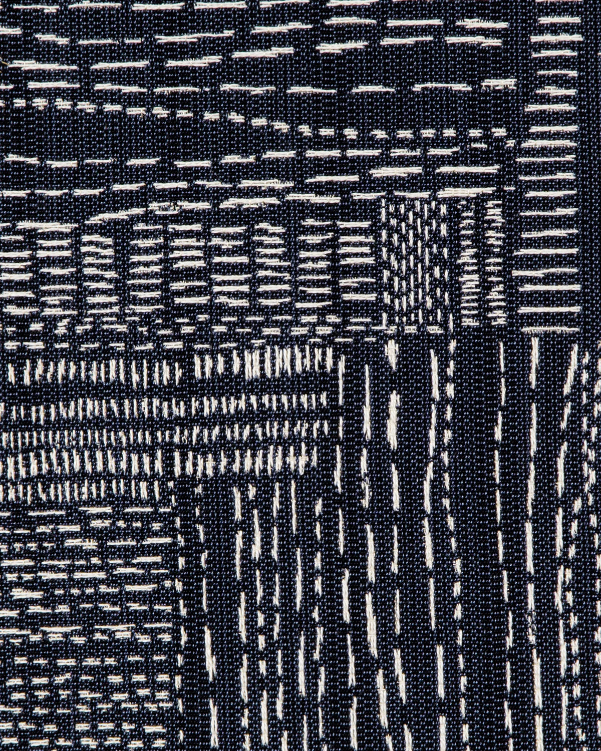
Textiles say so much about the culture in which they are worn and used.

Clothing can immediately identify who we are and what our history is. One can tell eastern v. western, wealthy v. impoverished, northern v southern. Clothing also tells us about the society that created it.

The Surprising History of the Kimono

The first ancestor of the kimono was born in the Heian period (794-1192). Straight cuts of fabric were sewn together to create a garment that fit every sort of body shape. It was easy to wear and infinitely adaptable. By the Edo period (1603-1868) it had evolved into a unisex outer garment called kosode. Literally meaning “small sleeves,” the kosode was characterized by smaller armholes. It was only from the Meiji period (1868-1912) onwards that the garment was called kimono. This last transformation, from the Edo era to modern Japan, is fascinating.
In the early 1600s, First Shogun Tokugawa unified Japan into a feudal shogunate. Edo, renamed Tokyo in 1868, now became Japan’s chief city. The resulting Edo Period (also called the Tokugawa Era) spanned 264 years. The years 1603 to 1868 are known as the last era of traditional Japan. Japanese culture developed with almost no foreign influence during this time. And the kosode was one of the key elements of what it meant to be Japanese.