
Some warm, fuzzy things for you
-

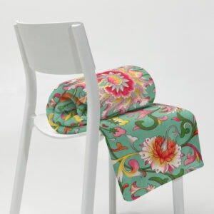
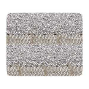
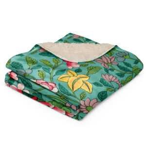
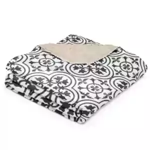
Matthew Digby Wyatt: Luxe Fleece Throw
Price range: $32.23 through $70.13 -
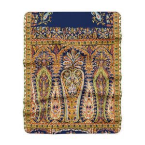
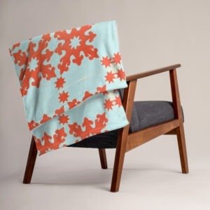
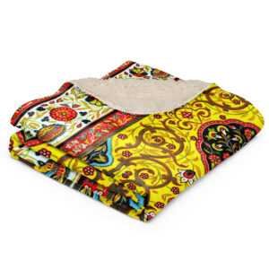
Arabe No.49 Sherpa Blanket
Price range: $42.50 through $68.00 -
Spider Crab Stemless Wine Glass
$15.00 -
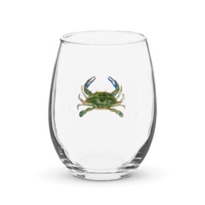
Blue Crab Stemless Wine Glass
$15.00 -
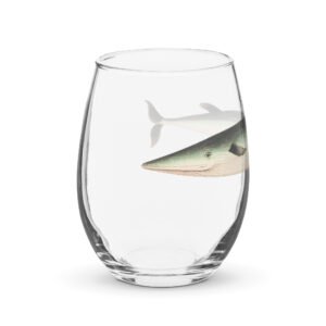
Small-Beaked Whale Stemless Wine Glass
$15.00 -
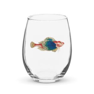
Bluewing Searobin Stemless Wine Glass
$15.00

-
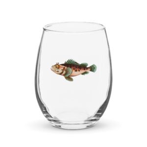
Black Scorpionfish Stemless wine glass
$15.00 -
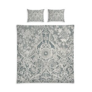
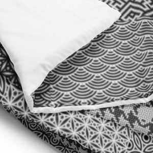
Spatiale Duvet Cover
Price range: $96.50 through $135.00 -
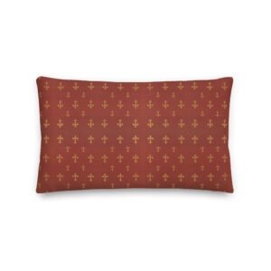
Fleur de Lis Premium Pillow
Price range: $25.00 through $28.00 -
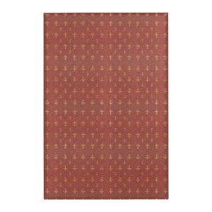
fleur de lis Area Rug
Price range: $31.50 through $98.00 -
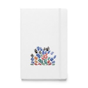
Henri Matisse: The Sheaf (1953) Hardcover Bound Notebook
$24.00 -
Henri Matisse: Blue Nude III (Nu Bleu III) Hardcover Bound Notebook
$24.00 -
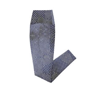
Sashiko Indigo Crossover Leggings with Pockets
Price range: $50.00 through $64.00 -
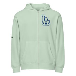
LA Essential Heavyweight Hoodie
$45.00 -
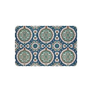
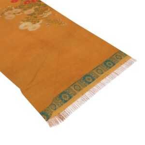
Chinoiserie Throw Blanket
Price range: $46.00 through $74.00 -
Red Quilt Pattern Throw Blanket
Price range: $46.00 through $74.00 -
Octopus Pint Glass — 16oz Kraken Sea Creature Mixing Glass
$15.00 -
Octopus Rocks Glass — 10oz Whiskey Tumbler
$15.00 -
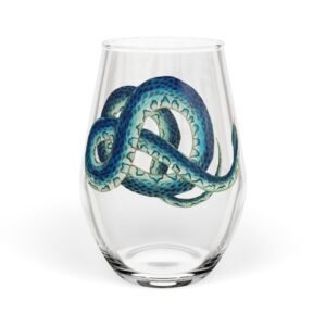
Blue Serpent Stemless Wine Glass — 11.75 oz Artistic Snake Design
$16.58 -
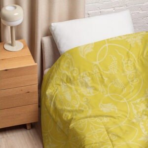
Moyenne Jaune Comforter
Price range: $100.00 through $130.00 -
Black and White Sashiko (刺し子) Comforter
Price range: $100.00 through $130.00 -
DTLA Premium Full Zip Hoodie
Price range: $46.50 through $49.00 -
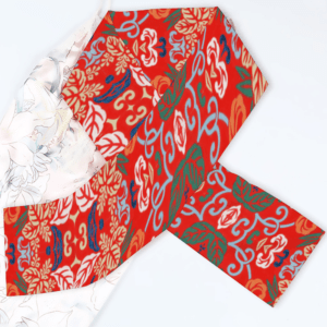
Blau Blumen Velvet Scarf
$34.00 -
夢 (Mèng) | Dream Crushed Velvet Blanket
$59.00 -
Blue Fields Sherpa Blanket
Price range: $55.00 through $82.00 -
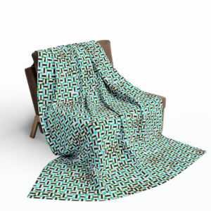
Amani Geometric Design Sherpa Blanket
Price range: $55.00 through $82.00 -
Serene Sherpa Blanket
Price range: $55.00 through $82.00 -
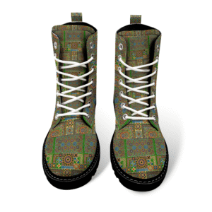
Complex Temple Round Toe Boots
$110.00 -
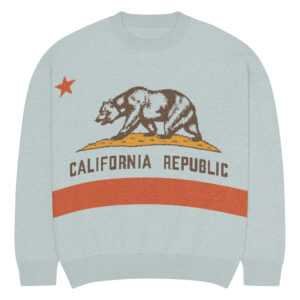
California Republic Relaxed Knitted Crew Neck Sweater
$67.50 -
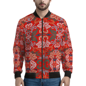
PanAm Embroidered Bomber Jacket
$113.00 -
Our Friendly Octopus Glass Mug. “Let Me Get That For You”
$22.00 -
Cutey Kraken Octopus Glass Mug
$22.00 -
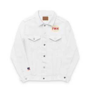
Vintage Airlines: TWA Embroidered Denim Jacket
$100.00 -
Complex Mandala Round Toe Boots
$109.00 -
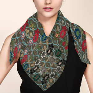
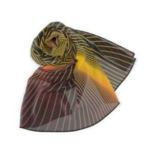
Cadiz Silk-like Scarf
$35.00 -
Open Poppy Sherpa Blanket
Price range: $36.00 through $51.00 -
Spectra Track Jacket
Price range: $84.00 through $87.00 -
Evergreen Lightweight Bomber Jacket
$79.00 -
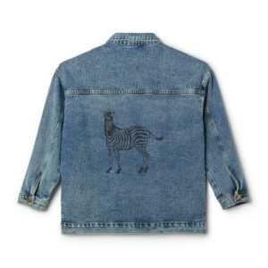
My Zebra Women’s Denim Jacket
$66.00 -
Quail and Rose Light Scarf
$29.95 -
Zeb-ra Men’s Puffer Jacket
$90.00 -
Prismatic Men’s Puffer Jacket
$90.00 -
Helix Puffer Jacket
$90.00 -
Niveau Men’s Puffer Jacket
$90.00 -
Terra Nostra Men’s Puffer Jacket
$90.00 -
Tenerife Fleece Blanket
Price range: $20.00 through $60.00 -
Azores Mosaic Fleece Blanket
Price range: $20.00 through $60.00 -
Candy Arctic Fleece Blanket
Price range: $20.00 through $60.00 -
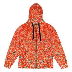
Red Orbit Recycled Zip Hoodie
$76.50 -
Paul Klee: “Old City” (1928) Fleece Sherpa Blanket
Price range: $50.00 through $65.00 -
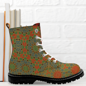
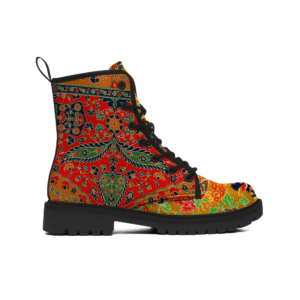
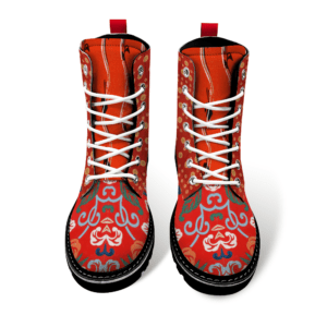
Arabesque Boots
$92.00 -
Crimson Timber Boots
$92.00 -
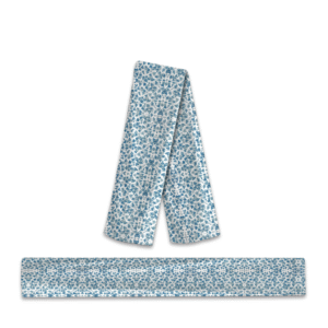
Fractured Delft Poly Scarf
Price range: $28.00 through $76.00 -
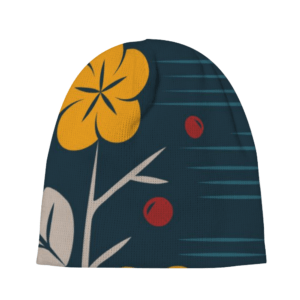
LA Embroidered Beanie
$25.00 -
Racinet: Jade Flower Sherpa Blanket
Price range: $39.00 through $51.00 -
Blue Fields Sherpa Blanket
Price range: $39.00 through $54.00 -
Sea Flower Sherpa Blanket
Price range: $35.00 through $78.00 -
Viol Sherpa Blanket
Price range: $35.00 through $78.00 -
Bee Line Sherpa Blanket
Price range: $35.00 through $78.00 -
Coral Sea Dragon Rounded Toe Boots
$125.00 -
-10%
Honeybee Stemless Wine Glass
Original price was: $15.00.$13.50Current price is: $13.50. -
Gustav Klimt: Choir of Angels Detail Velveteen Minky Blanket
Price range: $26.00 through $58.00 -
Persian XXV Sherpa Blanket
Price range: $42.00 through $55.00 -
Pompeian No. 3, Racinet Velveteen Minky Blanket
Price range: $26.00 through $58.00 -
Aloft Velveteen Minky Blanket
Price range: $26.00 through $58.00 -
Pale Blue Lotus Flannel Slippers
$28.00 -
Golden Cranes Stemless Wine Glass
$15.00 -
Red Sunrise Lightweight Bomber Jacket
Price range: $46.00 through $54.00 -
Blue Vine Thin Satin Shawl
$42.00 -
Blue Vines Sherpa Fleece Blanket
Price range: $50.00 through $67.00 -
Red Blooms Sherpa Fleece Blanket
Price range: $50.00 through $67.00 -
Rainy Graden Sherpa Fleece Blanket
Price range: $50.00 through $67.00 -
Violet Block Sherpa Fleece Blanket
Price range: $50.00 through $67.00 -
-7%
Flying Crane Thin Flannel Blanket
Original price was: $45.00.$42.00Current price is: $42.00. -
Yellow River Dragon Flannel Slippers
$28.00 -
Quilted Flannel Slippers
$28.00 -
Jardins Velvet Scarf
$26.00 -
Dawn Garden Velvet Scarf
$26.00 -
Fête Rouge Scarf
$34.00 -
Blue Porcelain Fleece Blanket
Price range: $28.00 through $60.00 -
Indigo Jag Zippered Boots
$52.00 -
Blue Lotus Zippered Boots
$52.00 -
Flower Walk Crochet Beanie
$19.00 -
Fire Red Dragon Boots
$99.00 -
Quartrefoil Sherpa Blanket
Price range: $44.00 through $52.00 -
Broken Pool Poly Scarf
Price range: $28.00 through $76.00 -
Bloo Men’s Canvas Boots
$110.00 -
Unicornia Men’s Canvas Boots
$110.00 -
Cold Bolt Men’s Canvas Boots
$110.00 -
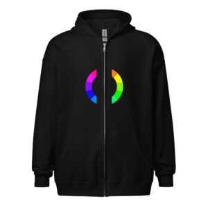
Color Spectra Customizable Unisex Hoodie
Price range: $44.00 through $48.00 -
Global Warming Stripes Soft Polyester Blanket
Price range: $25.00 through $50.00 -
Gentle Yellow Tide Poly Scarf
Price range: $24.00 through $75.00 -
Rose Sine Wave Poly Scarf
Price range: $24.00 through $75.00 -
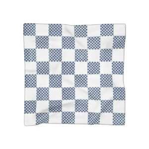
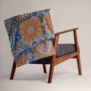
Scarves Couture Fit
Price range: $32.00 through $64.00 -
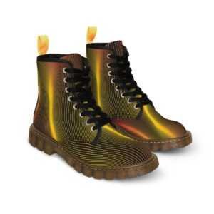
Helios Men’s Canvas Boots
$105.00 -
Cherry Brougham Poly Scarf
Price range: $24.00 through $75.00 -
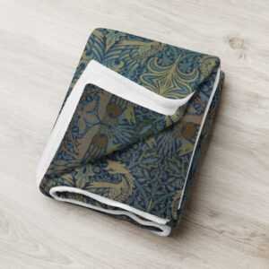
William Morris: Snakehead Cerulean Sea Throw Blanket
Price range: $35.00 through $51.00 -
Gilded Ivy Throw Blanket
Price range: $35.00 through $51.00 -
Amity Quilt Throw Blanket
Price range: $35.00 through $51.00 -
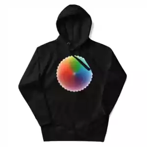
Color Wheel Unisex Heavy Blend Zip Hoodie
Price range: $45.00 through $50.50 -
Banana Leaf Sweatpants
$48.00 -
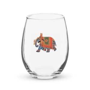
-10%
Ornate Elephant Stemless Wine Glass
Original price was: $15.00.$13.50Current price is: $13.50. -
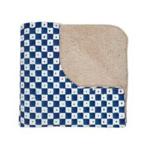
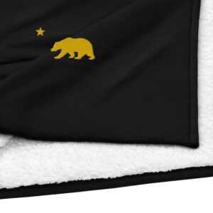
Golden State Premium Sherpa Blanket
$80.00


")


")
