
the Elegance and Subtle Formality of Kimonos
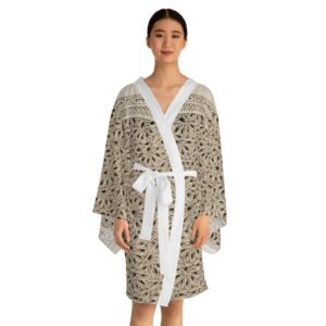
The haori (羽織) is a traditional Japanese jacket worn over a kimono. Resembling a shortened kimono with no overlapping front panels (okumi), the haori typically features a thinner collar than that of a kimono, and is sewn with the addition of two thin, triangular panels at either side seam. The haori is usually tied at the front with two short cords, known as haori himo, which attach to small loops sewn inside the garment.
During the Edo period, economic growth within the wealthy but low-status merchant classes resulted in an excess of disposable income, much of which was spent on clothing. It was during this period that, due to various edicts on dress mandated by the ruling classes, merchant-class Japanese men began to wear haori with plain external designs and lavishly-decorated linings, a trend still seen in men's haori
types of kimonos
Komon (小紋)
Komon (小紋): The lowest form of normal kimono. Meaning “Small Pattern,” it is characterized by its repeating patterns that can either be printed, painted, stencilled, or woven. They are worn as everyday wear, like when shopping or being out and around town.
It is a versatile and everyday kimono style that features repeating patterns. Whether you're out shopping or exploring the town, Komon is the perfect choice for casual wear. Its charming designs add a touch of elegance to your daily activities, making you stand out with effortless style.
Iromuji (色無地)
Iromuji (色無地): The second lowest of the normal kimono and the lowest of all formal kimono. Iromuji means “Single Solid Colour” and consists of just one colour with no decoration whatsoever. The only adornment that may be found would be patterns woven into the silk itself, but otherwise is quite plain. Weaving designs into silk is called Rinzu (綸子). Iromuji is also the lowest formality in which you will find Kamon (家紋). Meaning “Family Crest,” they are added to kimono as a sign of formality. Kamon can be added in sets of five, being the most formal, three, being the second most formal, and one, being the least formal. The number of kamon must also match the level of formality for the kimono, so you will only ever find a single kamon on an iromuji.
Tsukesage (付け下げ)
Tsukesage (付け下げ): The middle level of formality of all kimono. The term comes from the placement of its patterns as Tsueksage means “To Put Down.” Kimono are stitched together from long, rectangular pieces of fabric known as Tan (反), which are visible at the seam lines. When it comes to a tsueksage the decoration will always stay within the individual tan and not cross over to create larger or more cohesive patterns. When seen from afar the patterns seem to flow downwards, hence the name. They are almost always made of silk and can feature kamon, but only up to three.
Houmongi (訪問着)
Houmongi (訪問着): The second most formal kimono and considered suitable to wear to all formal occasions. They are often considered the most beautiful kimono because they are covered by flowing patterns and motifs that stretch across the entire garment. The name houmongi means “Visiting Wear” as they were originally worn to pay respects to neighbours on formal occasions. They will feature kamon more often than not and can have anywhere between one and five of them present. Du to their high formality they are always made from silk.
Furisode (振袖)
Furisode (振袖): The most formal type of kimono for unmarried women. When it comes to furisode there are three different sleeve lengths. They are: Ko Furisode (小振袖), meaning “Small Swinging Sleeves,” Chū Furisode (中振袖), meaning “Middle Swinging Sleeves,” and Ō Furisode (大振袖), meaning “Large Swinging Sleeves.” Today the word furisode brings to mind the ō furisode as it’s the most commonly worn type, but prior to World War II it was very common to also see ko furisode and chū furisode as sleeve length determined how formal a kimono was. Ko furisode and chū furisode are considered semi-formal wear, but are rarely ever made anymore due to the decline in kimono ownership.
Tomesode (留袖)
Tomesode (留袖): The most formal kimono of all. It is characterized by its solid colour background, usually black, and motifs that are only found bellow the waist. Black used to be the hardest colour dye to produce before synthetic or imported dyes were introduced, so it was considered a precious colour that would only be used for the most important garments. Tomesode means “Fastened Sleeves” as traditionally a bride would cut the sleeves from her furisode and then wear that kimono as a married woman in the form of a tomesode. They will always feature five crests and are worn by married women to formal occasions, usually the mother of the bride or groom at a wedding.
— source