RGB v. CMYK: Color Theory 101
Color is one of the most essential design elements. This site uses many different techniques to deliver items that are as sharp and vivid as the images that are presented on the web site.
There are very specific differences between what is displayed versus what is printed. Let’s take a quick look at some basic physics of rendering colors:
RGB is an additive color model, while CMYK is subtractive.
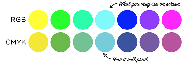
RGB uses white as a combination of all primary colors and black as the absence of light. CMYK, on the other hand, uses white as the natural color of the print background and black as a combination of colored inks. Graphic designers and print providers use the RGB color model for any type of media that transmits light, such as computer screens. RGB is ideal for digital media designs because these mediums emit color as red, green, or blue light.
RGB is best for websites and digital communications, while CMYK is better for print materials. Most design fields recognize RGB as the primary colors, while CMYK is a subtractive model of color.
With the RGB color model, pixels on a digital monitor are – if viewed with a magnifying glass – all one of three colors: red, green, or blue. The white light emitted through the screen blends the three colors on the eye’s retina to create a wide range of other perceived colors. With RGB, the more color beams the device emits, the closer the color gets to white. Not emitting any beams, however, leads to the color black.
This is the opposite of how CMYK works.
CMYK is best for print materials because print mediums use colored inks for messaging. CMYK subtracts colors from natural white light and turns them into pigments or dyes. Printers then put these pigments onto paper in tiny cyan, magenta, yellow, and black dots – spread out or close together to create the desired colors. With CYMK, the more colored ink placed on a page, the closer the color gets to black. Subtracting cyan, magenta, yellow, and black inks create white – or the original color of the paper or background. RGB color values range from 0 to 255, while CMYK ranges from 0-100%.
Source: Boingo Graphics


")