The Cephalopod Motif: Octopuses in Fine Art
Just like the ethereal jellyfish, the octopus has fascinated fine artists across centuries and continents. However, while jellyfish were primarily celebrated for their delicate, radial symmetry, the octopus has occupied a far more complex visual dualism. It has been depicted as a master of camouflage and mimicry, a terrifying sea monster of the deep, and a symbol of fluid, cosmic grace.
Ancient Maritime Civilizations: Mimicry and Decoration
In the ancient Mediterranean, the octopus was a daily reality for coastal communities, valued both as a food source and as a marvel of natural engineering.
Minoan “Marine Style” Pottery (c. 1500 BCE): The artisans of ancient Crete were the first to truly master the octopus form. On the famous Minoan Stirrup Jars, painters wrapped the creature’s bulbous body around the vessel’s center, allowing its fluid, looping tentacles to dynamically follow the natural, rounded curves of the terracotta. It was celebrated as a sacred symbol of ocean life.
Graeco-Roman Mosaics and Fish Plates (c. 1st Century BCE): In ancient Roman villas, such as the House of Geometric Mosaics in Pompeii, highly realistic stone mosaics featured octopuses entwined with other marine life. Classical writers like Aristotle marveled at the octopus’s ability to seamlessly change colors and mimic underwater rocks. Art historians note that painting or tiling an octopus became a self-reflexive exercise for classical artists: imitating nature’s ultimate master of visual illusion.
East Asian Traditions: Monsters, Myths, and Metaphor
In Japan’s Edo and Meiji periods, the octopus transformed into a prominent figure within woodblock printing (Ukiyo-e), representing everything from deep-sea terrors to playful folklore.
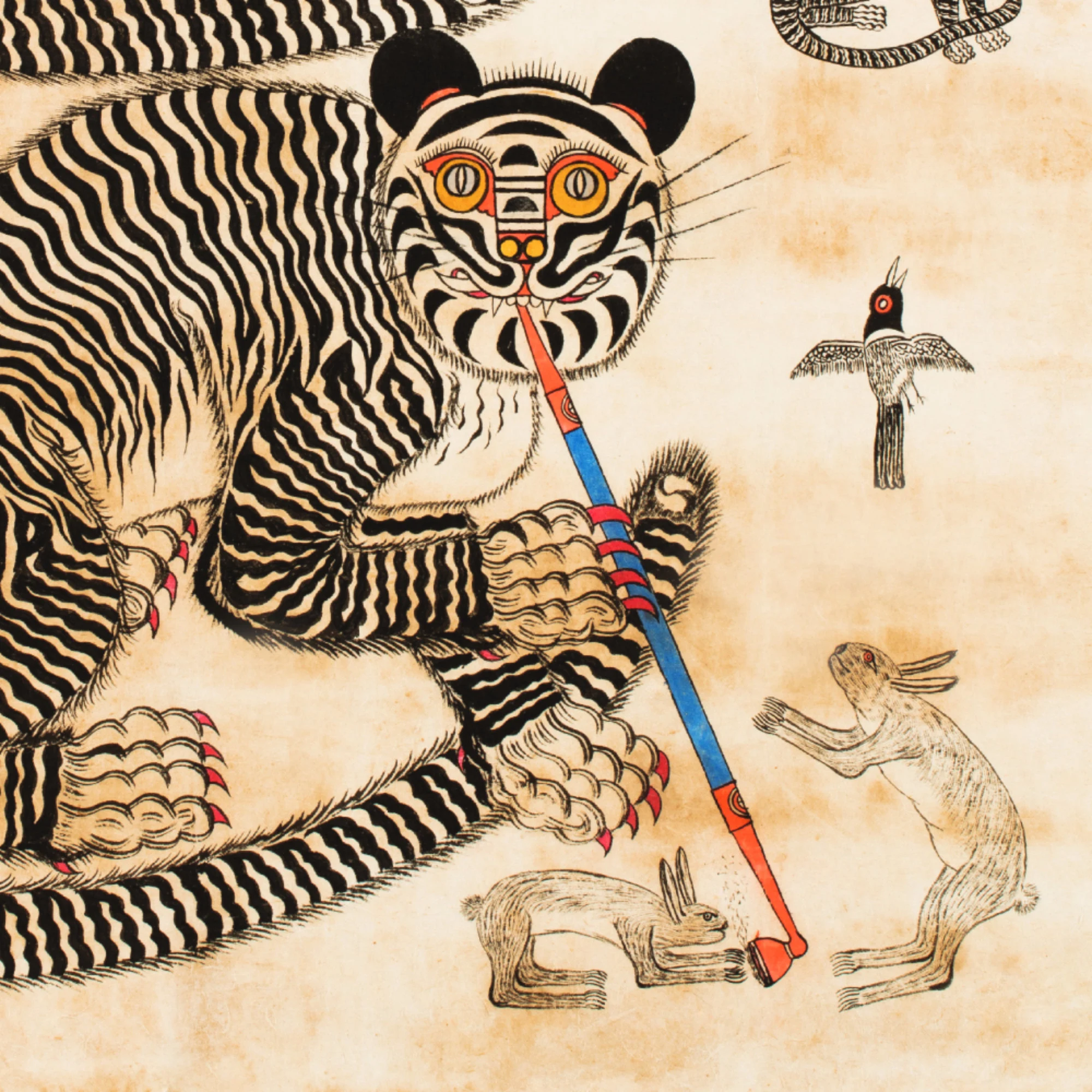
The Giant Sea Monster: Ukiyo-e master Utagawa Kuniyoshi frequently depicted the dramatic clashes between man and nature. In prints like Ariō Maru Battling a Giant Octopus (c. 1833–1835), the cephalopod is elevated to a terrifying monster with massive, bulging eyes and sweeping tentacles crashing against ships and heroes.
The Dream of the Fisherman’s Wife (1814): In a radically different register, Katsushika Hokusai used the fluid, boneless anatomy of the octopus to pioneer erotic surrealism. His famous shunga print depicts a woman entwined with a large and a small octopus, using the undulating, enveloping forms of the creature as a metaphor for overwhelming desire and the mysteries of the deep ocean.
The Scientific Revolution to Modern Surrealism:
As the maritime world shifted from myth to empirical science, the octopus became a subject of meticulous documentation before transitioning into 20th-century fantasy.
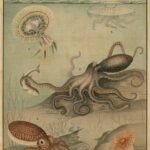
Lord Bodner’s Deep Sea Studies (1826): In London, scientist and illustrator Lord Bodner published highly influential copperplate engravings of cephalopods. His portraits stripped away the legendary “Kraken” myths, presenting the octopus on a clean white background with fine, textured anatomical precision, capturing every individual sucker with scientific clarity.
Victor Grasso’s Surreal Narratives: In modern surrealist watercolor painting, artists continue to use the octopus to symbolize emotional entanglement and mystery. In works by contemporary artists like Victor Grasso, massive octopuses are lifted out of the ocean and perched atop domestic architecture like chimneys, clutching odd human artifacts (like umbrellas and skull ornaments) in their arms to create an ominous, dreamlike atmosphere.
Contemporary Interventions: Animals as Co-Creators
In the 21st century, artists have pushed the boundary of fine art by treating the octopus not just as a subject, but as an active collaborator.
Shimabuku’s Octopus Collaborations: Contemporary Japanese artist Shimabuku has spent over two decades exploring the inner minds of marine invertebrates. In his avant-garde installation pieces, he places custom ceramic sculptures and marbles on the ocean floor, filming wild octopuses as they curiously examine, collect, and rearrange the items. By centering the choices and aesthetic preferences of the animal, Shimabuku completely upends the traditional human-dominated definition of fine art.
")


 The Cephalopod Motif: Octopuses in Fine Art
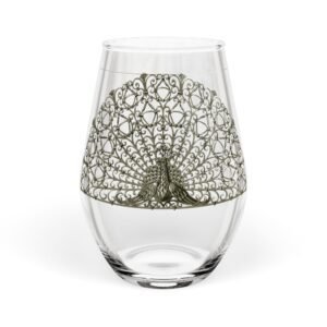
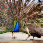 Among all avian subjects, the peacock holds an unrivaled position in global art history. Its iridescent plumage, sweeping train, and regal bearing made it the ultimate canvas for exploring luxury, divinity, immortality, and vanity.
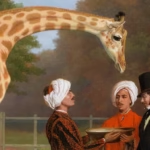 The Giraffe as Celebrity
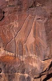
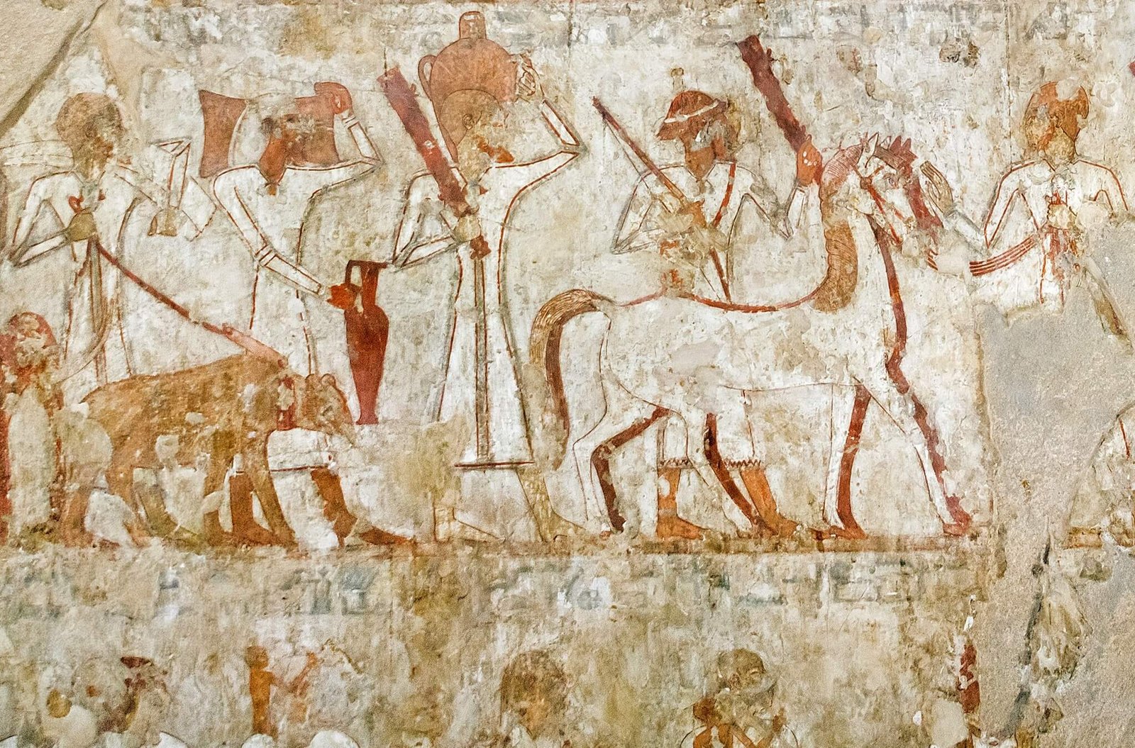
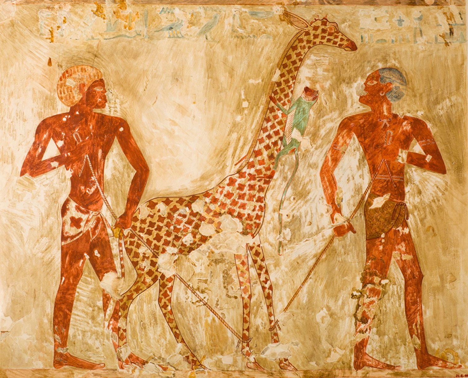
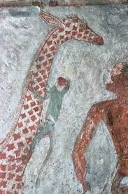


")