Slim Aarons was an American photographer noted for his images of socialites, jet-setters and celebrities. His work principally appeared in Life, Town & Country and Holiday magazines.
In his series of photos, Aarons documents the luxurious, pleasure class of the 60s and 70s.
Palm Springs, California could have been the only backdrop to such a menagerie of people.
After the war, Aarons moved to California and began photographing celebrities. In California, he shot his most praised photo, Kings of Hollywood, a 1957 New's Year's Eve photograph depicting Clark Gable, Van Heflin, Gary Cooper, and James Stewart relaxing at a bar in full formal wear.
Aarons never used a stylist, or a makeup artist. He made his career out of what he called "photographing attractive people doing attractive things in attractive places." An oft-cited example of this approach is his 1970 Poolside Gossip shot at the Kaufmann Desert House designed by Richard Neutra, with owner Nelda Linsk as one of the models in the photo. "I knew everyone," he said in an interview with The (London) Independent in 2002. "They would invite me to one of their parties because they knew I wouldn't hurt them. I was one of them." Alfred Hitchcock's film, Rear Window (1954), whose main character is a photographer played by Jimmy Stewart, is set in an apartment reputed to be based on Aarons' apartment.
In 1997, Mark Getty, the co-founder of Getty Images, visited Aarons in his home and bought Aarons' entire archive.
In 2017, filmmaker Fritz Mitchell released a documentary about Aarons, called Slim Aarons: The High Life. In the documentary it is revealed that Aarons was Jewish and grew up in conditions that were in complete contrast to what he told friends and family of his childhood. Aarons claimed that he was raised in New Hampshire, was an orphan, and had no living relations. After his death in 2006, his widow and daughter learned the truth that Aarons had grown up in a poor immigrant Yiddish-speaking family on the Lower East Side of Manhattan. When he was a boy, his mother was diagnosed with mental health issues and admitted to a psychiatric hospital, which caused him to be passed around among relatives. He resented and had no relationship with his father and had a brother, Harry, who would later commit suicide. Several documentary interviewees postulate that if Aarons's true origins had been known, his career would have been unlikely to succeed within the restricted world of celebrity and WASP privilege his photography glamorized.
the different technologies used in creating print-on-demand products
Direct-to-Garment (DTG)
Direct-to-Garment printing (DTG) was developed as an inexpensive mass-production alternative to screen-printing. This method involves printing ink directly onto a treated garment – almost like a giant laser jet printer.
While DTG has appeal in regard to cost, color capabilities, & complexity of the designs it can print, it falls short in some of our other assessment categories. The versatility of the print method is lacking as prints are only successful on cotton garments – this leaves popular garments like hoodies, sweatshirts, & activewear either out of the catalog or looking a little lackluster. DTG prints also vary widely in consistency from one machine to the next, one garment to another, & among different color materials, which means your design may look perfectly accurate on a royal blue t-shirt but awful on a burgundy sweatshirt. This inconsistency leads to higher error rates & increased waste. While we love the look & feel of a DTG print, the longevity of that look & feel isn’t as impressive as some of the other print methods on this list.
Direct-to-Film (DTF)
Direct to film, commonly known as DTF, is a process in which a graphic printed onto a piece of film with various colored inks is applied to an apparel item. This pre-printed film is binded to the garment through heat and pressure from a heat-press machine. This creates a long-lasting and detailed graphic that can be placed on an array of garments.
DTF printing starts with the film being made on a DTF printer. This printer uses a thick PET film that ensures for better transferring characteristics. The ink used for these printers are in the typical CMYK (cyan, Magenta, Yellow & Black) pigment but also has the addition of white ink. The white ink plays a significant role in the creation of the DTF film as it is the foundation that the colored pigments get placed on.
Sublimation
You might remember the word “sublimation” from high school science class, but in POD, it’s a print method that uses heat & pressure to turn ink into gas & transfer it from paper onto another surface.
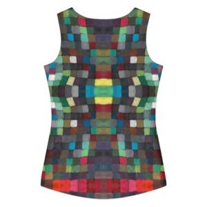
Overall, sublimation is an incredibly versatile print method, allowing for printing of both hard surfaces & porous materials. For printing garments, however, it’s limited to white polyester fabrics. In sublimation, the entire garment is printed, which means it’s better suited to edge-to-edge patterns than something like a graphic tee. While sublimation opens the door to incredible color and detail accuracy, it also has a higher error rate as the garment must be 100% flat for color to distribute evenly. When errors occur due to folds or elevated parts of the garment like seams, it often results in white unprinted areas on the final garment.
Vinyl
Decorating a garment with vinyl involves printing the design on heat transfer paper & using a combination of heat & pressure to transfer it onto a garment. Unlike sublimation, the print sits on top of the garment rather than being incorporated into the fibers.
Vinyl is an inexpensive alternative to screen printing for printing a smaller volume of garments. However, it’s quite time intensive per print as it involves manually trimming back the transfer paper, making it less than ideal for print on demand. Vinyl prints are also sensitive to heat & cannot be ironed without melting the print. While they’re able to capture more complex colors, vinyl prints are not conducive to small text or shapes with detailed edges as this requires excess vinyl to be manually pulled away from the detailed edges. Prints are also less durable & more prone to cracking as vinyl is heavy & inflexible.
Embroidery
Embroidery differs from the other decoration methods mentioned here, since it doesn’t really involve “printing” anything. Embroidery involves sewing a design into a garment with needle & thread – almost as old-school as it gets. In print-on-demand, it’s a little more technical. Your designs are converted into digital embroidery files that outline exactly where every stitch should be placed & what color thread should be used to do so. This file is then loaded onto an embroidery machine that places that design on a garment using as many spools of thread as are needed to create your design.
While it’s a great decoration method to use when embroidery is what’s desired, it’s quite a bit more expensive, restrictive, & time intensive than its other POD counterparts. Because your artwork needs to be digitized to be optimized for embroidery, it can take a bit longer for your products to be decorated than other decoration methods. Additionally, embroidery limits both design colors & design complexity – only a certain number of thread spool colors are available on each machine & a stitch can only be so small. This means you’ve got to be more conscious of the decoration method’s limitations when designing your clothing.
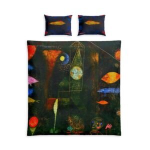
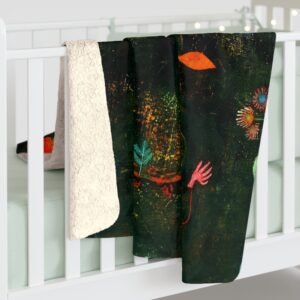
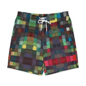
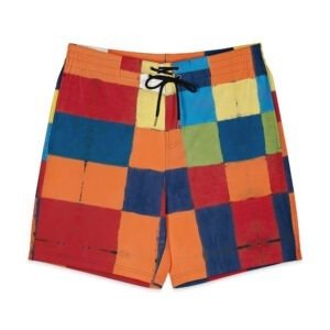
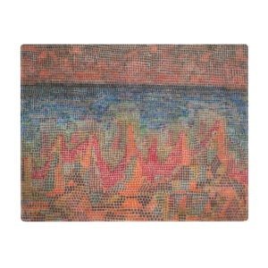
Paul Klee (German: [paʊ̯l ˈkleː]; 18 December 1879 – 29 June 1940) was a Swiss-born German artist. His highly individual style was influenced by movements in art that included expressionism, cubism, and surrealism. Klee was a natural draftsman who experimented with and eventually deeply explored color theory, writing about it extensively; his lectures Writings on Form and Design Theory (Schriften zur Form und Gestaltungslehre), published in English as the Paul Klee Notebooks, are held to be as important for modern art as Leonardo da Vinci's A Treatise on Painting was for the Renaissance.[1][2][3] He and his colleague, Russian painter Wassily Kandinsky, both taught at the Bauhaus school of art, design and architecture in Germany. His works reflect his dry humor and his sometimes childlike perspective, his personal moods and beliefs, and his musicality.
Klee was at the peak of his creative output. His Ad Parnassum (1932) is considered his masterpiece and the best example of his pointillist style; it is also one of his largest, most finely worked paintings.[53][54] He produced nearly 500 works in 1933 during his last year in Germany.[55] However, in 1933, Klee began experiencing the symptoms of what was diagnosed as scleroderma after his death. The progression of his fatal disease, which made swallowing very difficult, can be followed through the art he created in his last years. His output in 1936 was only 25 pictures. In the later 1930s, his health recovered somewhat and he was encouraged by a visit from Kandinsky and Picasso.[56] Klee's simpler and larger designs enabled him to keep up his output in his final years, and in 1939 he created over 1,200 works, a career high for one year.[57] He used heavier lines and mainly geometric forms with fewer but larger blocks of color. His varied color palettes, some with bright colors and others somber, perhaps reflected his alternating moods of optimism and pessimism.[58] Back in Germany in 1937, seventeen of Klee's pictures were included in an exhibition of "Degenerate art" and 102 of his works in public collections were seized by the Nazis.[59]
Klee has been variously associated with Expressionism, Cubism, Futurism, Surrealism, and Abstraction, but his pictures are difficult to classify. He generally worked in isolation from his peers, and interpreted new art trends in his own way. He was inventive in his methods and technique. Klee worked in many different media—oil paint, watercolor, ink, pastel, etching, and others. He often combined them into one work. He used canvas, burlap, muslin, linen, gauze, cardboard, metal foils, fabric, wallpaper, and newsprint.[65] Klee employed spray paint, knife application, stamping, glazing, and impasto, and mixed media such as oil with watercolor, watercolor with pen and India ink, and oil with tempera.[66]
Admit it. It's fun to laugh at global warming deniers. Until you realize that they're serious.
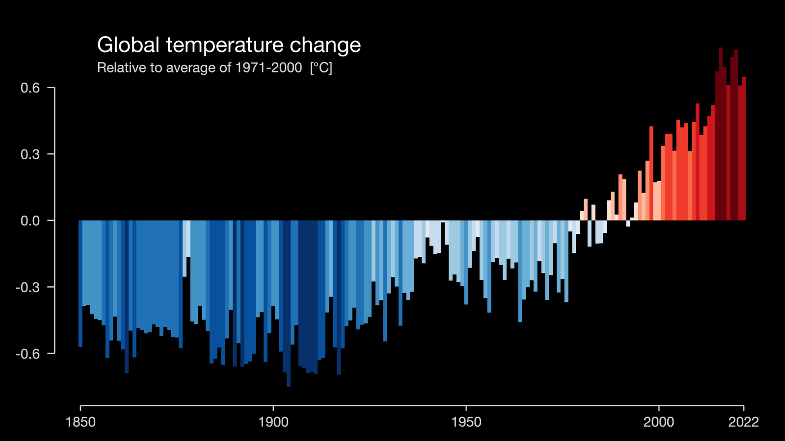
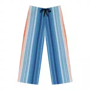
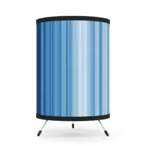
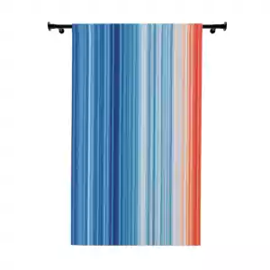
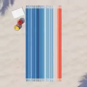
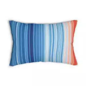
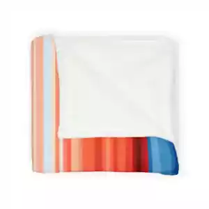
Design can be many things, but the thing at which it succeeds best is education. Professor Ed Hawkins (University of Reading) has created a graphic entitled "Climate Stripes" which make an eloquent, and damning point. The Earth is indeed warming. Terrifyingly so:
since 2000, heating of the planet has in fact continued at a rate equivalent to more than 250 billion 1KW household electric heaters. This is based upon evidence from thousands of automated ocean buoys that measure down to a depth of nearly 2km, combined with global satellite data measuring radiative energy entering and leaving the planet. Recent research indicates the current slowing in the rate of surface warming is primarily caused by natural ocean variability linked to La Niña conditions affecting the Pacific. During the 1980s and 1990s, heating from greenhouse gases warmed the upper layers of the ocean, which affected global surface temperatures. In the 2000s, changes in ocean circulation have caused this additional heat energy to affect deeper layers beneath the sea surface as demonstrated using a combination of simulations and observations.
cgk.ink cares deeply about this topic. We're proud to be an early adopter of Stripe (our credit card processor) Climate, joining over 25K small and large businesses. We contribute 1% to the Climate fund which uses that money to fund large-scale carbon removal.
To be clear, we contribute 1%, not you (although you are welcome to!). This contribution is not factored into our pricing and is automatically processed through Stripe.
We're fascinated by airlines. Specifically, the airlines operating in the period of c. 1950-1980.
During those three decades, something extraordinary happened: design and technology merged for the first time with audacious, striking results.
Looking backward at the history of aviation design (graphics, illustrations, photography, couture +), there is a marked shift in how the industry portrayed itself. Corporate identity went from trust-inspiring, federal-looking shields and banners to bold typefaces, abstract forms and creative color palettes.
The thirty years of the period saw, as we all know now, an extremely volatile culture as America redesigned itself from a war-making country to conqueror of world markets. And airlines were our new ambassadors (or propagandists). The shift in design was (and is) as profound as the society from which it was formed.
a material world
We're experiencing something similar. The "flattening" of logos, meaning the loss of shadows, perspective and depth) is a precursor to today's material design as professed by Google and like-minded companies.
Material Design is a design language developed by Google in 2014. Expanding on the "cards" that debuted in Google Now, Material Design uses more grid-based layouts, responsive animations and transitions, padding, and depth effects such as lighting and shadows. Wikipedia
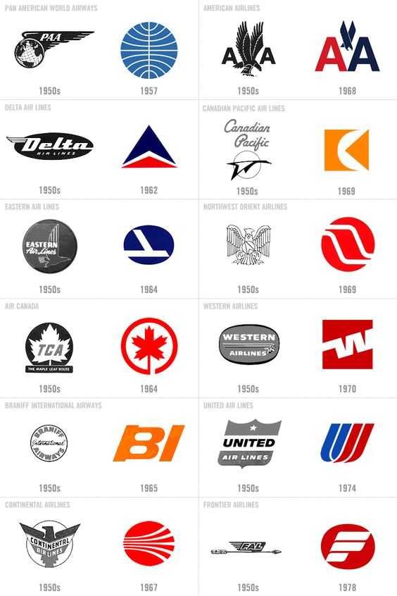
This design evolution is very apparent in the following examples from BrandedSkies.com:
You'll notice that shadows, filigrees, framing and, perhaps most remarkably, text in any form gives way to abstract form and meta-meaning.
the difference this time
It may not be possible to experience such a dramatic shift in design now. The emergence of "material" design already quotes previous design trends and reiterates them. The shift from ornamentation to abstract, free-form shapes has more to do with the fact that most communication is now digital and visual. Airlines (and other industries) do not need to stand out in print, they need to punch us in the eye so that we click.
We welcome your feedback as we explore this topic.
To provide the best experiences, we use technologies like cookies to store and/or access device information.
Not consenting or withdrawing consent, may adversely affect certain features and functions.
Functional
Always active
The technical storage or access is strictly necessary for the legitimate purpose of enabling the use of a specific service explicitly requested by the subscriber or user, or for the sole purpose of carrying out the transmission of a communication over an electronic communications network.
Preferences
The technical storage or access is necessary for the legitimate purpose of storing preferences that are not requested by the subscriber or user.
Statistics
The technical storage or access that is used exclusively for statistical purposes.The technical storage or access that is used exclusively for anonymous statistical purposes. Without a subpoena, voluntary compliance on the part of your Internet Service Provider, or additional records from a third party, information stored or retrieved for this purpose alone cannot usually be used to identify you.
Marketing
The technical storage or access is required to create user profiles to send advertising, or to track the user on a website or across several websites for similar marketing purposes.