Description
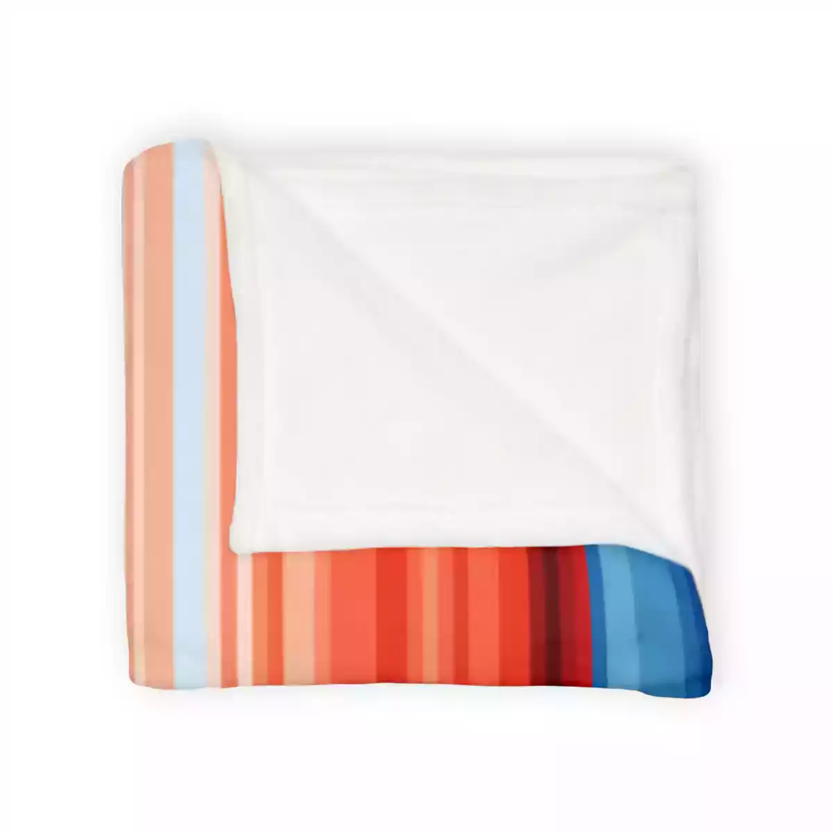
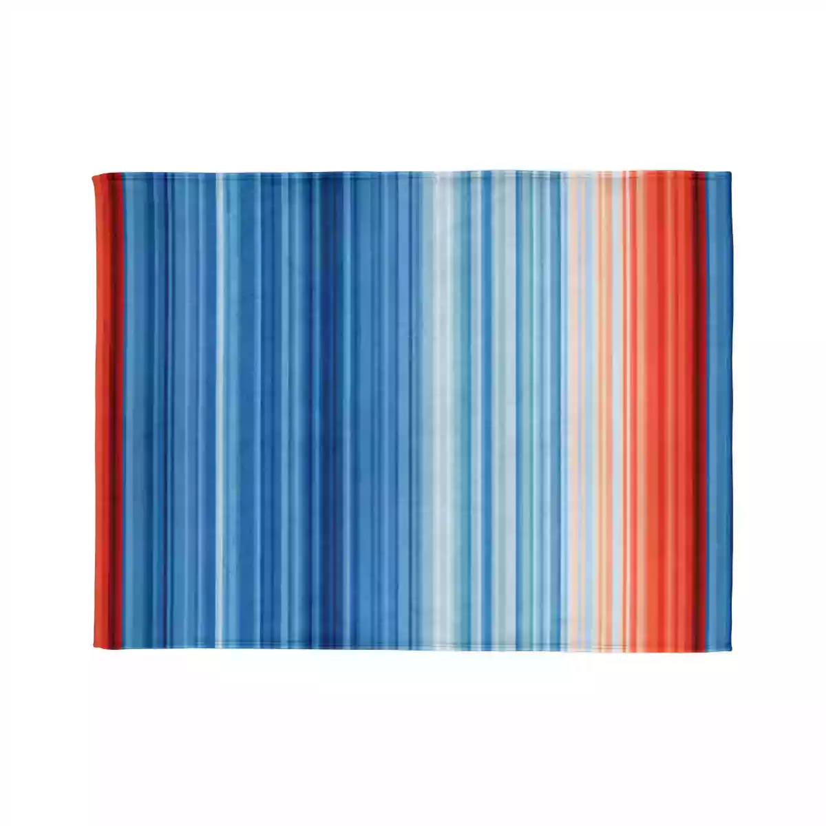
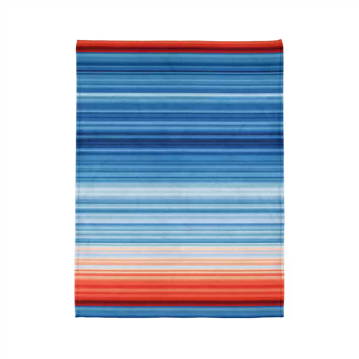
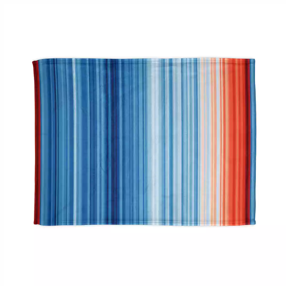
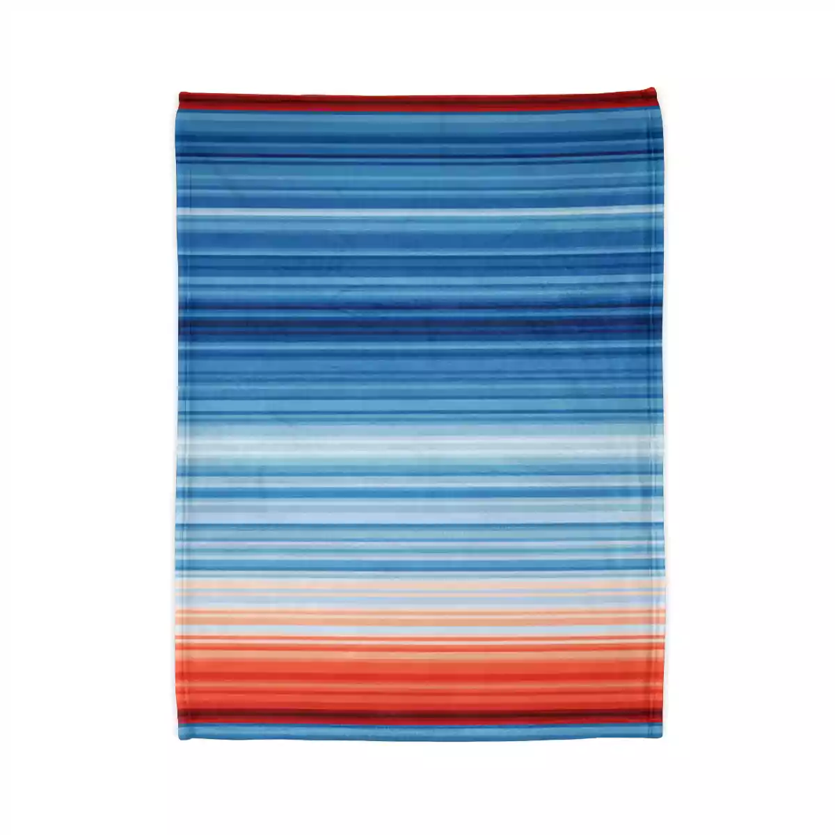
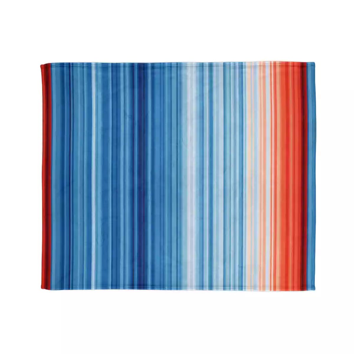
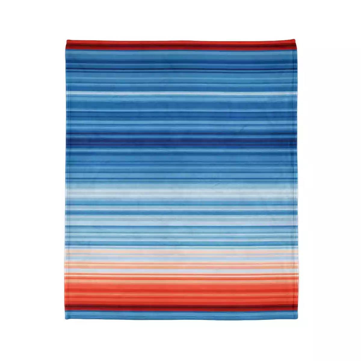
Each stripe represents the average temperature for a single year, relative to the average temperature over the period as a whole. Shades of blue indicate cooler-than-average years, while red shows years that were hotter than average. The stark band of deep red stripes on the right-hand side of the graphic show the rapid heating of our planet in recent decades.
Start the conversation
The graphics also show how no corner of the globe is immune from the effects of global warming. Stripes images for more than 200 countries, states and cities are available to download for free from the showyourstripes.info website. People in every country can see how their home is heating and share the images, helping to start conversations about climate change.
Global impact
The stripes are already having an impact. More than a million people downloaded graphics from the site within a week of its launch in 2019.
Television weather presenters, scientists and campaigners worldwide continue to wear and share them on social media – using the hashtag #showyourstripes – each June on the summer/winter solstice. The stripes have appeared on the Main Stage at Reading Festival, on badges worn by US senators, at school climate strikes, and on electric cars, trams and trains.
Previous images designed by Professor Ed Hawkins includes the animated ‘climate spiral’ of global temperature, which was used in the opening ceremony for the 2016 Olympic Games in Rio.
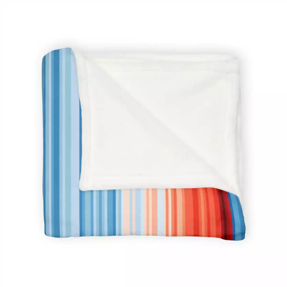
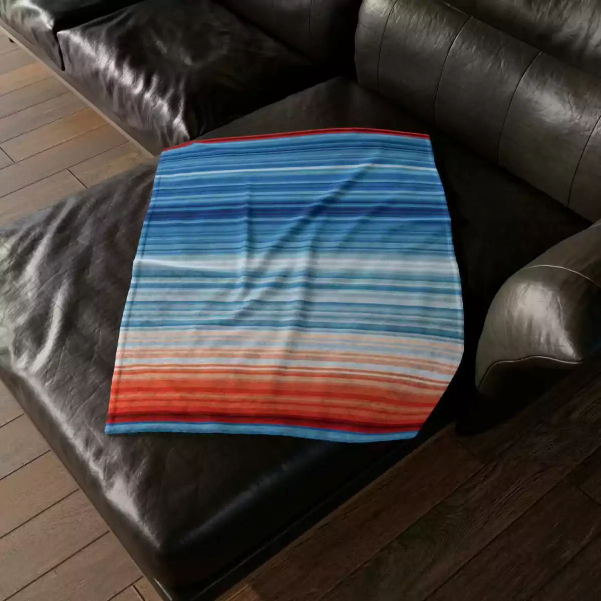
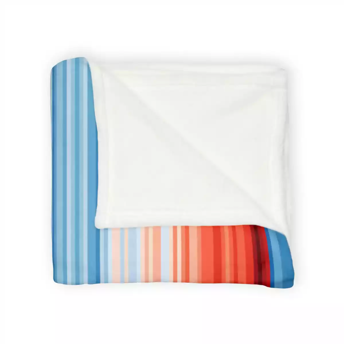
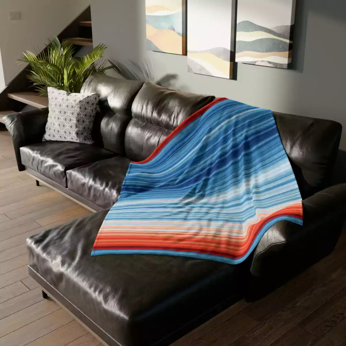
Available in 3 sizes, these personalized minky blankets are the perfect means to keep cozy in style. Each blanket is incredibly comfy and soft to the touch. Add your design to create a favorite take along.






Reviews
There are no reviews yet.