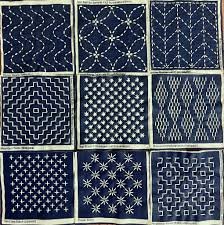
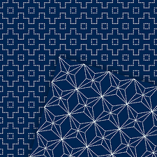
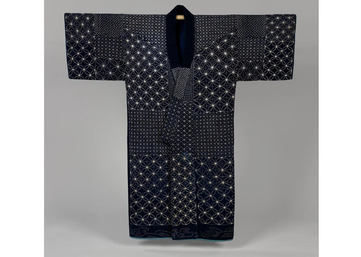
Sashiko, Kimonos & History
A recent BBC Culture story by Bel Jacobs: The 300-year-old Japanese method of upcycling explores the method of sashiko.
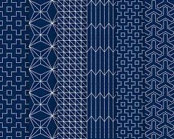
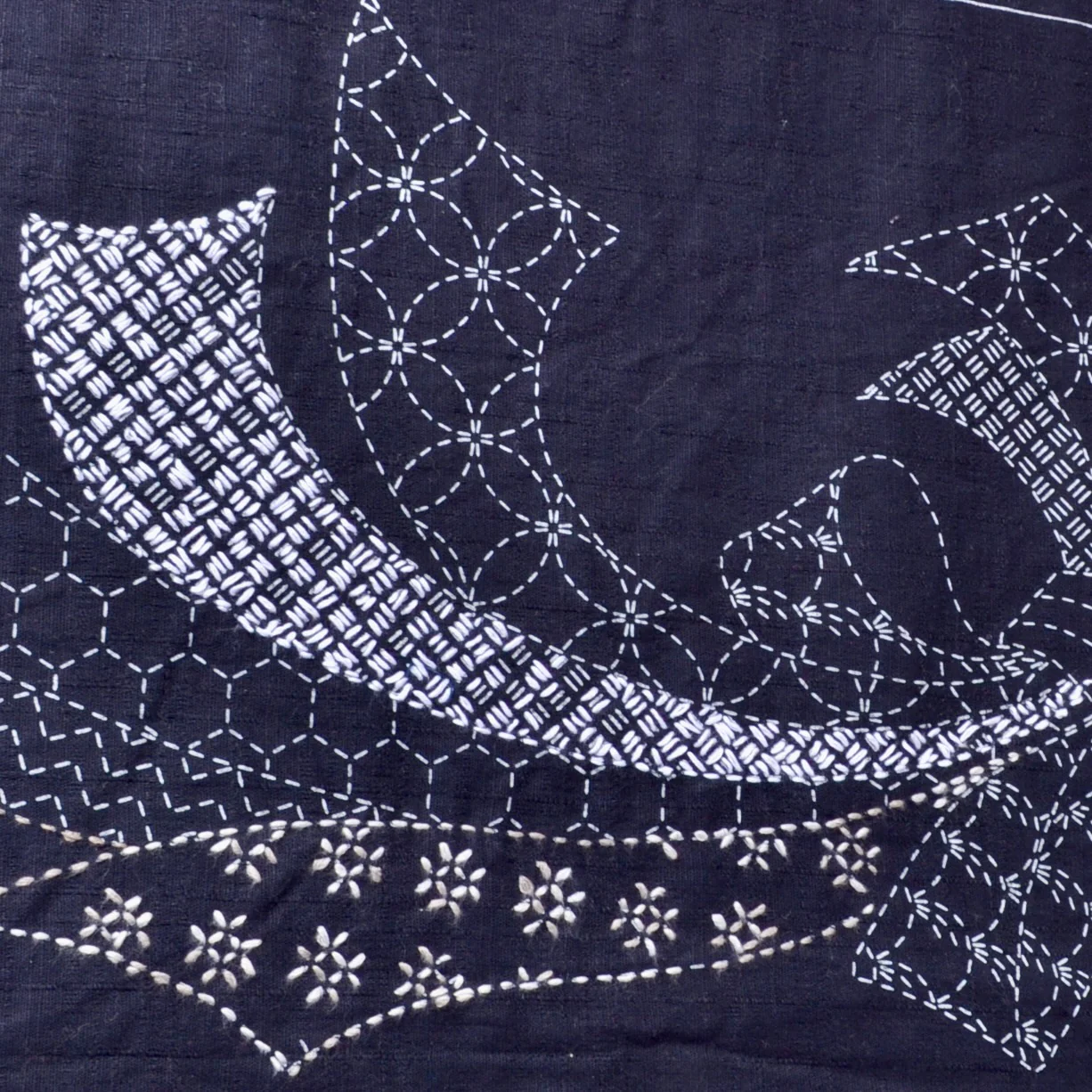
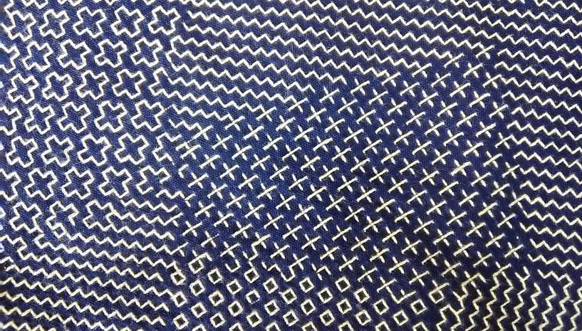
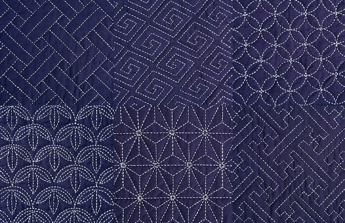
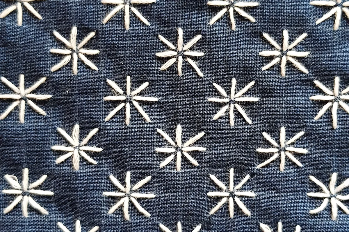
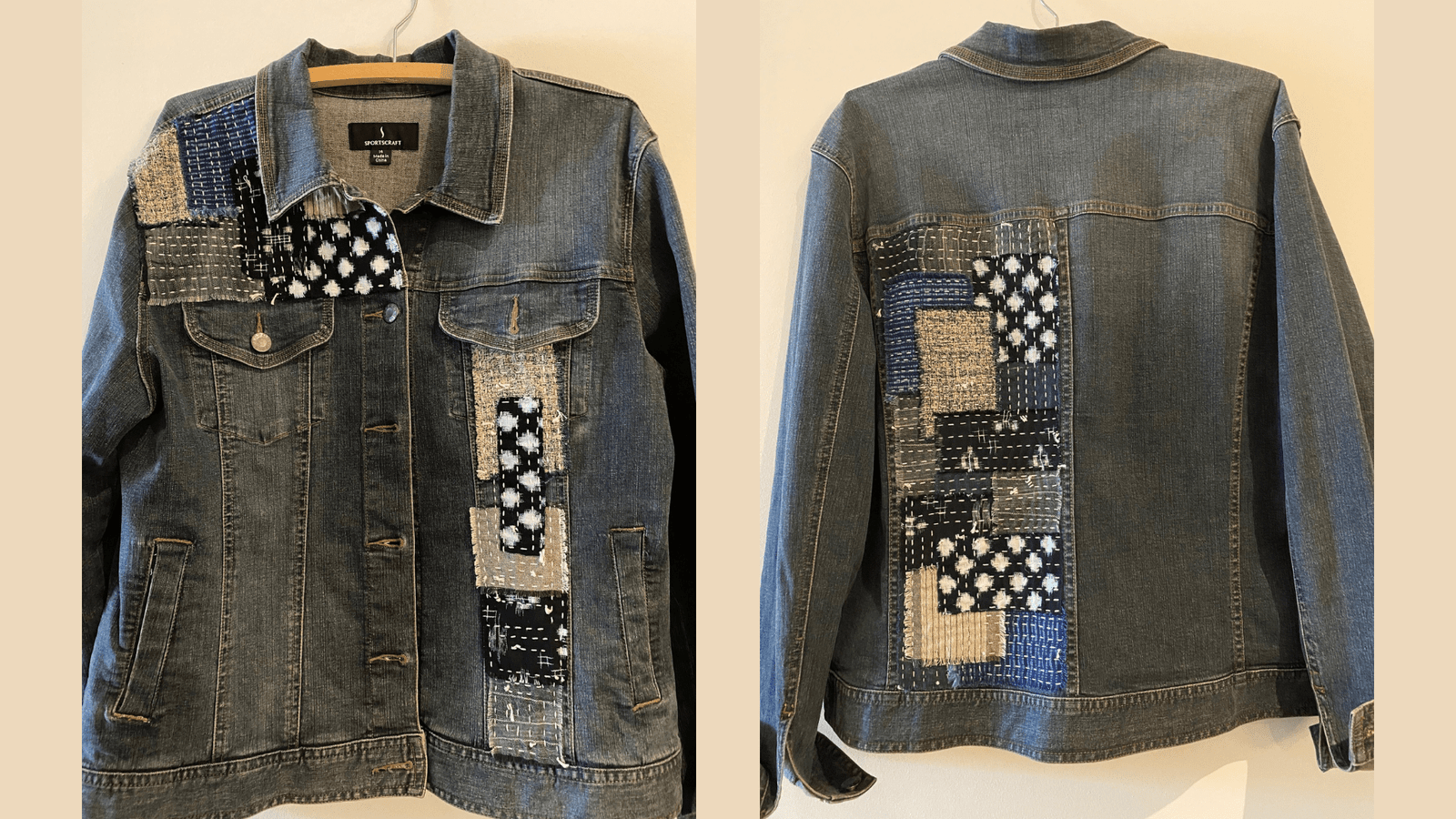
Sashiko emerged through necessity, particularly in poor rural areas, during the Edo period. “Cotton came late to the north of Japan,” explains craft and design writer Katie Treggiden. “So the only way people could get hold of it was as tiny rags of fabrics, that were either passed around or bought from tradesmen from the south. Sashiko – literally, ‘little stabs’ – was a way of connecting all those little pieces into a quilted fabric, known as boro, that would keep them warm.”
Textiles say so much about the culture in which they are worn and used.
Clothing can immediately identify who we are and what our history is. One can tell eastern v. western, wealthy v. impoverished, northern v southern. Clothing also tells us about the society that created it.
The Surprising History of the Kimono
The first ancestor of the kimono was born in the Heian period (794-1192). Straight cuts of fabric were sewn together to create a garment that fit every sort of body shape. It was easy to wear and infinitely adaptable. By the Edo period (1603-1868) it had evolved into a unisex outer garment called kosode. Literally meaning “small sleeves,” the kosode was characterized by smaller armholes. It was only from the Meiji period (1868-1912) onwards that the garment was called kimono. This last transformation, from the Edo era to modern Japan, is fascinating.
In the early 1600s, First Shogun Tokugawa unified Japan into a feudal shogunate. Edo, renamed Tokyo in 1868, now became Japan’s chief city. The resulting Edo Period (also called the Tokugawa Era) spanned 264 years. The years 1603 to 1868 are known as the last era of traditional Japan. Japanese culture developed with almost no foreign influence during this time. And the kosode was one of the key elements of what it meant to be Japanese.
-
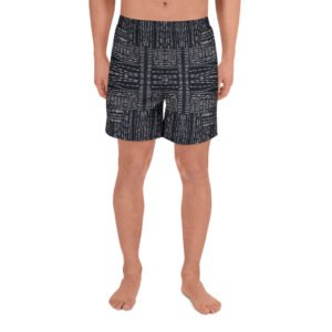
Dark Sashiko Athletic Long Shorts
Price range: $40.00 through $42.50 -
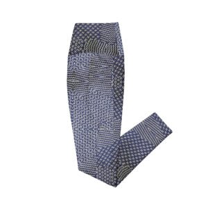
Sashiko Indigo Crossover Leggings with Pockets
Price range: $50.00 through $64.00 -
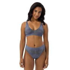
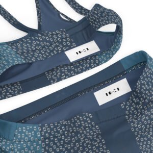
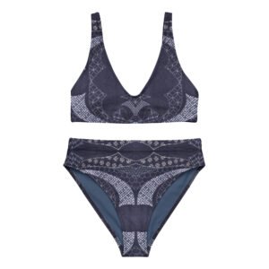
Complex Sashiko Pattern Recycled High-waisted Bikini
Price range: $46.00 through $50.00 -
Split Quad Recycled High-waisted Bikini
Price range: $46.00 through $50.00 -
Curved Sashiko Pattern Recycled High-waisted Bikini
Price range: $46.00 through $50.00 -
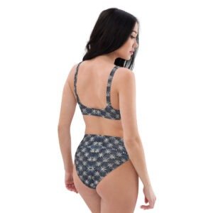
Astra Recycled High-waisted Bikini
Price range: $46.00 through $50.00 -

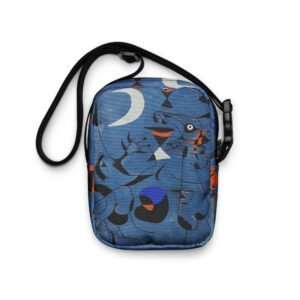
Indigo Cross Sashiko Crossbody Bag
$35.00 -

Indigo School Sashiko Crossbody Bag
$35.00 -

Split Personality Utility Backpack
$60.00 -

Grey Sashiko Shower Curtain
$45.50 -
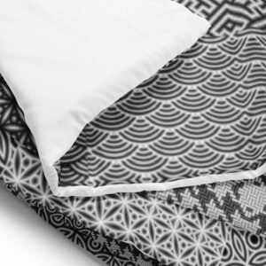
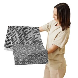
Black and White Sashiko (刺し子) Comforter
Price range: $100.00 through $130.00 -
Black and White Sashiko (刺し子) Table Runner
$39.50 -
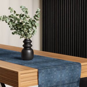
Blue Tiled Stream Sashiko (刺し子) Table Runner
$39.50 -

Sashiko Racerback Cut & Sew Dress
$42.00 -

Sashiko Crossbody Wallet
$24.00