
 Pint Glass")
No Results Found
The page you requested could not be found. Try refining your search, or use the navigation above to locate the post.
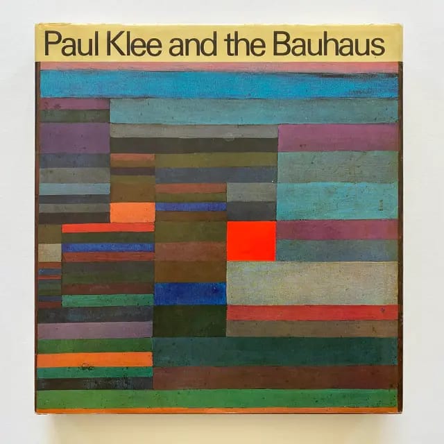
A sun-warm face floats on a grid of reds and golds, a quiet mask made of squares. Eyes balance like notes on a staff. The surface hums, as if a musical score learned to breathe. This is Klee at his most direct, painting sound with simple shapes and bold color.
Paul Klee was born in 1879 in Switzerland, and he grew up with music in his bones. He trained on the violin, and that training shaped his eye. Lines move like melody, color works like harmony, rhythm controls each shift in tone. He died in 1940, leaving a body of work that still feels new.
Klee taught at the Bauhaus, and his clear ideas turned intuition into practice. His Pedagogical Sketchbook distilled how line, shape, and color create meaning. Artists learned that a dot can wander, a line can think, a square can sing. That small insight opened big doors.
In 2025, Klee matters because his method still guides how we see. His symbols bridge thought and feeling, his color theory keeps painters honest, and his play with abstraction feeds design, Surrealism, and Abstract Expressionism. Museums and classrooms keep returning to his pages and paintings. The work remains a living studio.
Here is the thesis, plain and firm. Paul Klee transformed modern art by blending abstraction, symbols, and emotion, and his influence continues to shape movements and artists today.
https://www.youtube.com/watch?v=_QezvWUxiwI
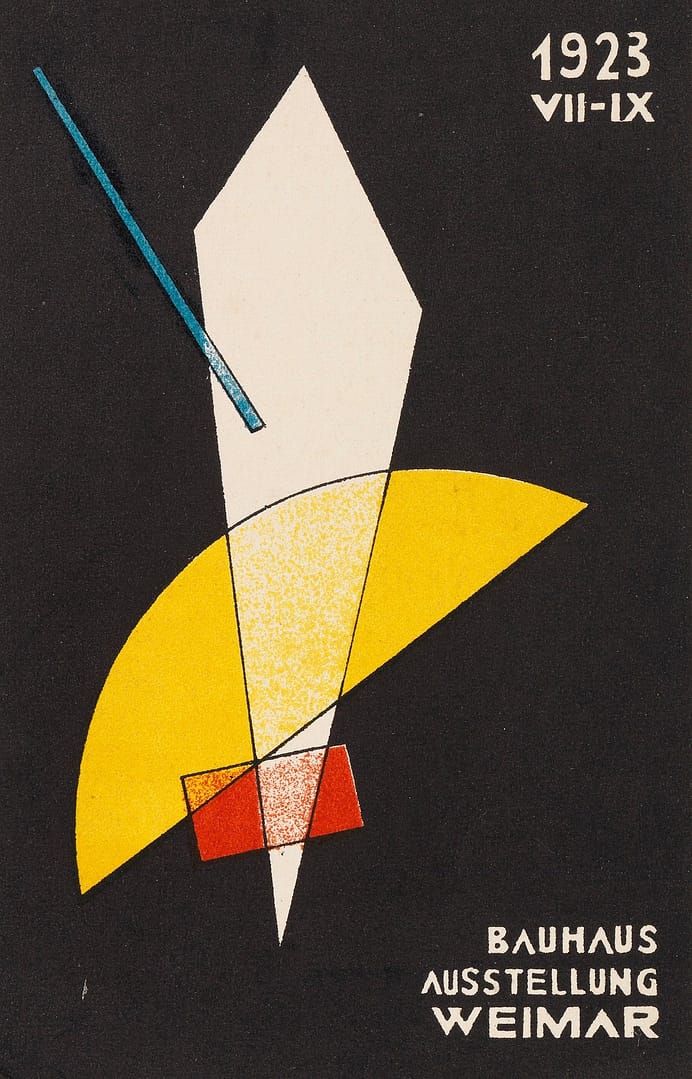
After World War I, Paul Klee joined the Bauhaus in 1921, first at Weimar then at Dessau. He brought a calm, lucid method to a restless moment in art. In studio and lecture, he treated painting like a living system. Line, color, and form worked together, with rules you could test by hand. His Pedagogical Sketchbook (1925) turned studio intuition into a compact field guide that still shapes how we teach visual thinking.
Klee taught from the ground up. He showed how a dot takes a walk, how a line breathes, how a plane holds weight. He made theory tactile with chalk, paper, string, and simple models. Students saw ideas move.
Core moves he stressed, often on the board in quick, witty demos:
He paired analysis with play. A wash of diluted pigment became a weather system, a square nested in a spiral taught growth and proportion. Many Bauhaus basics, from foundation courses to problem-led exercises, trace back to this mix of clarity and experiment. For a concise overview of his classes and approach, see the Bauhaus-Archiv’s summary, Classes by Paul Klee.
This method seeded later studios in abstraction, typography, and product design. Designers learned to test variables, painters learned to stage tensions, teachers learned to structure discovery. Klee modeled how to think with materials.
Klee kept one foot in Expressionism. His symbols carried mood, not just motif. Eyes, suns, arrows, and ladders worked as emotional cues, small signs that stirred a feeling-state on contact. He absorbed Cubist ideas too. Fragmented planes, faceted light, and tilting space appear, then soften into his own lyric order.
He did not mimic styles. He translated them. Expressionism’s heat became quiet intensity in color fields. Cubist structure turned into flexible scaffolds that guided tone and tempo. Critics tracking these overlaps will see how Klee filtered both movements into a personal grammar that served teaching and practice. Britannica surveys this cross-current in its entry on Klee’s Expressionism, Cubism, Abstraction, useful for a broader frame, Paul Klee – Expressionism, Cubism, Abstraction.
The result shaped the Bauhaus ethos. Emotion gained a method, and structure kept its play. That blend helped students move from the canvas to design problems with confidence. When we say Paul Klee Bauhaus today, we mean this union of feeling and form that still guides how we build images and ideas.
Klee built a visual language that feels both ancient and fresh. He turned color into music, line into breath, and symbols into thinking tools. Across 10,000 paintings and 5,000 drawings, he shaped a system where signs and creatures carry thought, not just decoration. That mix gave modern art a grammar that holds feeling and structure at once.
Klee did not chase pure abstraction. He set it to work. In his pictures, a face can be a clock, a fish can be a thought, a city can sing like a chord. He nudged simple shapes into glyphs that read like poetry.
Core moves that mark his hand:
This mattered because it opened a path beyond formalism. Klee proved that abstraction can carry story, that a grid can host a spirit, and that a symbol can still feel new. His picture space invites reading and seeing at once, a key move for later artists who sought freedom without losing sense. For a quick tour of notable canvases, see this concise survey of Paul Klee famous works.
Late in life, Klee faced illness and pressure from the Nazi label of degenerate art, which pushed him back to Switzerland. The paintings sharpened. Lines got thicker. Faces became masks, pared to bone and sign.
In 1940, he painted Klee’s Death and Fire (1940). A skull-like face floats in heat, built from ochres, reds, and a hard black curve. The German word Tod hides in the form, letter fused with image. The paint feels dry, like ash. The eye stares, steady and calm. No gore, only presence.
Other late pieces lean on stark contours, compressed color, and repeated signs that read like prayers. Themes of loss collect in small motifs, a ladder, a gate, a moon. The mood stays clear, not maudlin. He strips the surface to essentials, then lets silence do the work. For critics, the power sits in this reduction. Klee compresses music, myth, and grief into a few strokes, showing how a sign can carry a life.
 Photo by Steve Johnson
Klee’s ideas still move through studios, classrooms, and galleries in 2025. His symbolic abstraction gives artists a stable grammar for feeling and form. You see it in street murals that float like music, in design systems that think in modules, in paintings that fuse sign and space. The Paul Klee legacy anchors Surrealism’s sense of play and Abstract Expressionism’s charge of feeling, then feeds today’s hybrid practices.
In Bern, the Zentrum Paul Klee holds thousands of works and archives that map his methods with rare clarity. Its Miró exhibition notes how an early encounter with klee’s art reshaped Miró’s path, a direct thread between sign and dream, color and wit, image and breath. See the museum’s account in Zentrum Paul Klee’s Miró overview.
Critics tracking influence find a clean through line. Klee’s signs act like notes and letters at once. His color behaves like weather, shifting pressure across the field. That mix still guides painters who want freedom with structure.
Klee affected both Surrealism and Abstract Expressionism through playful symbols, modular color, and a musical sense of form. Two clear cases show how this worked.
For contemporary painters, designers, and installation artists, the lesson stays crisp. Use symbols as living tools. Let color set the air. Build a surface that thinks. Klee keeps that door open, and today’s art walks through it.
Klee fused early musical training with a clear eye for structure, then turned that mix into a teaching method that shaped the Bauhaus. He stripped painting to line, color, and sign, letting simple marks carry feeling and thought. From those moves came a flexible grammar for modern art, alive in Surrealism, Abstract Expressionism, and today’s design studios.
For fresh contact with klee, see Affinities: Anni Albers, Josef Albers, Paul Klee at David Zwirner, New York, March 13 to April 19, 2025. Walk the collection tours at the Zentrum Paul Klee in Bern, where the studio logic still breathes. Seek Paul Klee: Constellations of Creation at the Aichi Prefectural Museum of Art in 2025, and stream the Met’s lecture Paul Klee: “In the Magic Kitchen” for sharp context.
Critics, return to the thesis with open eyes. Klee did not escape the world, he rebuilt how we see it, one measured stroke at a time. Visit a show, study the notebooks, and test his claims on your own canvas. Think of a small square warming a field, a thin line taking a walk, and a quiet face made of color that still sings.


Two-in-one: these mixing glasses are both shakers and serving glasses. Made from 100% glass, they’re crystal clear and look sleek. The solid-glass base also minimizes the risk of tipping and spilling the drink. They’re more narrow at the bottom for a more comfortable grip and easier carrying.

Elevate your drinking experience with our 10oz Rocks Glass. Crafted from clear tempered glass, it comes packed with style and durability. With an FDA Certification and BPA-free material, you can enjoy your favorite beverages worry-free.

A bar essential. These come in one size: 6oz (0.17l), which fits into the whiskey-glass standard in hospitality.
Whether it’s weddings, parties, or beautiful evenings with friends and family, these stemless glass wine fits right in. With its sleek, stemless design, each glass holds 11.75oz of your favorite wine.

Mugs, Mason Jars, Flutes and many other types of glasses for special occassions and when only a unique form of barware is required.
Showing 49–57 of 57 resultsSorted by latest


 Shaker Pint Glass")
 Stemless Wine Glass")
 Stemless Wine Glass")

He also worked collaboratively with other artists, including his first wife Lucia Moholy, Walter Gropius, Marcel Breuer, and Herbert Bayer.
His largest accomplishment may be the School of Design in Chicago, which survives today as part of the Illinois Institute of Technology, which art historian Elizabeth Siegel called “his overarching work of art”. He also wrote books and articles advocating a utopian type of high modernism.


Carbon offsetting is a way to compensate for the carbon dioxide we spew into the atmosphere by funding projects that reduce greenhouse gases or absorb carbon from the air. At cgk.ink, this means investing in renewable energy sources, reforestation efforts, and energy-efficient technologies that help balance out the environmental impact of shipping and packaging.
Stripe Climate is the easiest way to help promising permanent carbon removal technologies launch and scale. cgk.ink has joined a growing group of ambitious businesses that are changing the course of carbon removal.
")
Carbon Balance Pte. Ltd. is a sustainability platform based in Singapore providing a calculator API to measure the GHG footprint of ecommerce transactions and an Integration Plugin for popular ecommerce enablers such as WooCommerce, EasyStore, Shopify with flexible options to offset footprint by contributing to trustworthy projects.
These pieces of software complement our other intiatives, such as:
Google Travel, as well as other travel and hotel search sites, have formulated a way to compare carbon emission variations among similar routes. The impetus is on both the airline and the consumer to choose among the available options with ecological criteria being included.

Showing 49–59 of 59 resultsSorted by latest


Color is one of the most essential design elements. This site uses many different techniques to deliver items that are as sharp and vivid as the images that are presented on the web site.
There are very specific differences between what is displayed versus what is printed. Let’s take a quick look at some basic physics of rendering colors:
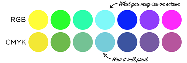
RGB is an additive color model, while CMYK is subtractive.
RGB uses white as a combination of all primary colors and black as the absence of light. CMYK, on the other hand, uses white as the natural color of the print background and black as a combination of colored inks. Graphic designers and print providers use the RGB color model for any type of media that transmits light, such as computer screens. RGB is ideal for digital media designs because these mediums emit color as red, green, or blue light.
RGB is best for websites and digital communications, while CMYK is better for print materials. Most design fields recognize RGB as the primary colors, while CMYK is a subtractive model of color.
With the RGB color model, pixels on a digital monitor are – if viewed with a magnifying glass – all one of three colors: red, green, or blue. The white light emitted through the screen blends the three colors on the eye’s retina to create a wide range of other perceived colors. With RGB, the more color beams the device emits, the closer the color gets to white. Not emitting any beams, however, leads to the color black.
This is the opposite of how CMYK works.
CMYK is best for print materials because print mediums use colored inks for messaging. CMYK subtracts colors from natural white light and turns them into pigments or dyes. Printers then put these pigments onto paper in tiny cyan, magenta, yellow, and black dots – spread out or close together to create the desired colors. With CYMK, the more colored ink placed on a page, the closer the color gets to black. Subtracting cyan, magenta, yellow, and black inks create white – or the original color of the paper or background. RGB color values range from 0 to 255, while CMYK ranges from 0-100%.
Source: Boingo Graphics

The importance of the Bauhaus lies in its revolutionary approach to design, architecture, and art education that emphasized functionality, simplicity, and the integration of art with mass production, creating a lasting influence on modern design across many fields, from furniture and buildings to graphic design and beyond. Despite being a short-lived German school (1919-1933), its principles were spread worldwide, especially after its closure by the Nazis, pioneering the concept of design as a holistic, problem-solving discipline.
The school existed in three German cities—Weimar, from 1919 to 1925; Dessau, from 1925 to 1932; and Berlin, from 1932 to 1933—under three different architect-directors: Walter Gropius from 1919 to 1928; Hannes Meyer from 1928 to 1930; and Ludwig Mies van der Rohe from 1930 until 1933, when the school was closed by its own leadership under pressure from the Nazi regime, having been painted as a centre of communist intellectualism.[4] Internationally, former key figures of Bauhaus were successful in the United States and became known as the avant-garde for the International Style.[5] The White city of Tel Aviv, to which numerous Jewish Bauhaus architects emigrated, has the highest concentration of the Bauhaus’ international architecture in the world.
The changes of venue and leadership resulted in a constant shifting of focus, technique, instructors, and politics. For example, the pottery shop was discontinued when the school moved from Weimar to Dessau, even though it had been an important revenue source; when Mies van der Rohe took over the school in 1930, he transformed it into a private school and would not allow any supporters of Hannes Meyer to attend it.

The Bauhaus was founded in 1919 in the city of Weimar by German architect Walter Gropius (1883–1969).
Its core objective was a radical concept: to reimagine the material world to reflect the unity of all the arts. Gropius explained this vision for a union of art and design in the Proclamation of the Bauhaus (1919), which described a utopian craft guild combining architecture, sculpture, and painting into a single creative expression. Gropius developed a craft-based curriculum that would turn out artisans and designers capable of creating useful and beautiful objects appropriate to this new system of living.
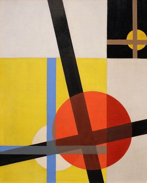
The Bauhaus combined elements of both fine arts and design education. The curriculum commenced with a preliminary course that immersed the students, who came from a diverse range of social and educational backgrounds, in the study of materials, color theory, and formal relationships in preparation for more specialized studies. This preliminary course was often taught by visual artists, including Paul Klee (1987.455.16), Vasily Kandinsky (1866–1944), and Josef Albers (59.160), among others.
Wassily Kandinsky (1866–1944):
A leading figure in abstract art, he was a member of the influential Der Blaue Reiter group and taught at the Bauhaus.
Paul Klee (1879–1940):
Also a member of Der Blaue Reiter, Klee was known for his colorful, geometric abstract paintings and taught at the Bauhaus from 1921 to 1932.
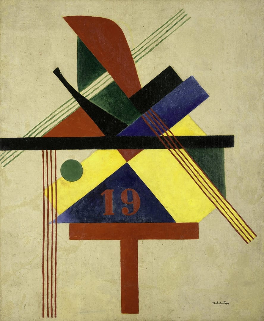
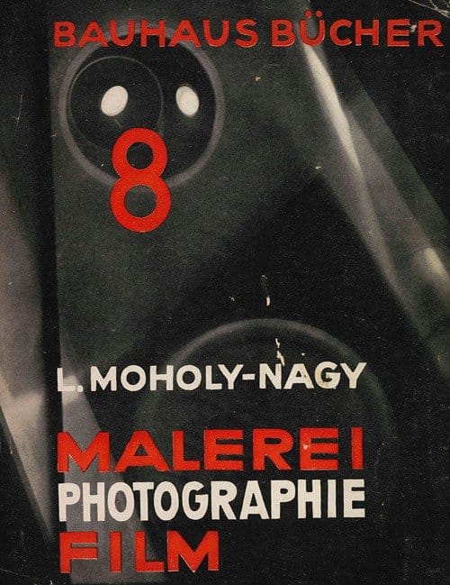
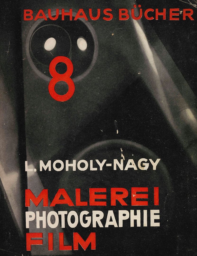
László Moholy-Nagy (1895–1946):
A Hungarian artist who taught painting and photography, known for his work in kinetic sculpture and his use of light and form.
Josef Albers (1888–1976):
A German artist who was both a student and later a master at the Bauhaus, known for his work with color and geometric forms.
Oskar Schlemmer (1888–1943):
A painter and sculptor who designed the Bauhaus emblem and taught painting, known for his work on the ballet “The Triadic Ballet”.
Anni Albers (1899–1994):
A significant textile artist and printmaker, she was a key figure in the women artists of the Bauhaus.


Although Gropius’ initial aim was a unification of the arts through craft, aspects of this approach proved financially impractical. While maintaining the emphasis on craft, he repositioned the goals of the Bauhaus in 1923, stressing the importance of designing for mass production. It was at this time that the school adopted the slogan “Art into Industry.”
In 1925, the Bauhaus moved from Weimar to Dessau, where Gropius designed a new building to house the school. This building contained many features that later became hallmarks of modernist architecture, including steel-frame construction, a glass curtain wall, and an asymmetrical, pinwheel plan, throughout which Gropius distributed studio, classroom, and administrative space for maximum efficiency and spatial logic.


The cabinetmaking workshop was one of the most popular at the Bauhaus. Under the direction of Marcel Breuer (1983.366) from 1924 to 1928, this studio reconceived the very essence of furniture, often seeking to dematerialize conventional forms such as chairs to their minimal existence. Breuer theorized that eventually chairs would become obsolete, replaced by supportive columns or air. Inspired by the extruded steel tubes of his bicycle, he experimented with metal furniture, ultimately creating lightweight, mass-producible metal chairs. Some of these chairs were deployed in the theater of the Dessau building.


The Bauhaus weaving workshop was one of the most inventive and commercially successful departments of the pioneering 20th-century school of art and design. Notably, most of the artists involved were women.
These women were “exploring textiles’ potential, both as works of art and as utilitarian fabrics,” said Laura Muir, research curator for academic and public programs and curator of The Bauhaus and Harvard at the Harvard Art Museums.
Collaboration and innovation were paramount in the workshop: artists pursued new designs suitable for industrial production and experimented with novel materials and techniques.
Source —Harvard Art Museums
The textile workshop, especially under the direction of designer and weaver Gunta Stölzl (1897–1983), created abstract textiles suitable for use in Bauhaus environments.
Students studied color theory and design as well as the technical aspects of weaving. Stölzl encouraged experimentation with unorthodox materials, including cellophane, fiberglass, and metal. Fabrics from the weaving workshop were commercially successful, providing vital and much needed funds to the Bauhaus. The studio’s textiles, along with architectural wall painting, adorned the interiors of Bauhaus buildings, providing polychromatic yet abstract visual interest to these somewhat severe spaces.
While the weaving studio was primarily comprised of women, this was in part due to the fact that they were discouraged from participating in other areas. The workshop trained a number of prominent textile artists, including Anni Albers (1899–1994), who continued to create and write about modernist textiles throughout her life.


Metalworking was another popular workshop at the Bauhaus and, along with the cabinetmaking studio, was the most successful in developing design prototypes for mass production. In this studio, designers such as Marianne Brandt (2000.63a–c), Wilhelm Wagenfeld (1986.412.1–16), and Christian Dell (1893–1974) created beautiful, modern items such as lighting fixtures and tableware. Occasionally, these objects were used in the Bauhaus campus itself; light fixtures designed in the metalwork shop illuminated the Bauhaus building and some faculty housing.
Brandt was the first woman to attend the metalworking studio, and replaced László Moholy-Nagy (1987.1100.158) as studio director in 1928. Many of her designs became iconic expressions of the Bauhaus aesthetic. Her sculptural and geometric silver and ebony teapot (2000.63a–c), while never mass-produced, reflects both the influence of her mentor, Moholy-Nagy, and the Bauhaus emphasis on industrial forms. It was designed with careful attention to functionality and ease of use, from the nondrip spout to the heat-resistant ebony handle.


The typography workshop, while not initially a priority of the Bauhaus, became increasingly important under figures like Moholy-Nagy and the graphic designer Herbert Bayer (2001.392). At the Bauhaus, typography was conceived as both an empirical means of communication and an artistic expression, with visual clarity stressed above all. Concurrently, typography became increasingly connected to corporate identity and advertising. The promotional materials prepared for the Bauhaus at the workshop, with their use of sans serif typefaces and the incorporation of photography as a key graphic element, served as visual symbols of the avant-garde institution.


Gropius stepped down as director of the Bauhaus in 1928, succeeded by the architect Hannes Meyer (1889–1954). Meyer maintained the emphasis on mass-producible design and eliminated parts of the curriculum he felt were overly formalist in nature. Additionally, he stressed the social function of architecture and design, favoring concern for the public good rather than private luxury. Advertising and photography continued to gain prominence under his leadership.
Under pressure from an increasingly right-wing municipal government, Meyer resigned as director of the Bauhaus in 1930. He was replaced by architect Ludwig Mies van der Rohe (1980.351). Mies once again reconfigured the curriculum, with an increased emphasis on architecture. Lilly Reich (1885–1947), who collaborated with Mies on a number of his private commissions, assumed control of the new interior design department.
Other departments included weaving, photography, the fine arts, and building. The increasingly unstable political situation in Germany, combined with the perilous financial condition of the Bauhaus, caused Mies to relocate the school to Berlin in 1930, where it operated on a reduced scale. He ultimately shuttered the Bauhaus in 1933.
During the turbulent and often dangerous years of World War II, many of the key figures of the Bauhaus emigrated to the United States, where their work and their teaching philosophies influenced generations of young architects and designers.
Breuer and Gropius taught at Harvard. Josef and Anni Albers taught at Black Mountain College, and later Josef taught at Yale.
Moholy-Nagy established the New Bauhaus in Chicago in 1937.
Mies van der Rohe designed the campus and taught at the Illinois Institute of Technology.
It remains to this day, standing as a distinguished monument to the power of art.

The page you requested could not be found. Try refining your search, or use the navigation above to locate the post.